


PHOTOBOOK REVIEW: Gregory Halpern - King, Queen, Knave
An in-depth review of Halpern's latest photobook, analyzing the photographs, and breaking down how it functions as a book.

If you’d prefer to watch my review of King, Queen, Knave, you can see the video here:
The work in this book was made over a 20 year period in Halpern’s hometown of Buffalo, New York. Long term projects are nothing new for Halpern. Both ZZYZX from 2016, and A from 2011 took five years to finish. Omaha Sketchbook from 2019 took over fifteen years complete, including an early version of the book that was published in 2009.
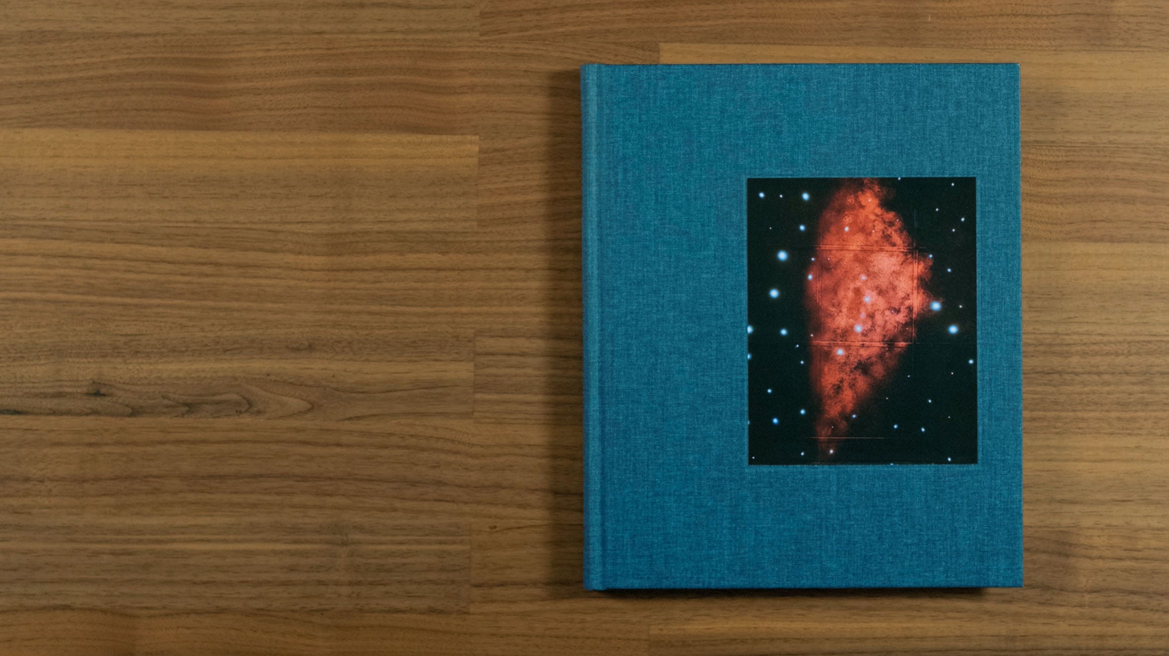
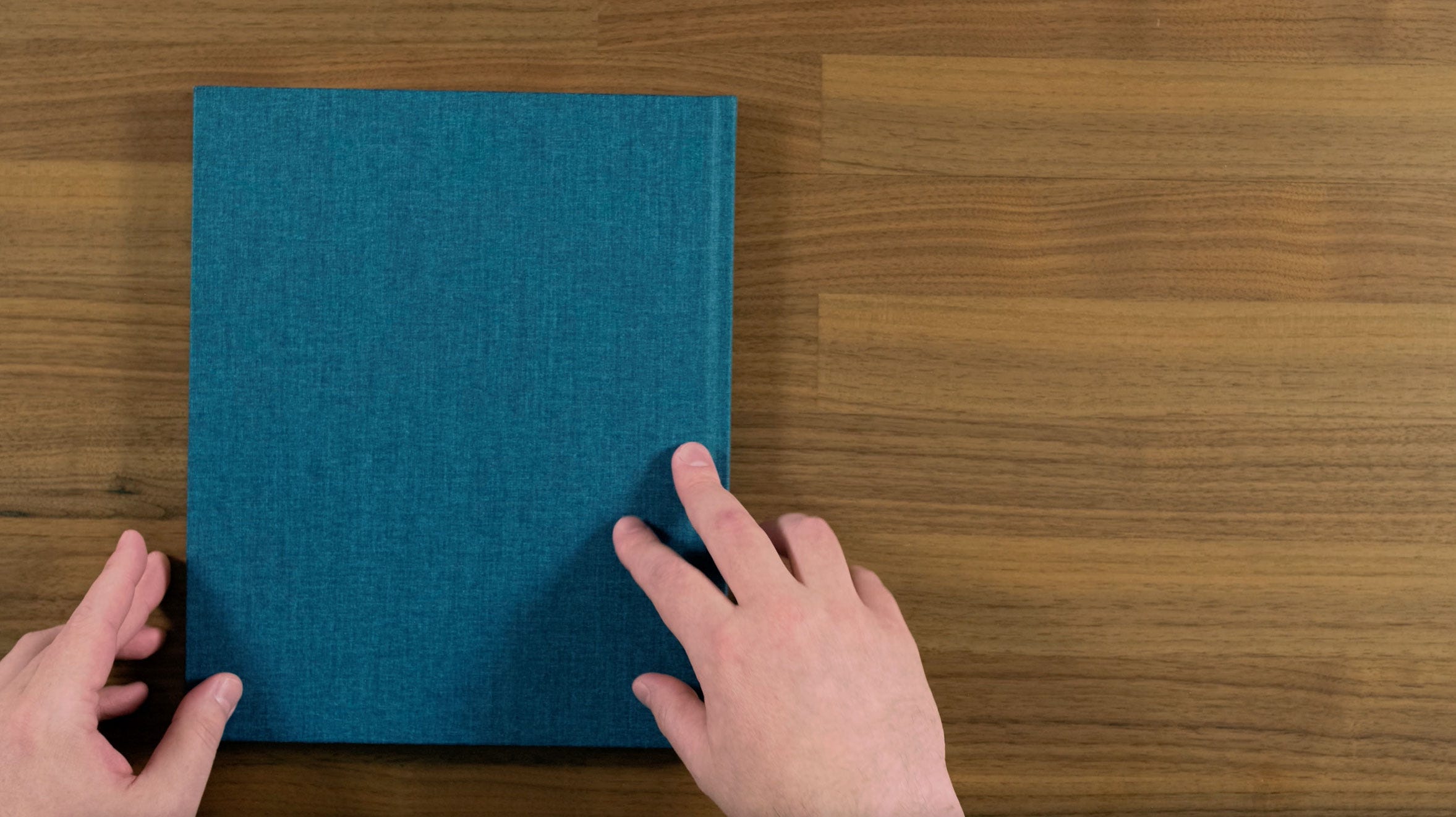
The first thing you see when you look at the book, is this really nice warm dark blue book cloth. You also have a tipped-in image, which at first glance appears to be astrophotography of some kind of galaxy or nebula. But on closer inspection, you’ll see that it’s actually a painting on a drop ceiling, as you can tell from the tiles and ceiling grid. Speaking about his work, Halpern said:
"The more I’ve thought about photography’s slippery relationship to “truth,” the more fascinated I’ve become in how photographic precision and Surrealism are not contradictory.”
Although the images in this book do feel stylistically like documentary work, the place Halpern takes us to does feel quite surreal by the end.
Here we have some purple end papers, which contrast nicely with the blue book cloth.
Next we have a very simple title page, that doesn’t even the artists name on it.
That Surrealist feeling is something that runs throughout this book. It gives a strong feeling of place, while almost completely avoiding images of things like landmarks that are typically associated with documentary projects about a city.
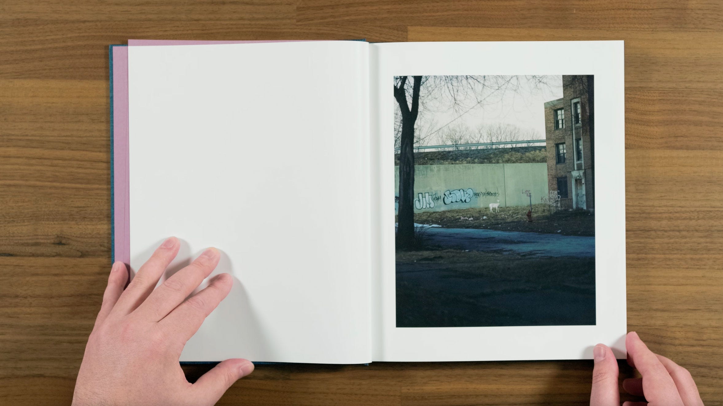
Gregory Halpern is an absolute master of the reoccurring motif, and that’s something we’ll return to again and again throughout the book. We start out with our very first reoccurring motif with this little white deer. It’s a subtle, but rather mysterious start to the book, which is quite fitting for where it goes from here.
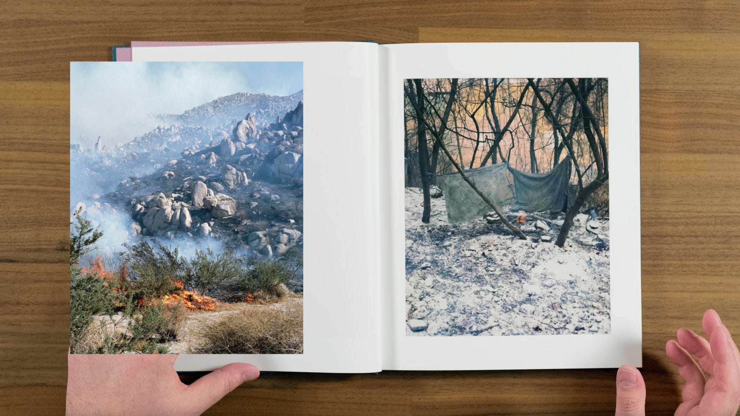
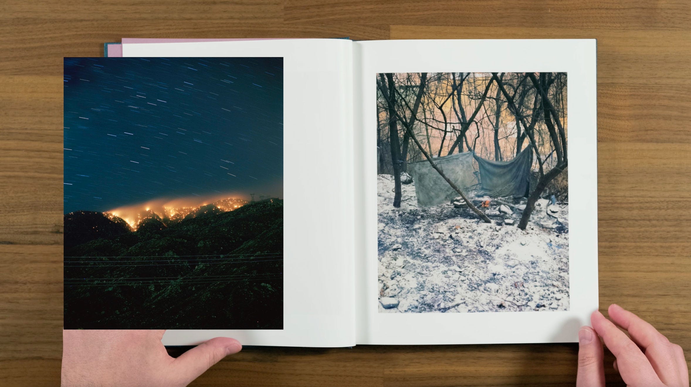
Images of fire are another reoccurring motif in this book, and throughout Halpern’s career.
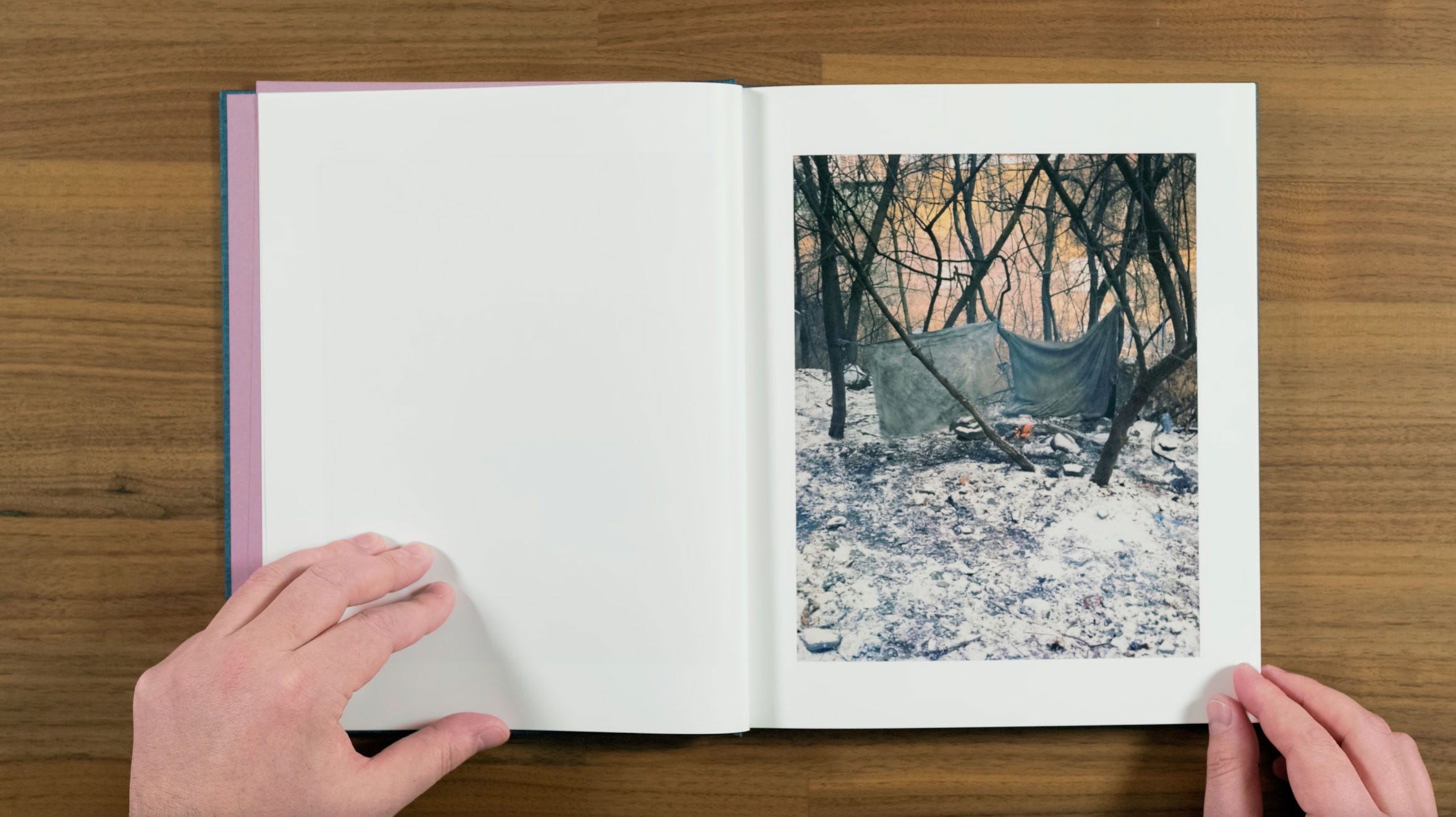
Fire seem to be a subject that he’s continually drawn to photograph. This one appears to be some sort of encampment. It almost feels like a modern version of a western, where you come upon a camp with the fire still burning, having just missed whoever was staying there.
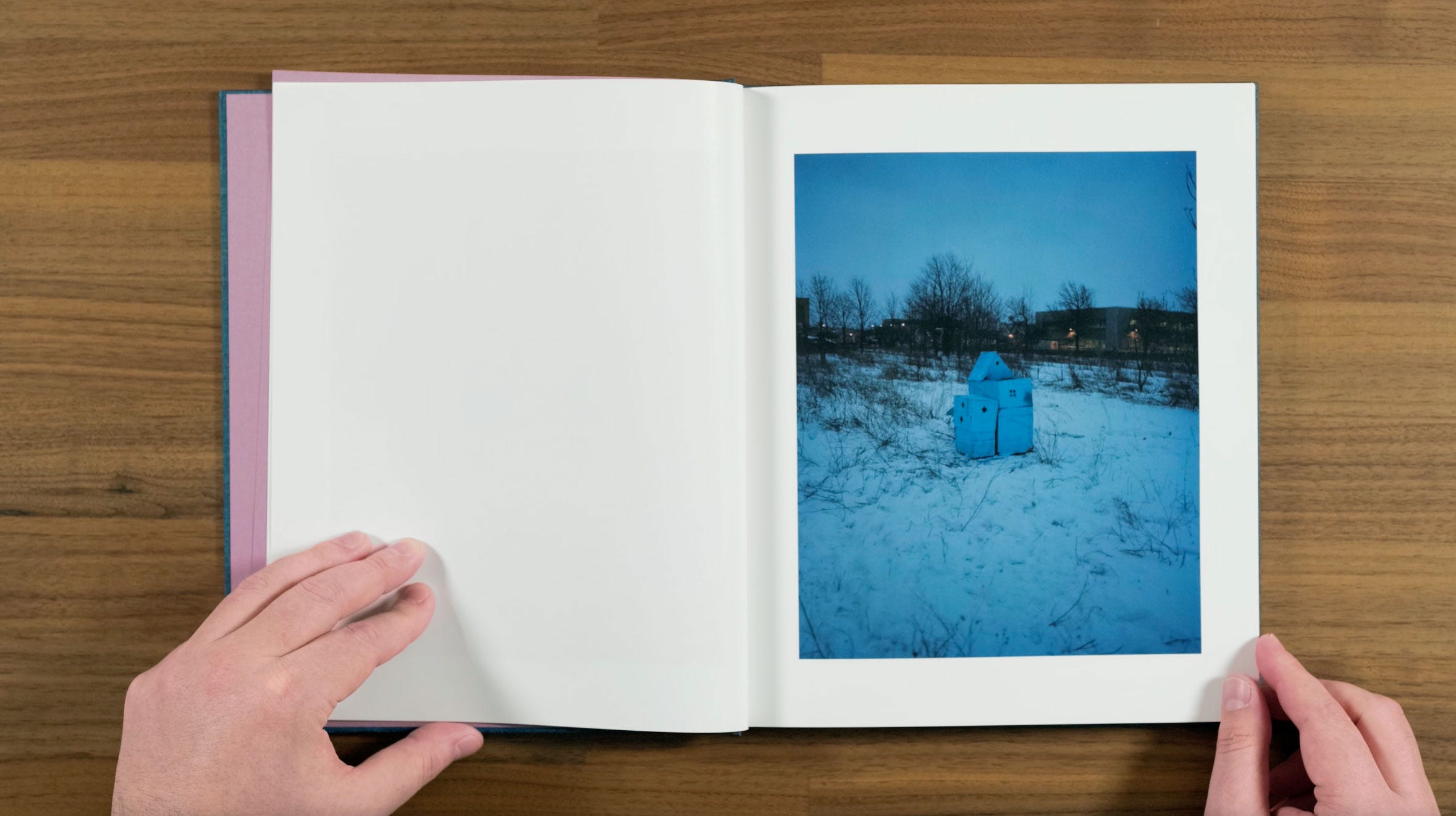
Here we have a strange little structure in a field behind an industrial park. It almost looks like a dollhouse with it’s little windows, but I think it might actually be a beekeeping box. Talking about what drew him back to his hometown to photograph Halpern said:
“I’ve always found Buffalo kind of magical, which I realize to some people might sound like a ridiculous statement. I often think about when we were kids, exploring buildings. There were some key amazing buildings that I often think about as the source of my interest in where “realism” and “surrealism” come together.”
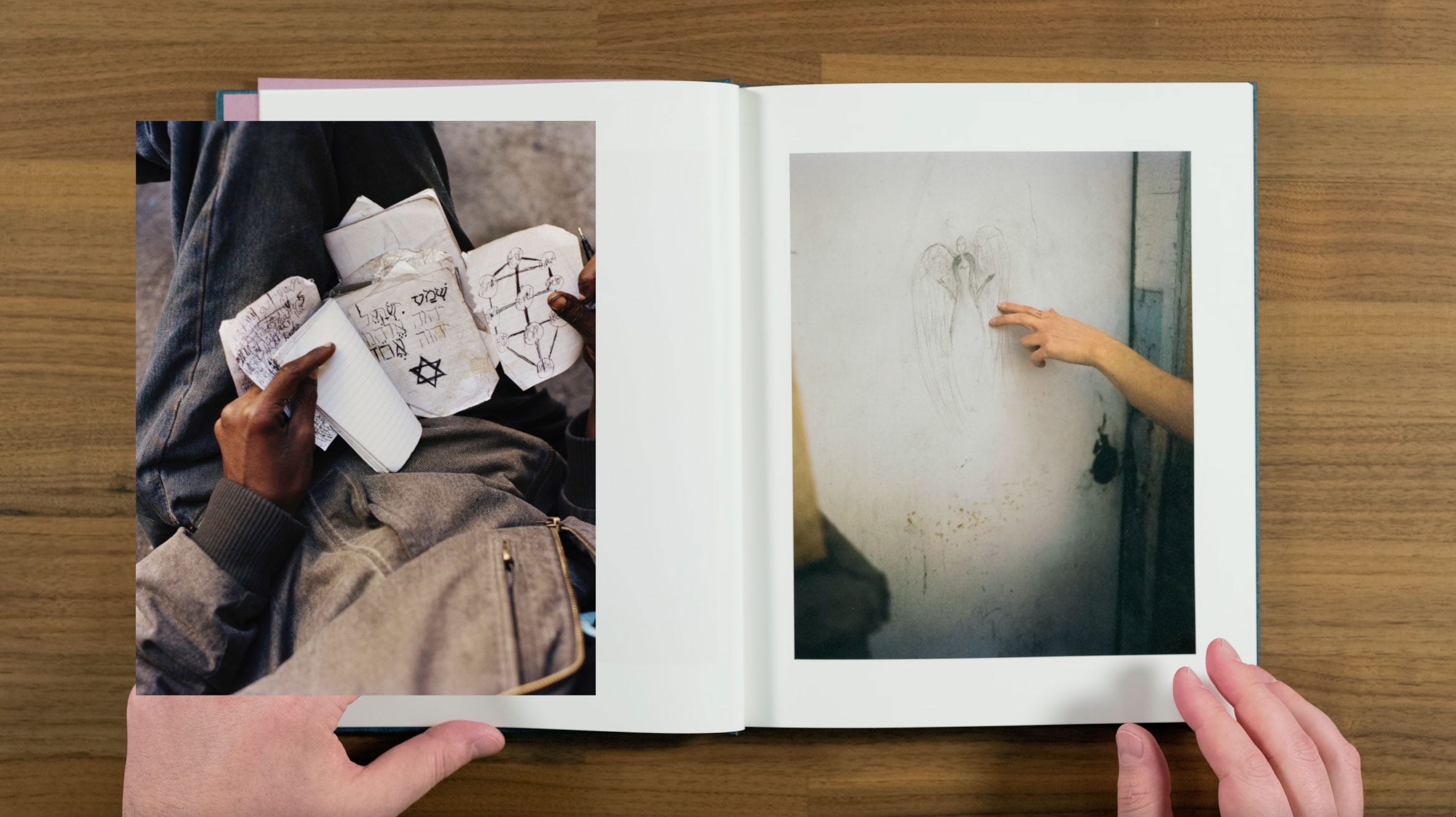
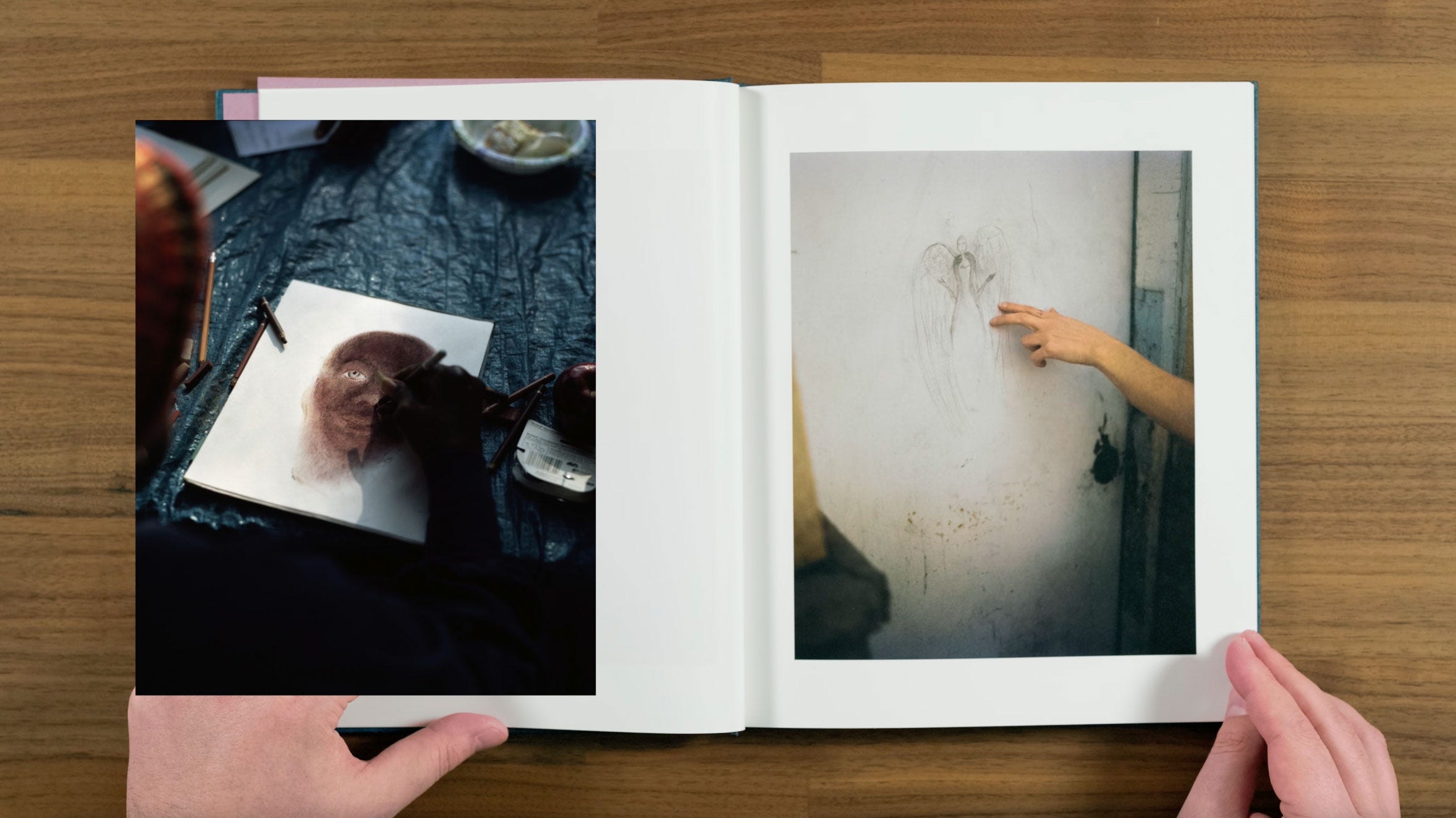
Images of unusual drawings are also an ongoing theme in Halpern’s work.
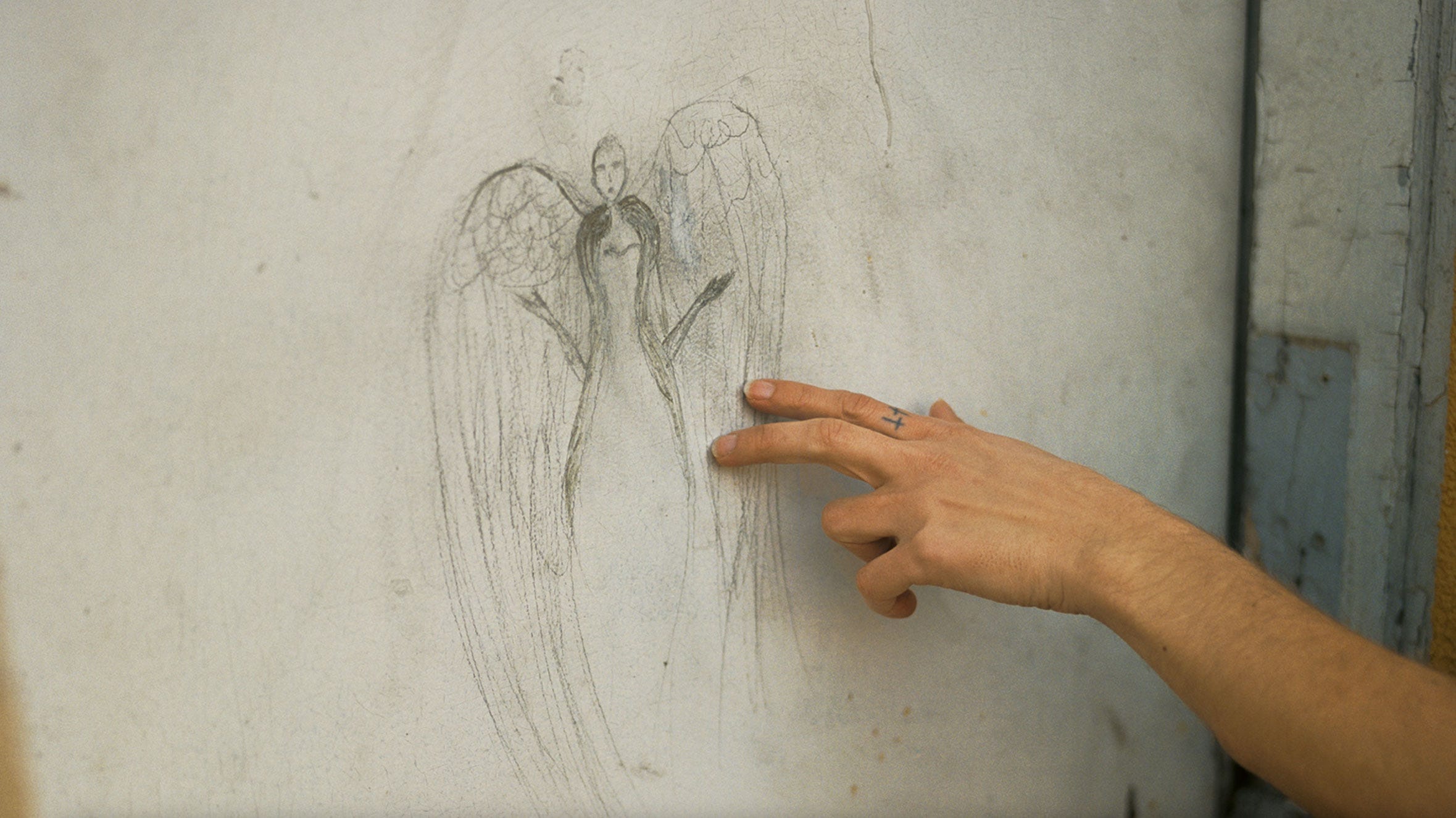
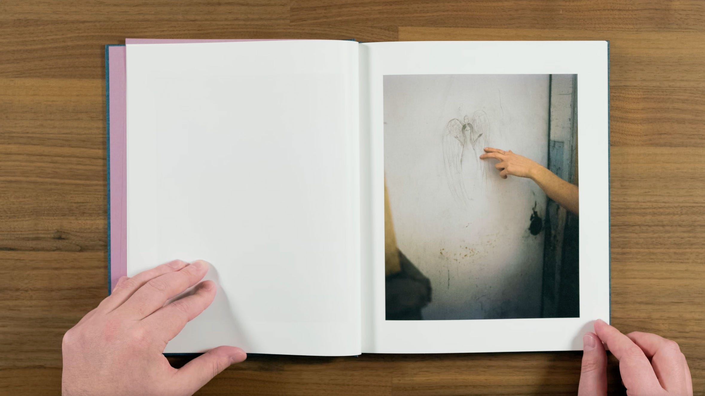
There’s something quite mysterious about the way the hand is reaching out from the edge of the fame and touching the drawing. There’s also an implied connection between the angel, and the two cross tattoos on the index finger. It’s almost a bit ominous feeling with the shallow depth of field and vignette.
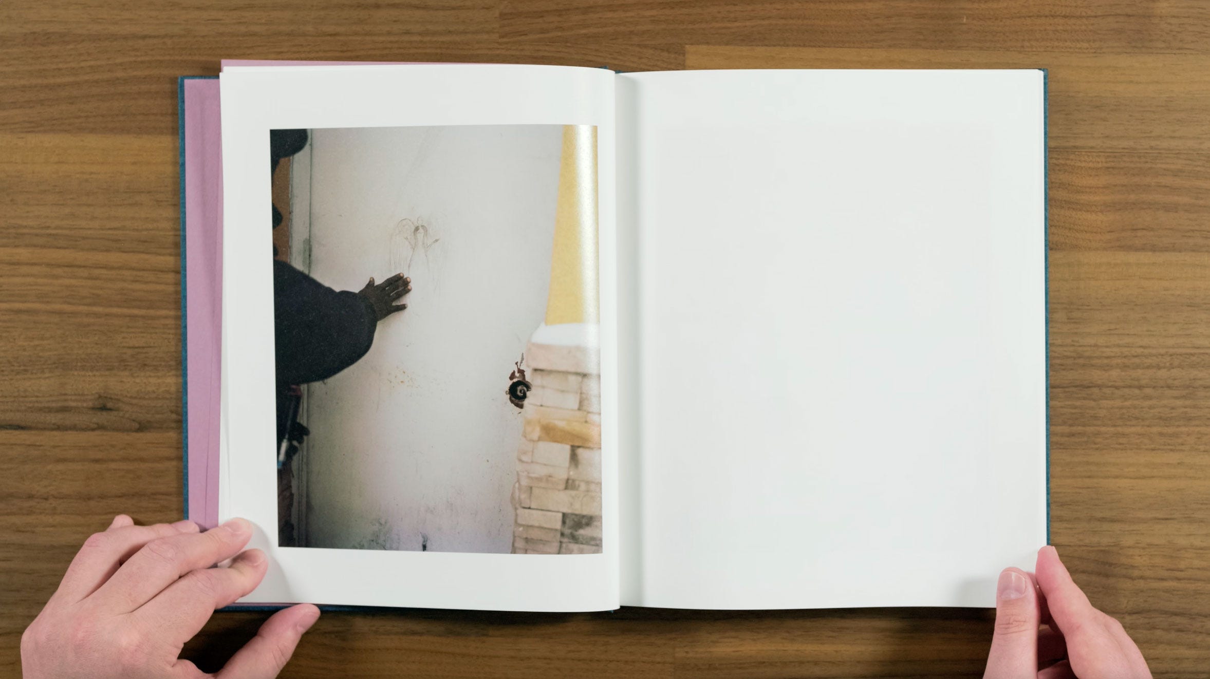
On the next page we switch to the other side of the spread, with a different photograph of the same drawing from the opposite angle. Having two different versions of the same thing is something that Halpern likes to include in his books.
Even as a fan of his work, I generally find that approach a little obvious. But I do have to say that I like the back to back pages version of it in this book, quite a bit better than this side by side version from his book ZZYZX.
The way the hand in this one is touching the angel in the second one feels more longing than ominous, which I think is why I feel having two versions of this drawing actually works for me in this case.
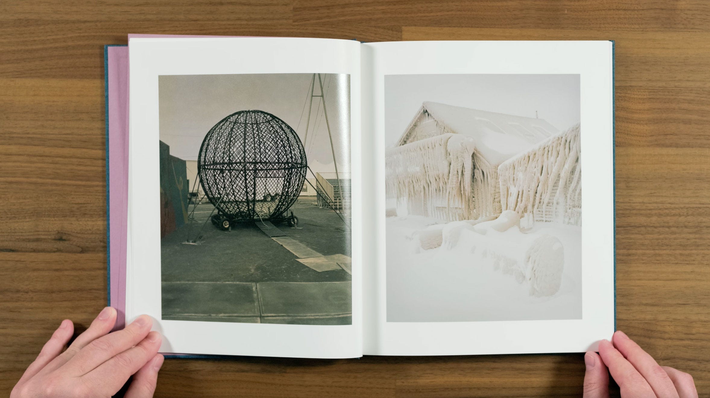
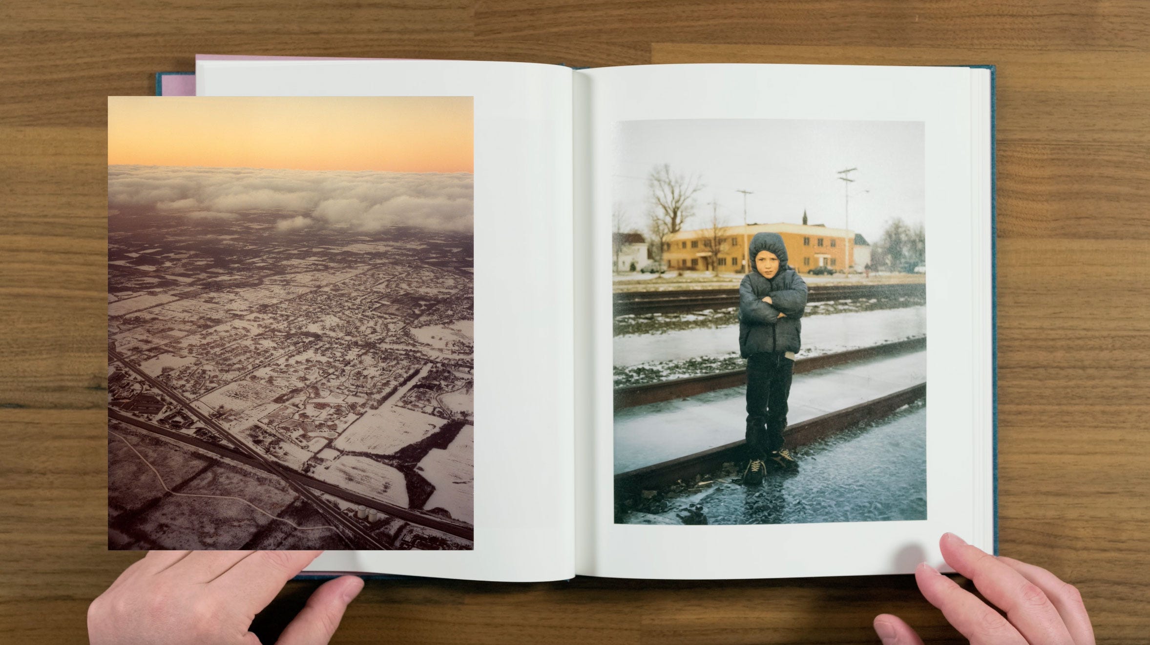
Here we get our first pair. The working title for this project was 19 Winters / 7 Springs. Halpern says that he “first thought of the project as being about Buffalo and winter, because to me, that’s when the city earns its identity. And there’s a really unique feeling there in winter.”
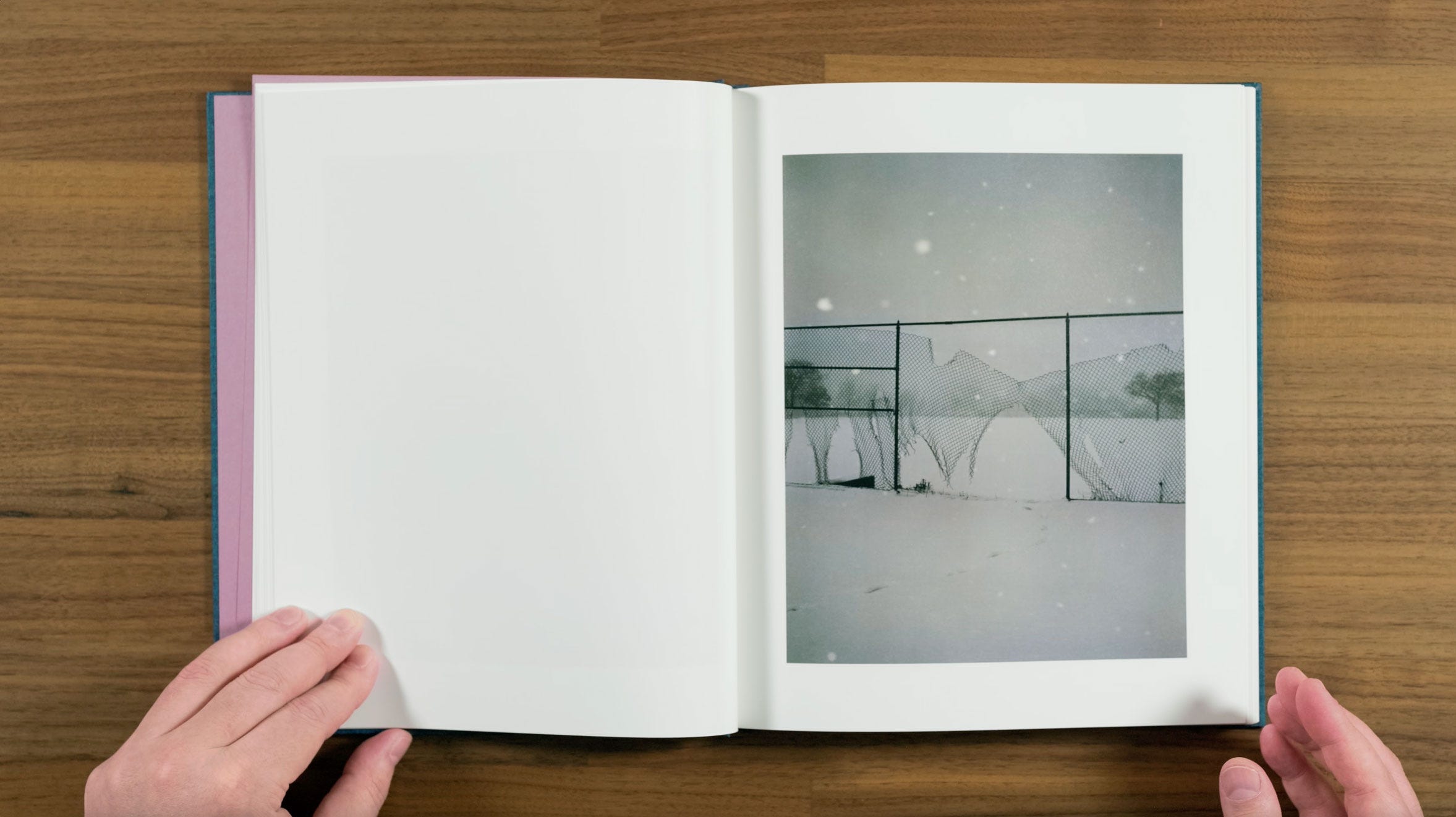
This image on the right is probably one of the most quintessential Buffalo winter images in the book, with the mass of icicles from Buffalo’s notorious lake effect storms. The strange ball on the left appears to be one of those cages that motorcyclists perform tricks inside of at the circus. I love the visual and conceptual contrast between these images. They make for a really compelling pair, with a lot of room for the viewer to build their own connections between them.
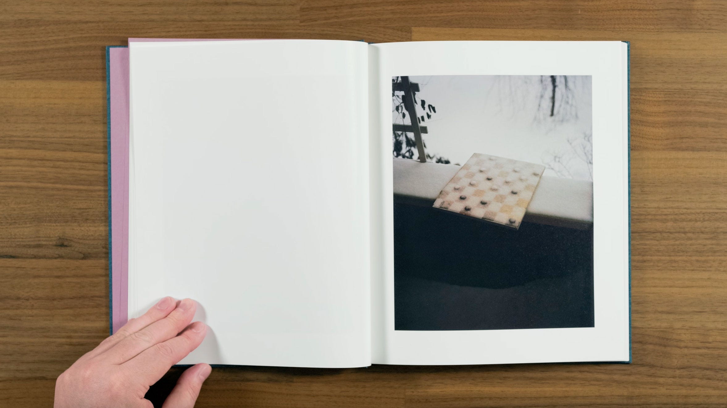
Here we have another wintery image, with a snow covered checker board. It’s a pretty simple image compositionally, but there’s a really powerful mood to it.
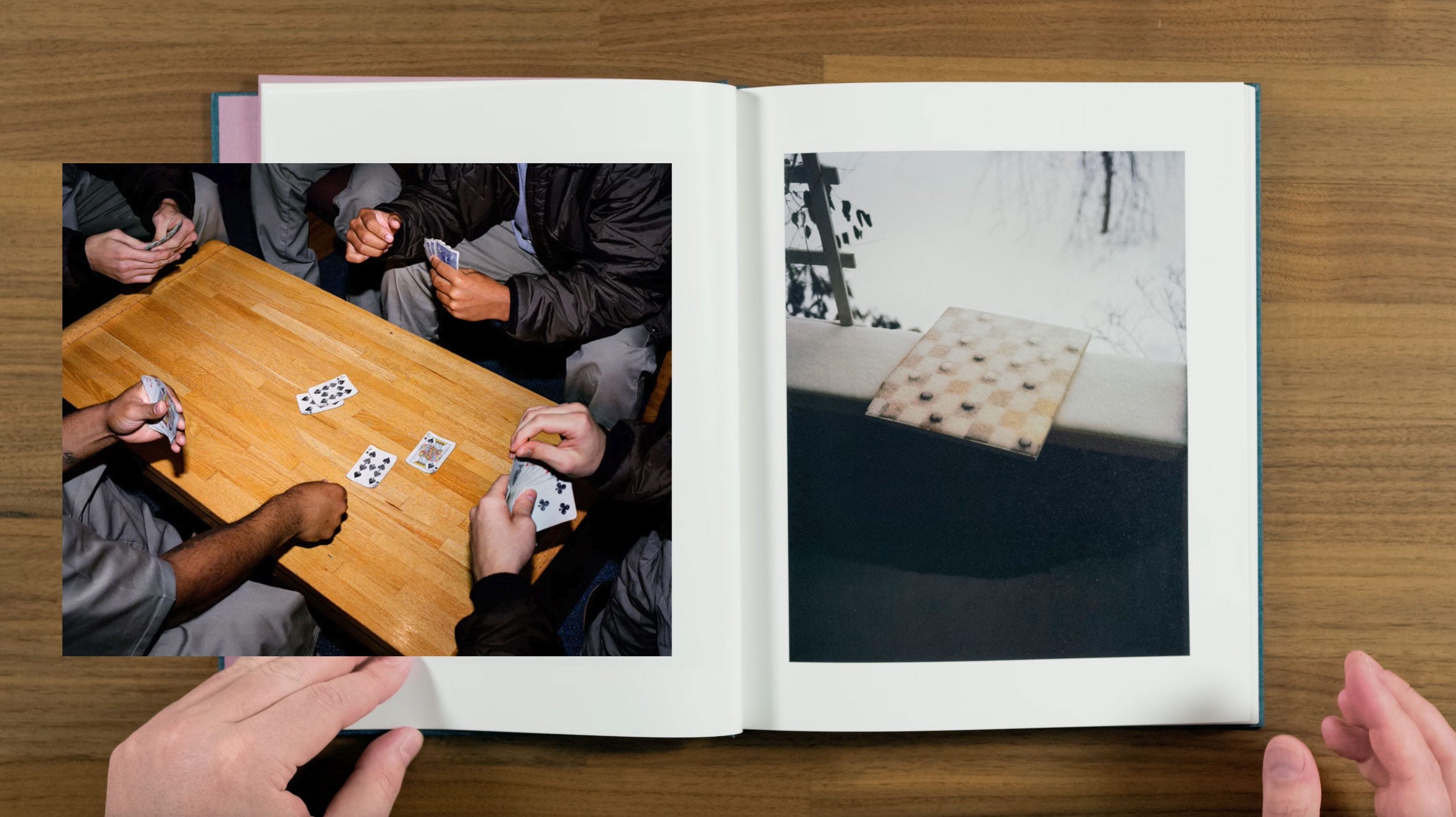
Games are another ongoing theme in Halpern’s work, including their reference in title of this book, which we’ll discuss a bit later.
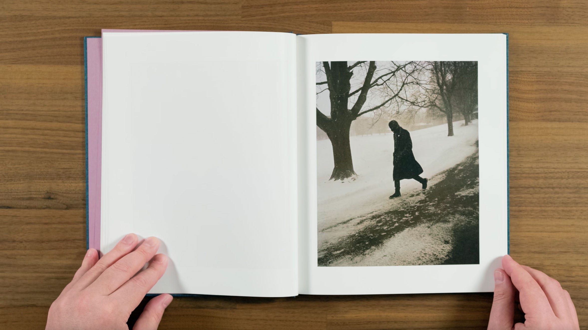
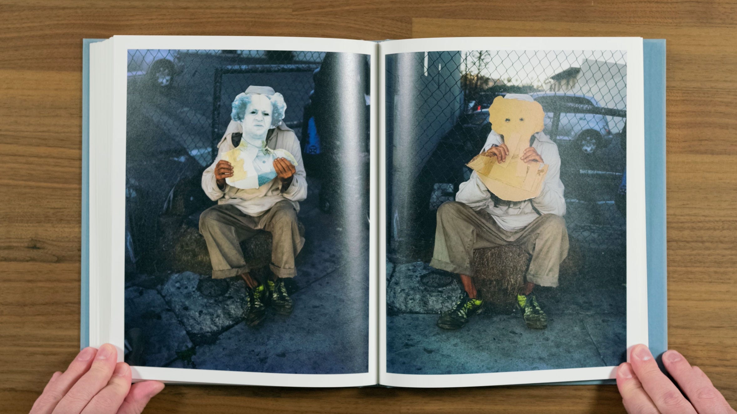
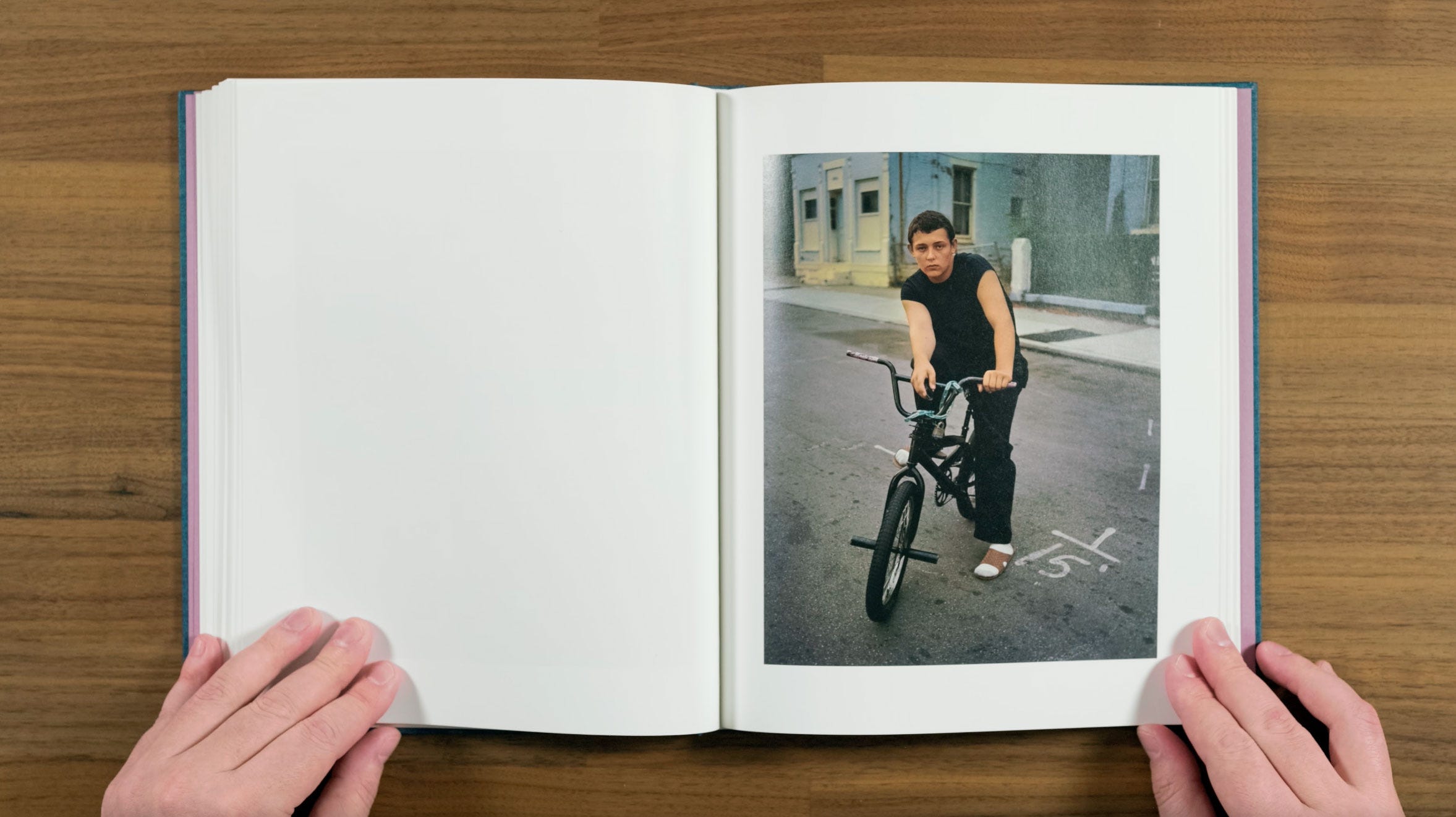
Here we get our first full image of a person, a mysterious figure in a ski mask, wearing head-to-toe black. This one makes me think of the word Knave in the books title. Knave is another term for the Jack in a deck of cards, but it’s also a term for a rogue, or an unscrupulous man. This character looks like he’s off to do something sinister. His outfit almost make him look like a medieval executioner.
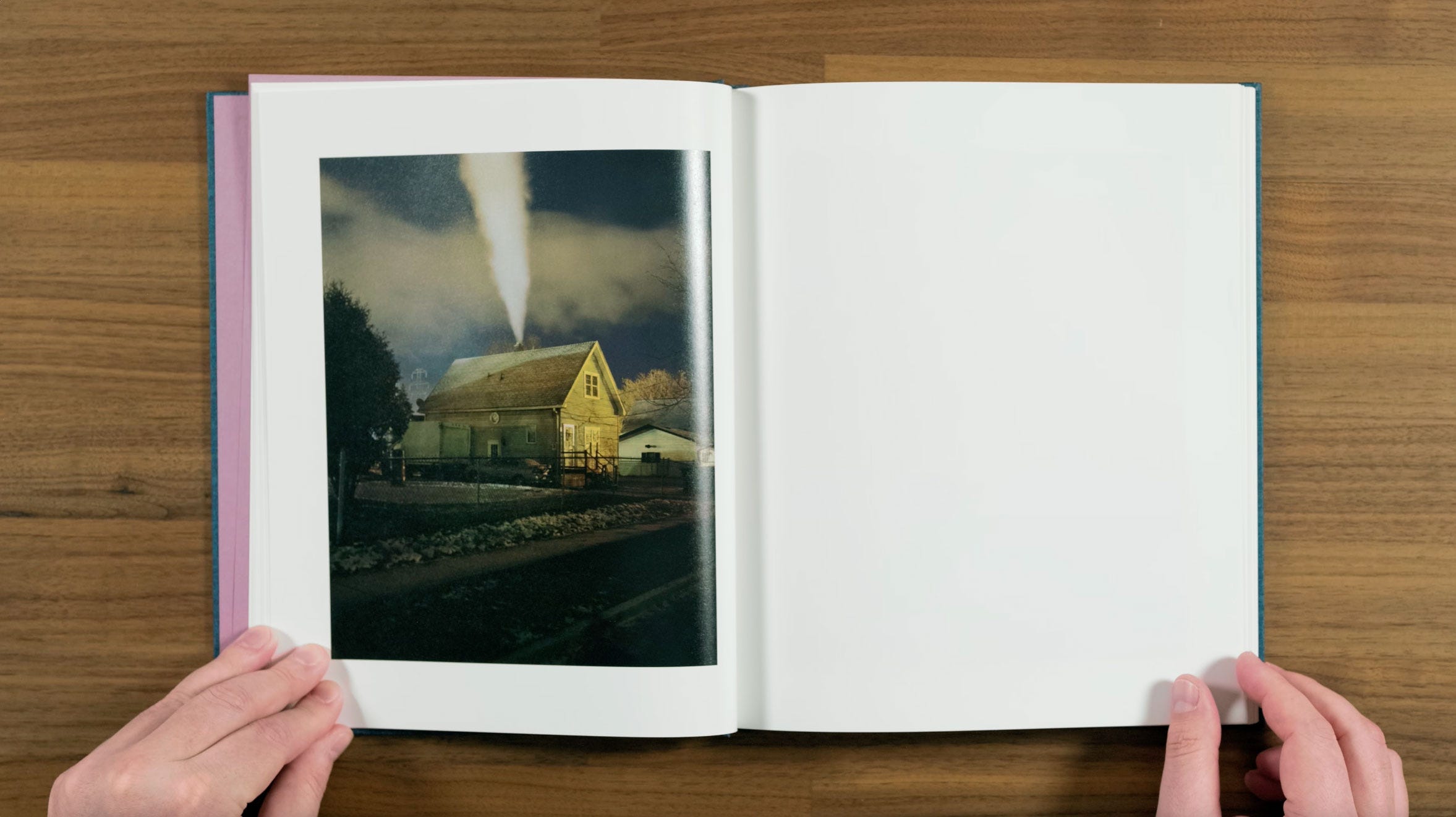
Here we switch to the other side of the spread again for little break in the rhythm. This house image has a bit of a Todd Hido House Hunting aesthetic, but with a decidedly cold feeling atmosphere. The long exposure on the plume of smoke from the chimney almost gives the feeling that time is standing still.
Buffalo is known as a place that has lost half its population since 1950. Halpern has said of his hometown that “certain people would say the city is dying, but it’s also continually being born.” And that “There’s an emptiness in the landscape that was compelling and intriguing.”
I particularly enjoy this image as a photographer myself. As much as I admire Halpern’s work, most of the time I couldn’t see myself creating photographs that look like his, even if I had the opportunity. Part of that may be the vertical frame that Halpern almost always uses (whereas I hardly ever shoot vertically oriented images), but this one also feels like a spot where our interests and aesthetics intersect. So it really strikes a chord with me personally.
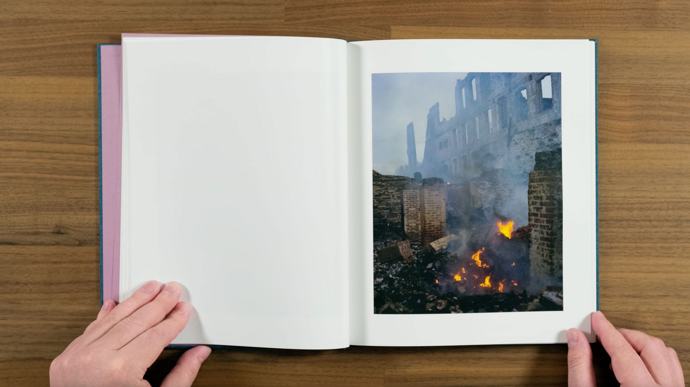
Here we have another one of our reoccurring fire motifs. Although the book’s sequence eventually starts to change gears in a bit, up to this point there’s been an almost apocalyptic undertone to the images that’s reinforced by this smoldering building fire. Even in ruins, it embodies the type of building that Halpern explored as child, where a “realism” and “surrealism” came together.”
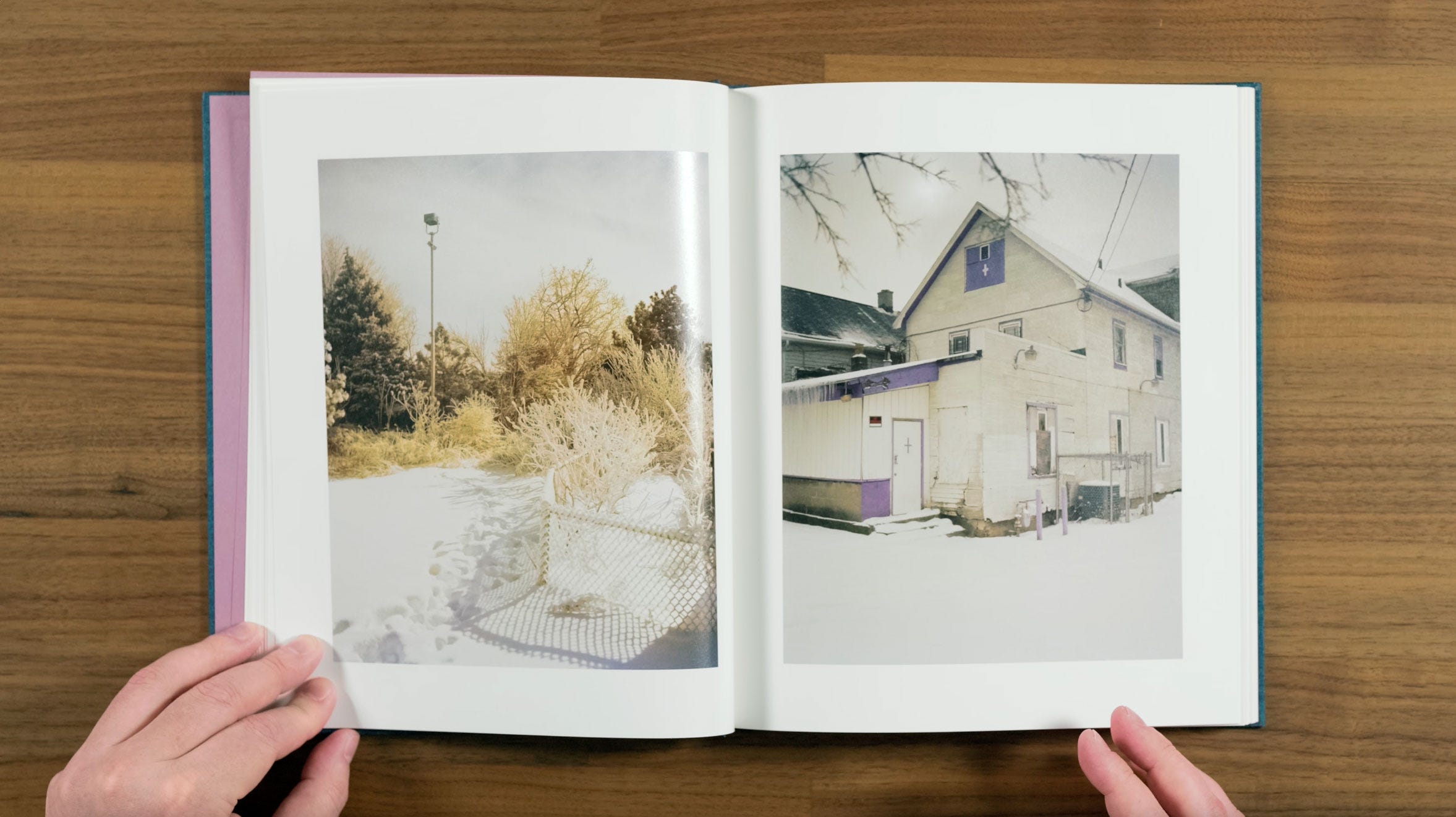
Here we have another nice wintery pair. They’re both snowy, but there’s a good amount of contrast between them, which allows them to have something to say to each other. It’s worth noting from a sequencing perspective, that this first quarter of the book has been much heavier on landscapes than the book as a whole will be.
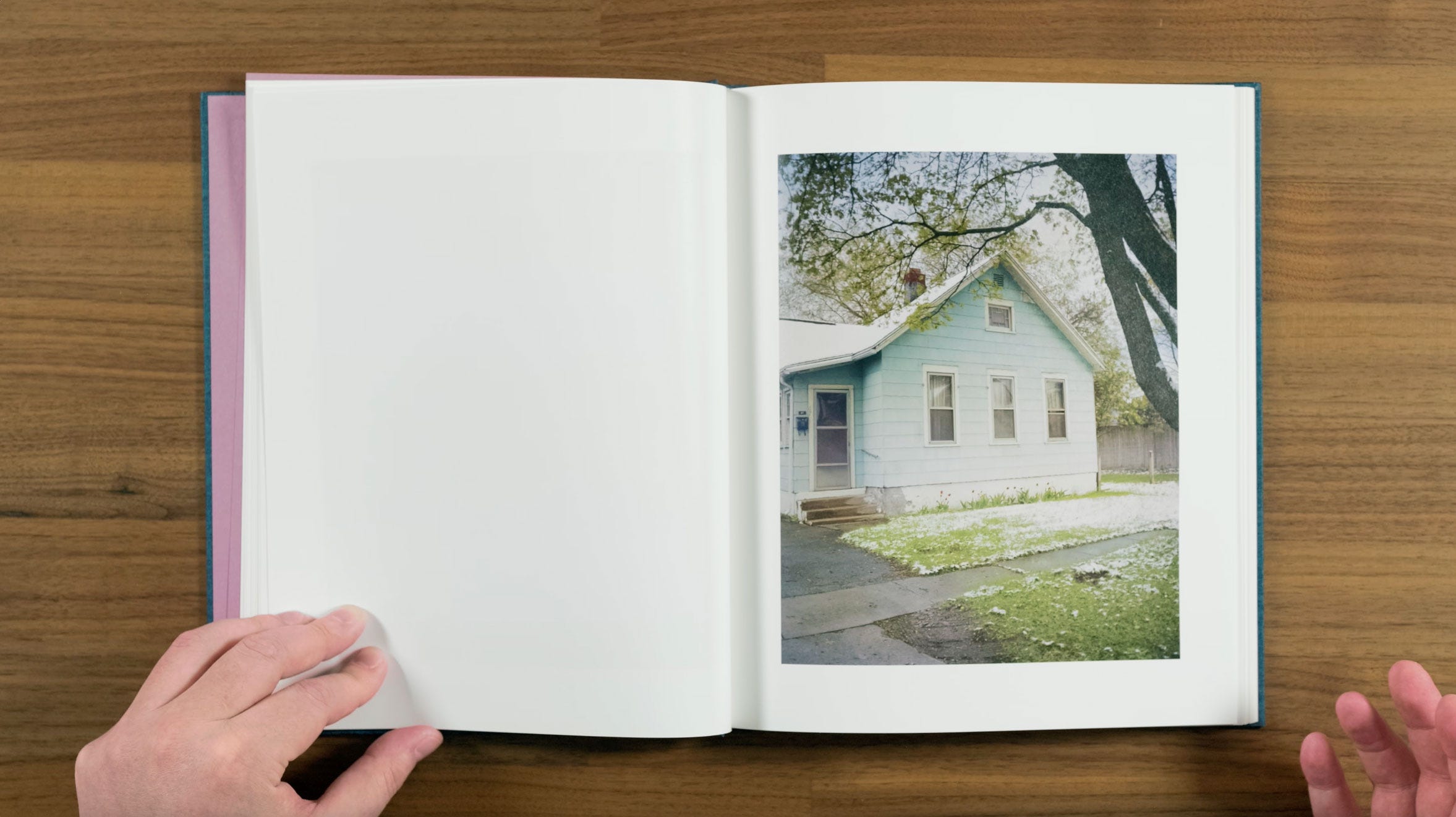
This is pretty subtle image, with the nice little detail of the tulips in front of the house, even though there’s snow on the ground. An an interview, Halpern talked about:
“What’s interesting to me about the world is its chaos and contradictions, the way opposites can be so beautiful in relation to each other. I like how you can be attracted and repelled by something at the same moment. I want my images to create cognitive dissonance. If I feel that a sensation caused by an image is singular in nature—awe, beauty, dread, for example—I wind up finding the image to be manipulative, and unfaithful to the contradictory natures of reality. I think we underestimate our viewers’ and ability to read the work.”
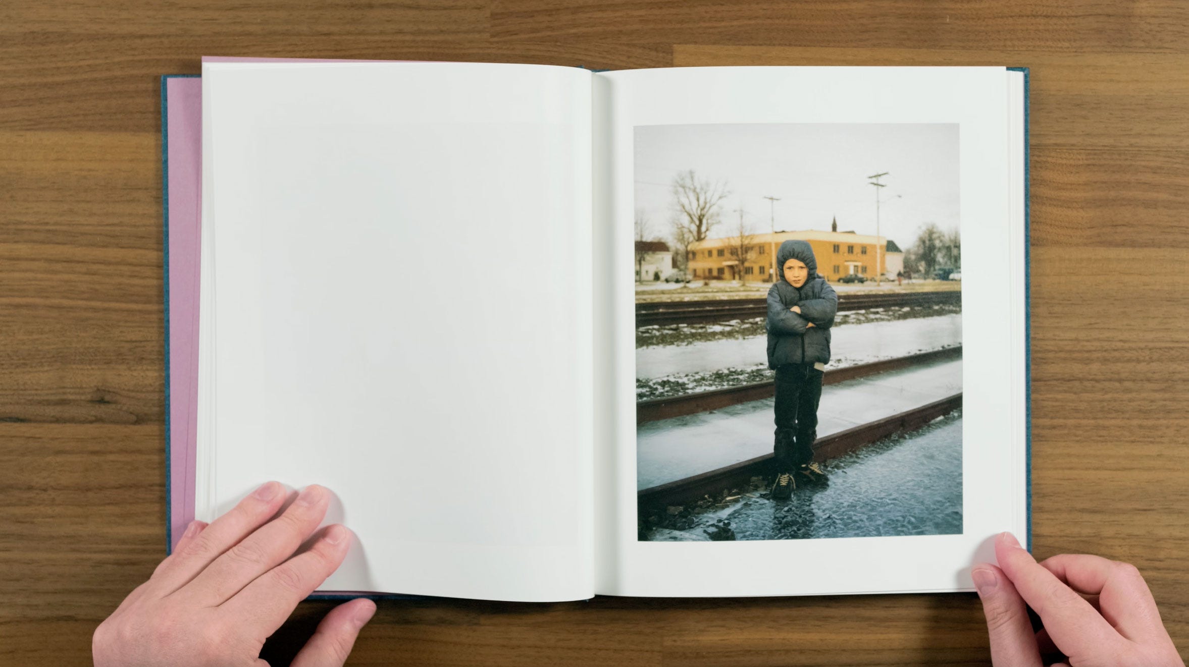
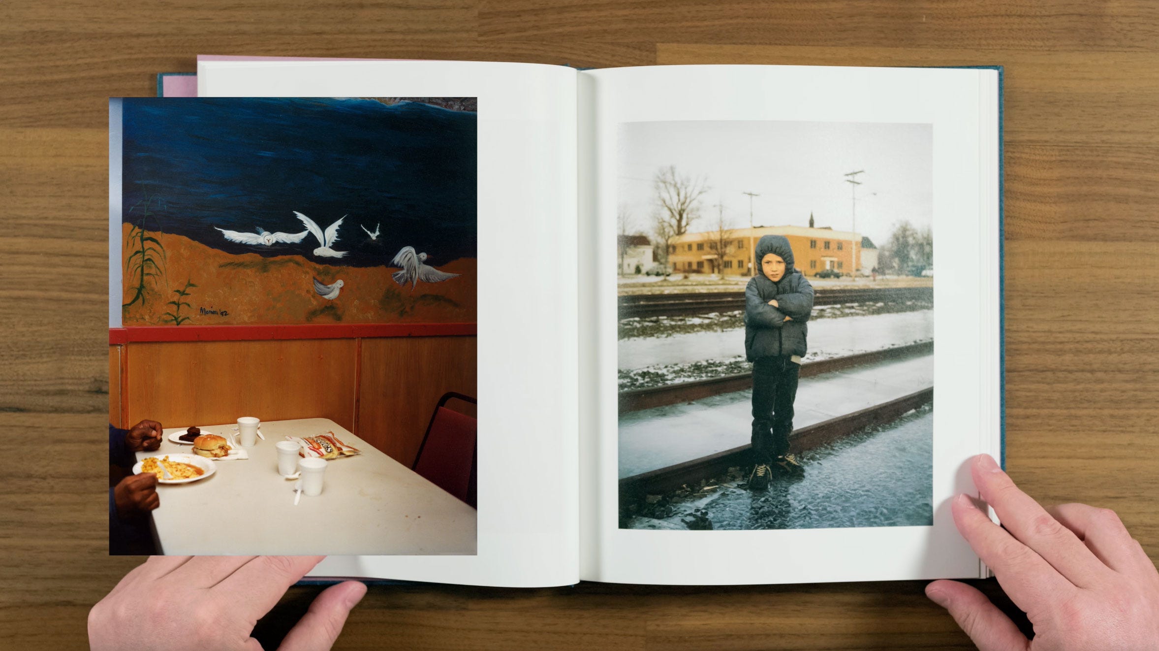
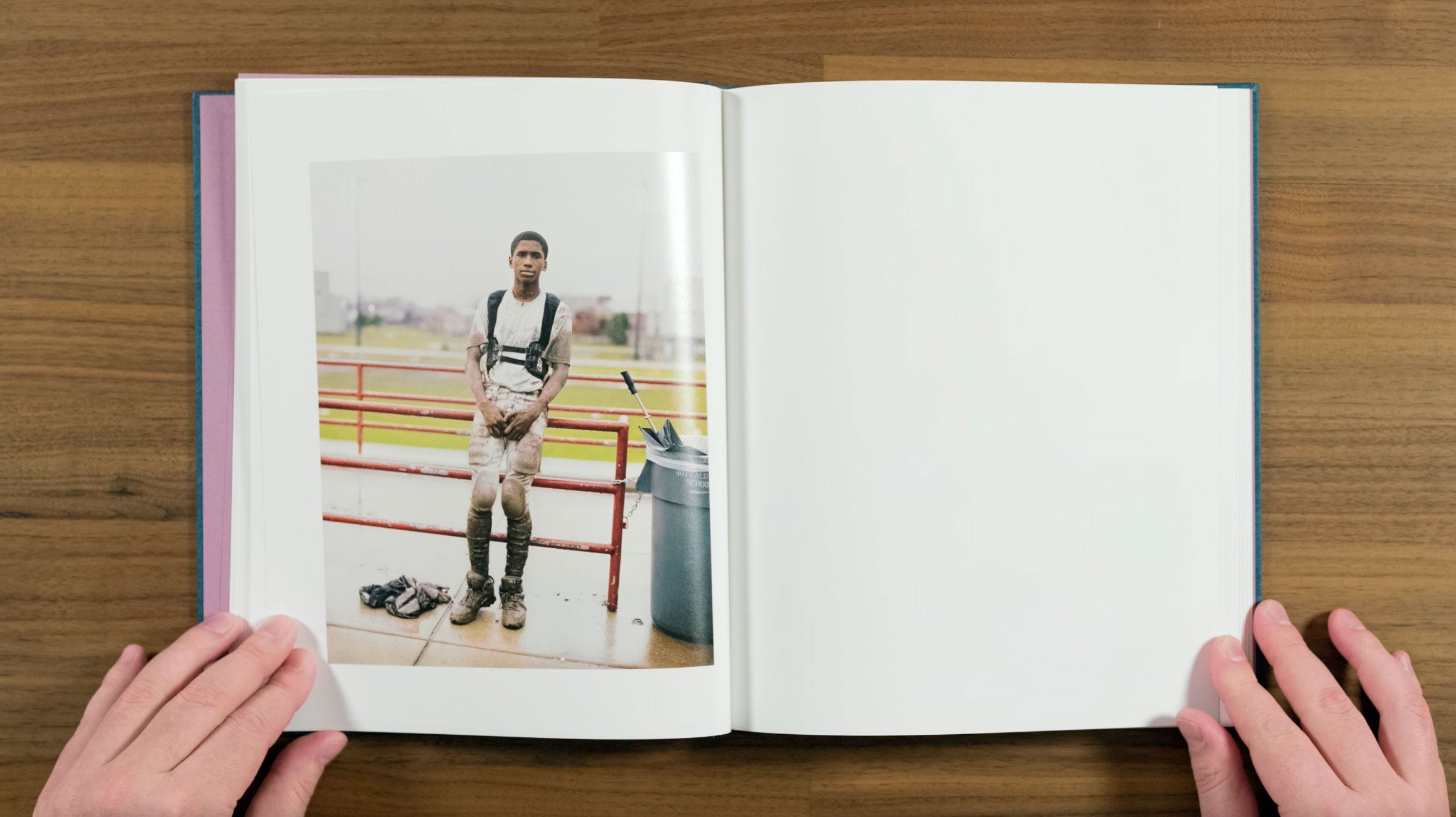
This striking portrait of a cold looking kid continues the winter in Buffalo theme, but palette of the last few images have been brightening up compared to the beginning of the book.
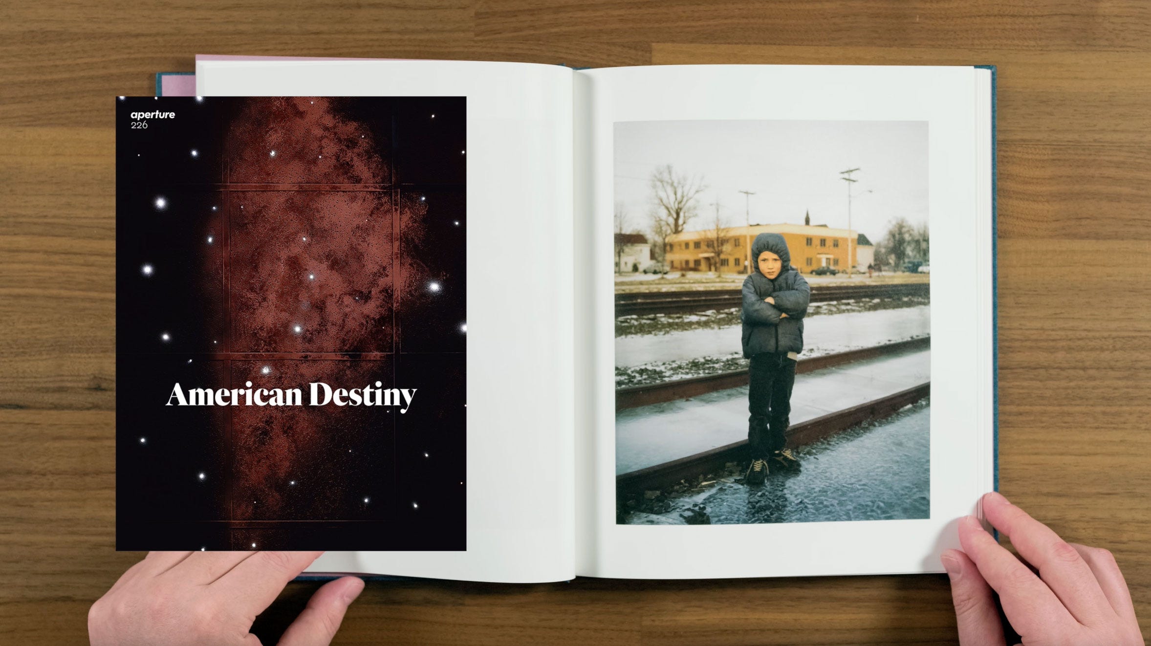
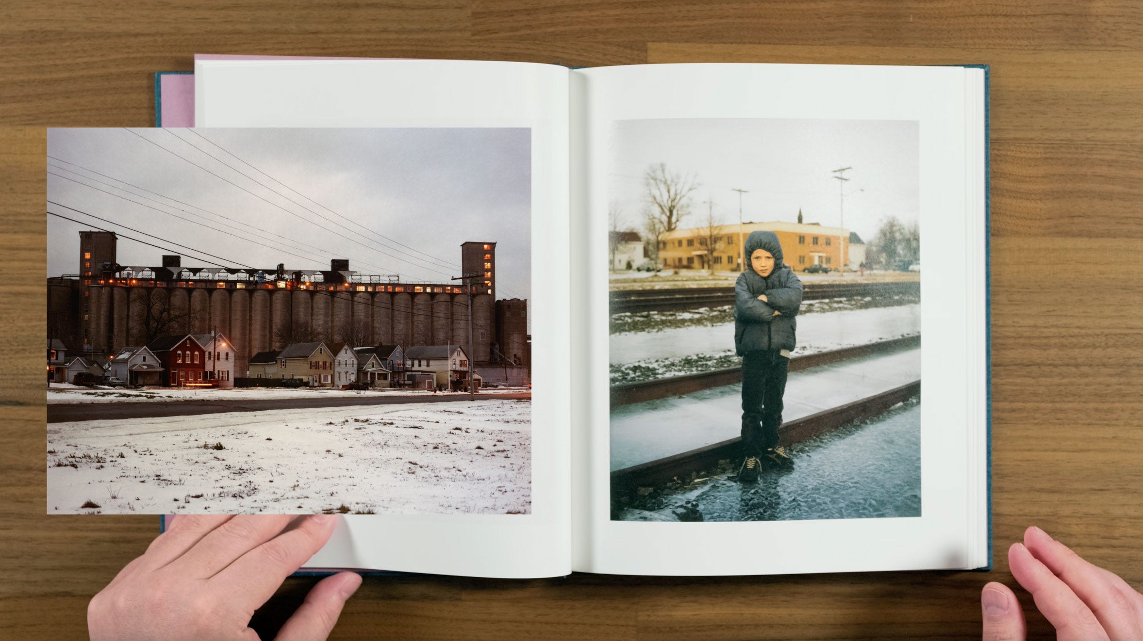
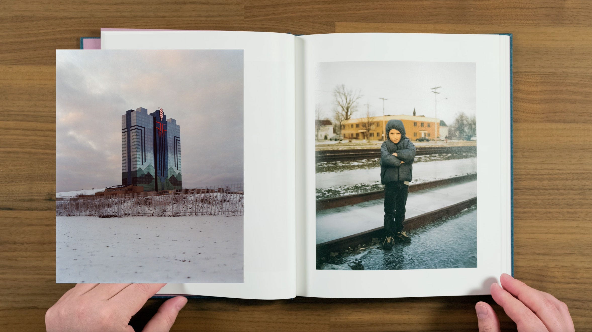
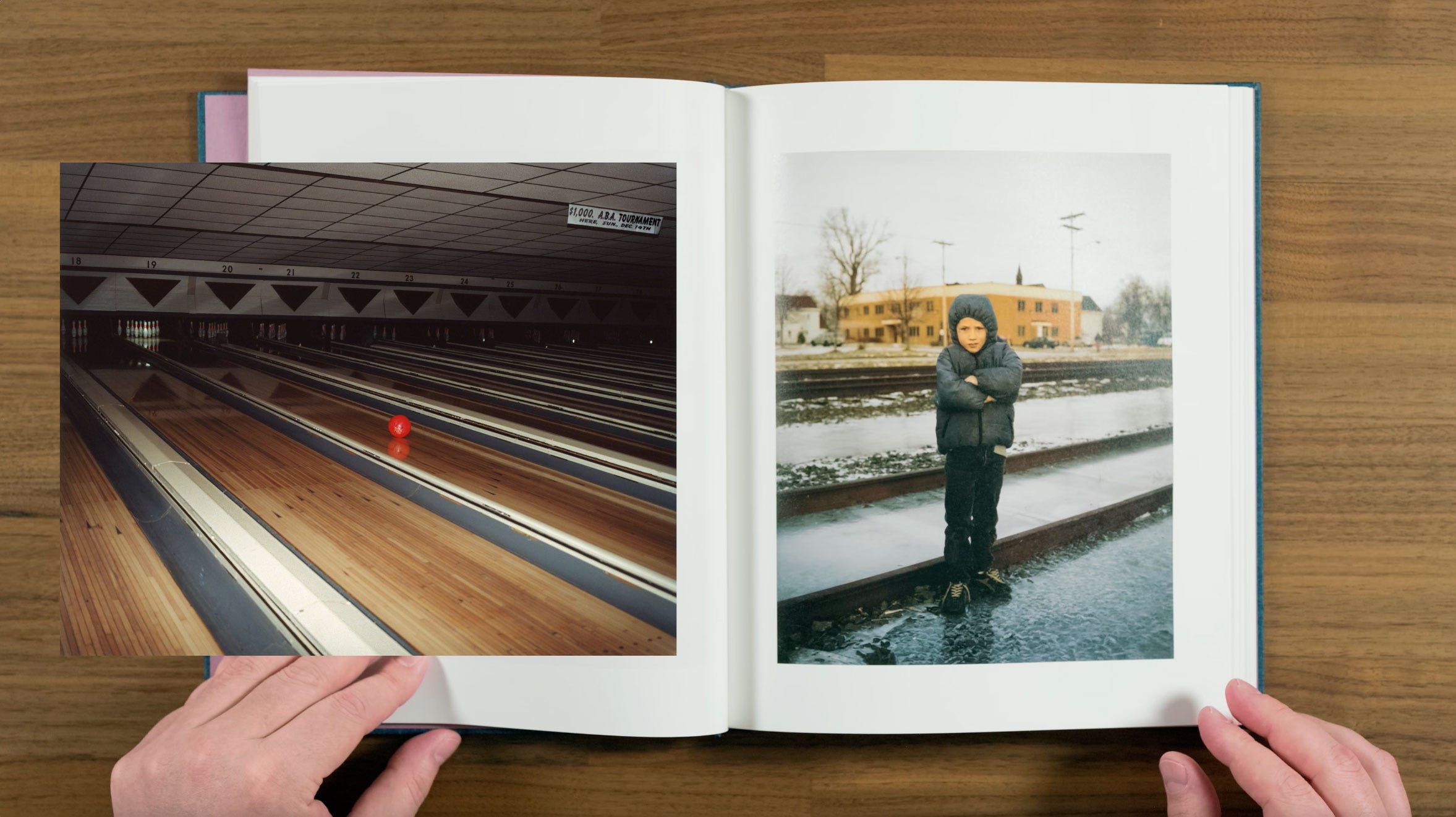
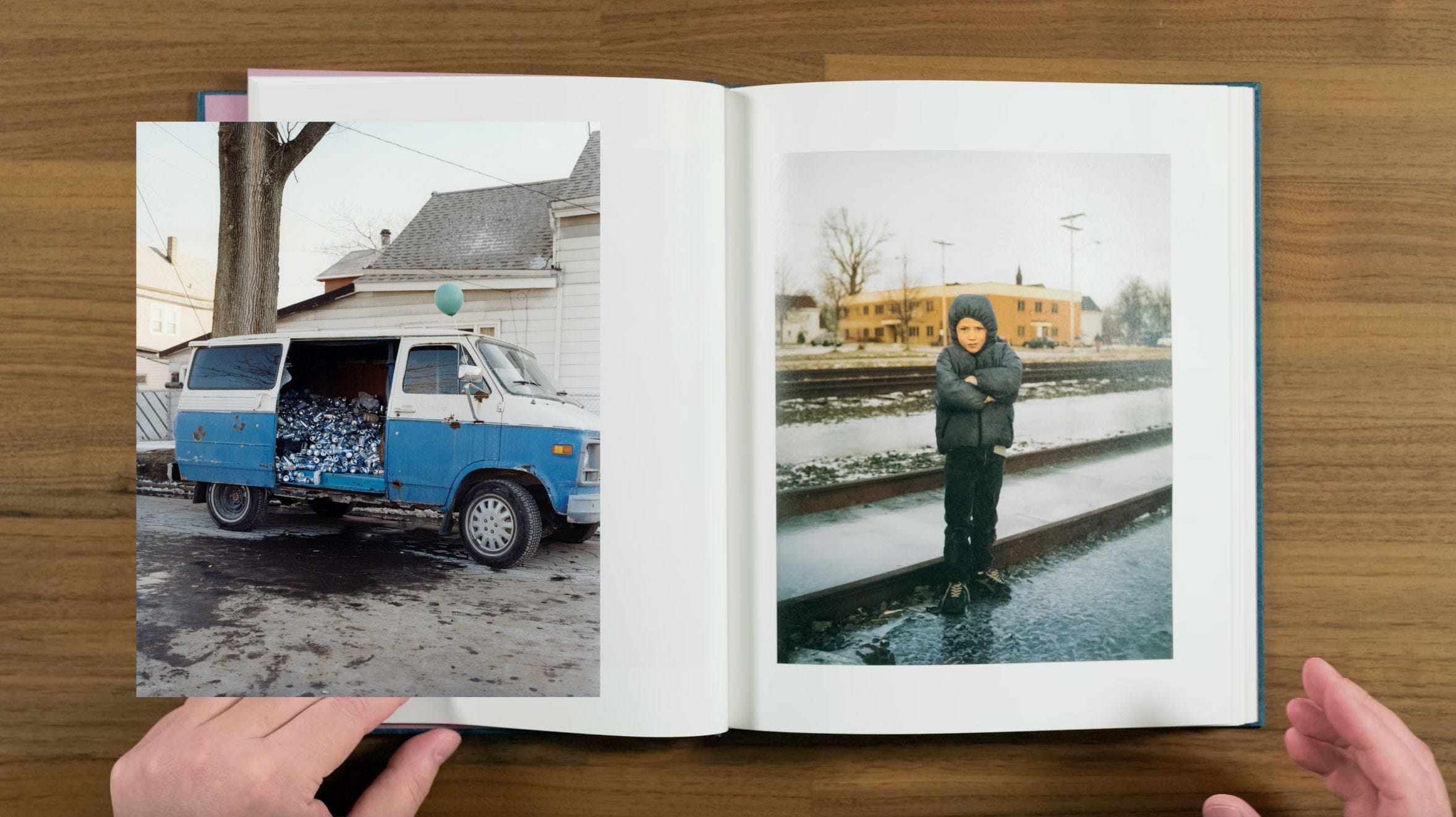
This image was included in an early version of the project featured in a 2017 issue of Aperture magazine. It’s quite interesting to see how much the project has changed since then, when there were originally a lot of more straightforward documentary style images.
Halpern says that “Over the years I’ve become less interested in documentary and more interested in the space between fiction and non-fiction, which sometimes feels like Surrealism to me. It became most obvious when I was working on ZZYZX, which starts with contemporary Los Angeles but sort of builds a semi-fictional world out of the city.”
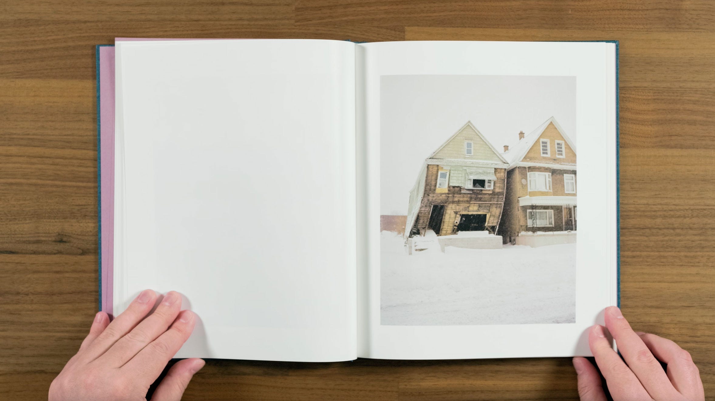
He’s obviously looking to do something similar with his depiction of Buffalo in this book, where images like this shifted house on the verge of collapse, become part of his Surrealist vision of the city.
Now we begin moving out of winter, and into a much more portrait heavy section of the book, with this nice portrait of a painter. We already talked about how Halpern originally thought that the project would be about Buffalo in the winter. But he went on to say: “I realized that it was more interesting to mix the other seasons, to create more dynamism in the work.”
He we return to the reoccurring motif of the the white deer from the first page. Fun little fact, the deer is named April, and it’s sort of a local celebrity in Buffalo’s Old First Ward neighborhood.
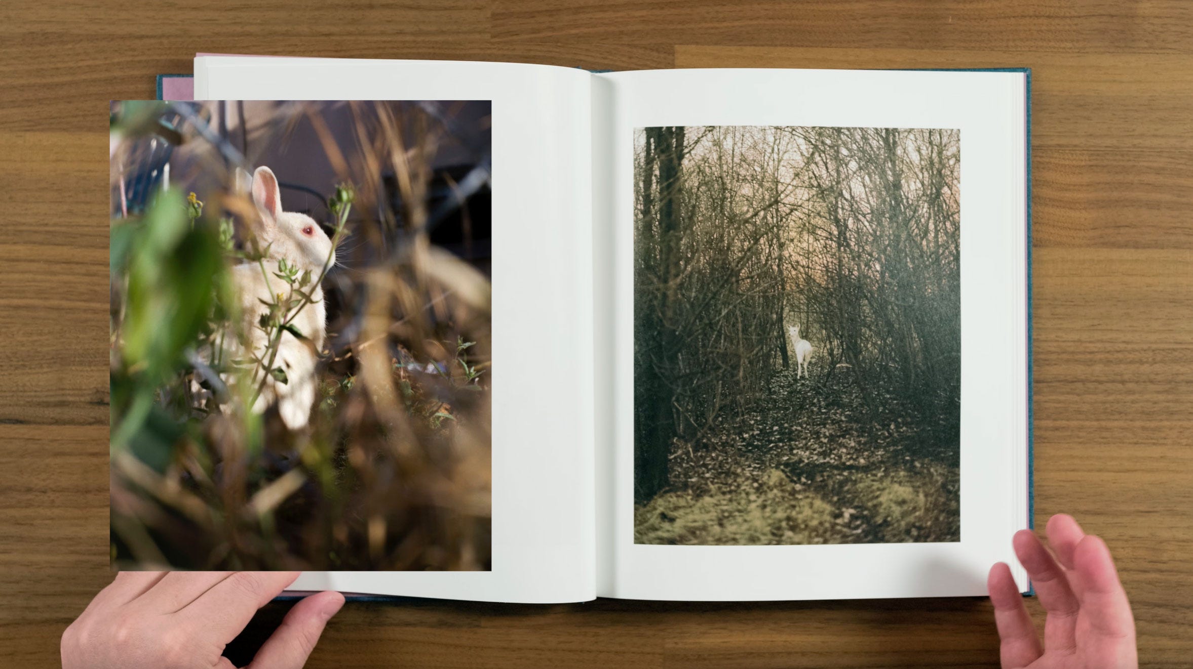
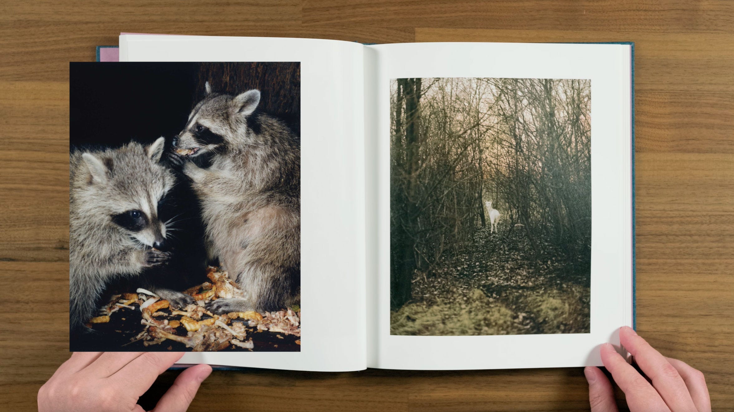
Photographs of animals are a regular theme in Halpern’s work. This version of the April seems particularly aware of the viewers presence, like she’s beckoning us to follow her down the path through the thicket.
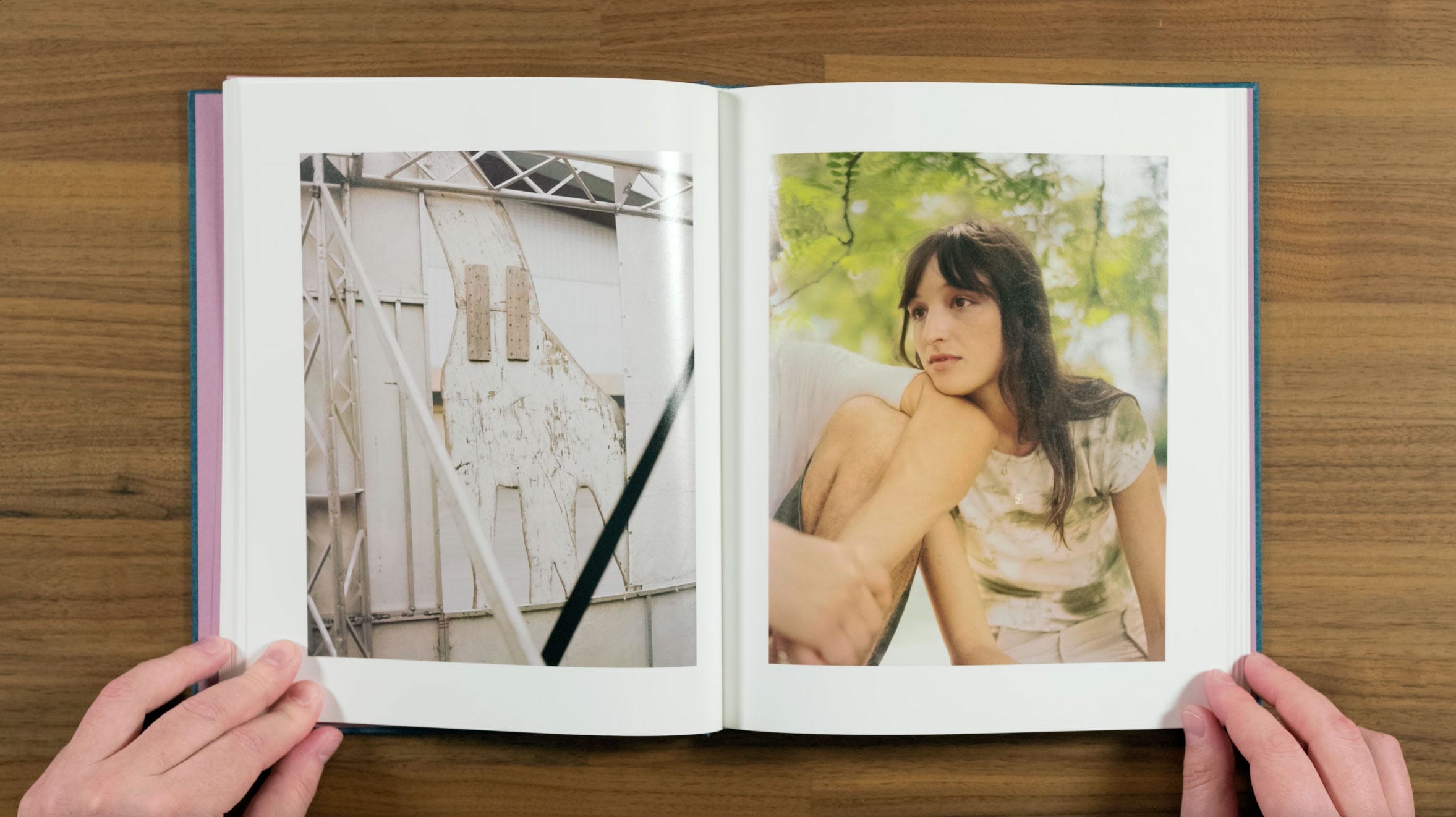
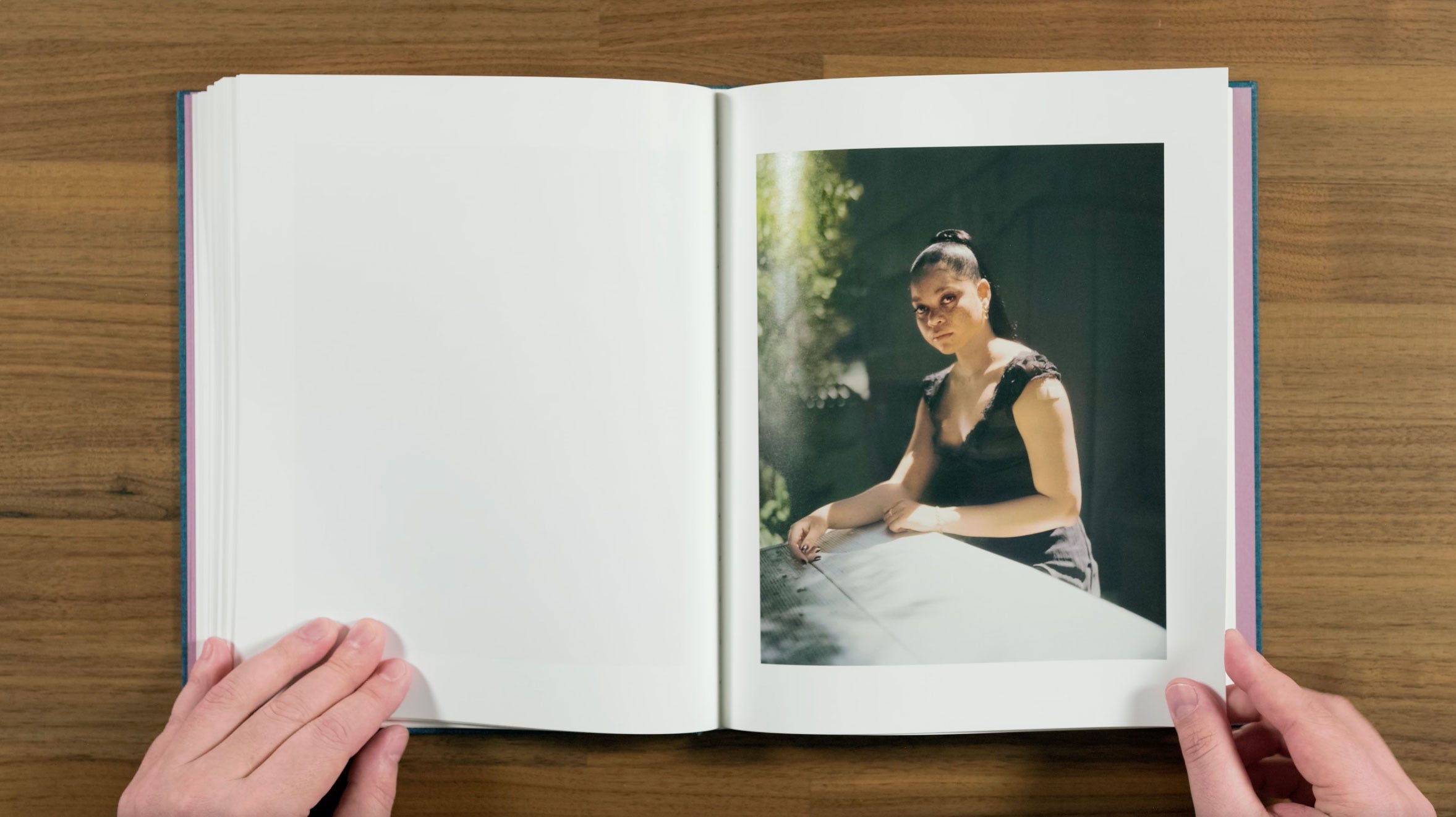
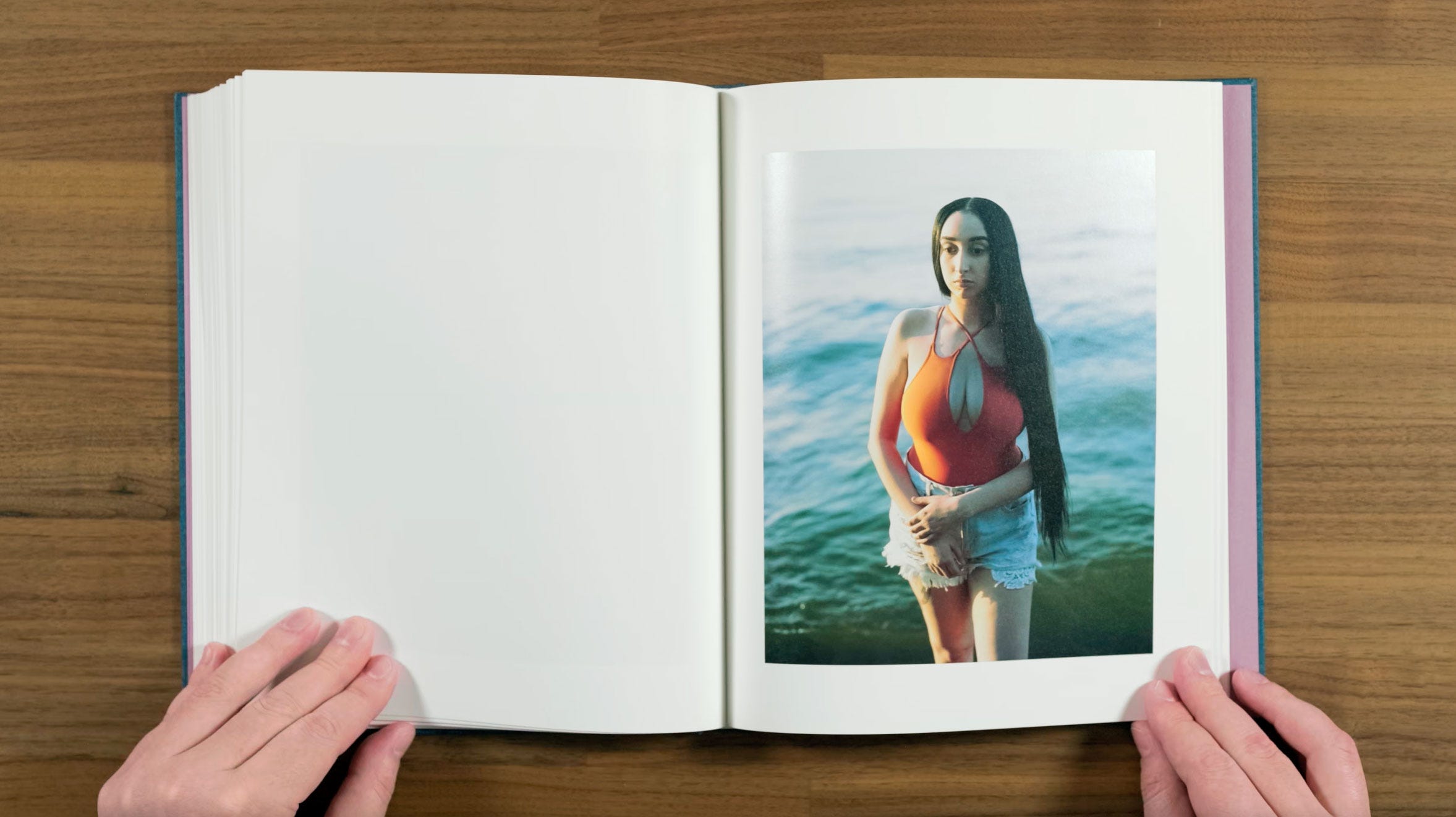
When two images are paired together in this book, they always seem to have fairly similar color palettes to one another. It works though, because one, they’re consistently used that way, and two, because the subjects are always different enough that they’re never repeating each other. I like the way the girl in this image appears to have a slightly amused recognition of plywood cutout of a giraffe that we’re seeing from behind.
Speaking about making portraits Halpern says: “There is something mysterious and hopeful when one stranger looks into the face of another stranger (via portraiture) and feels something.”
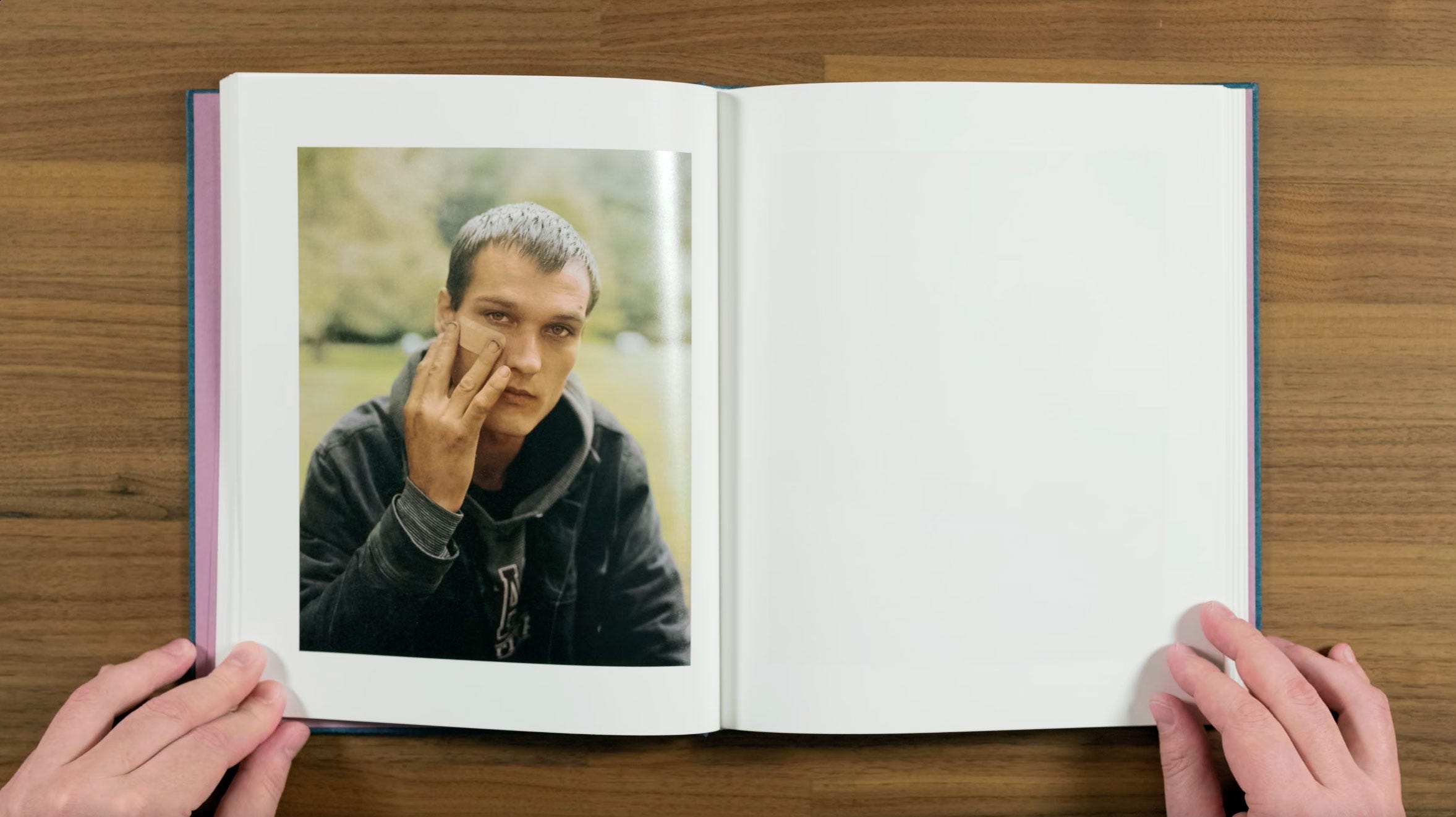
I think that’s a good self-assessment of the way Halpern’s portraits function in general, and particularly with an image like this. The way he’s touching the band-aid on his cheek almost makes you want to reach for your own face, as if you could feel the sting of the wound like he is.
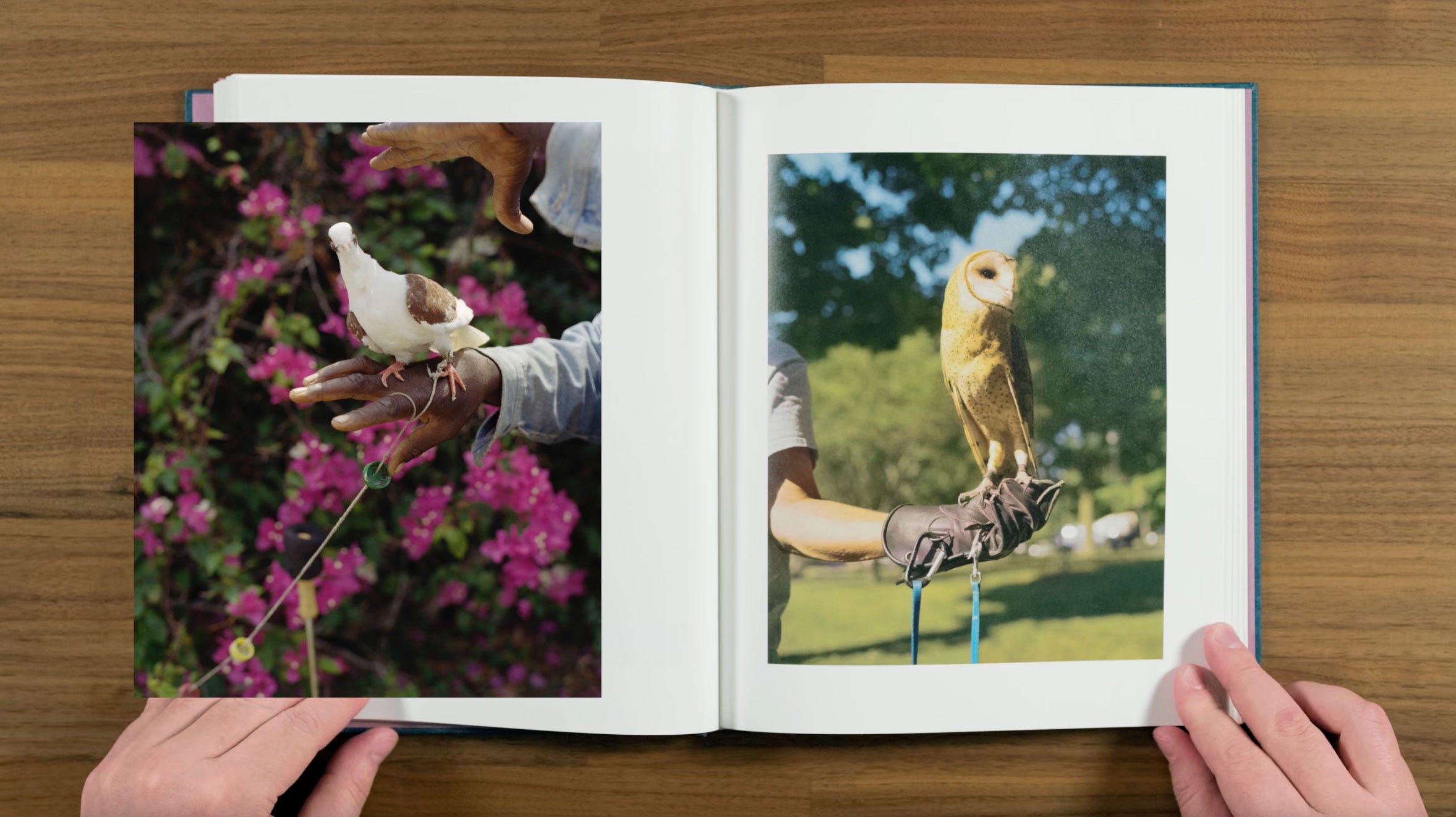
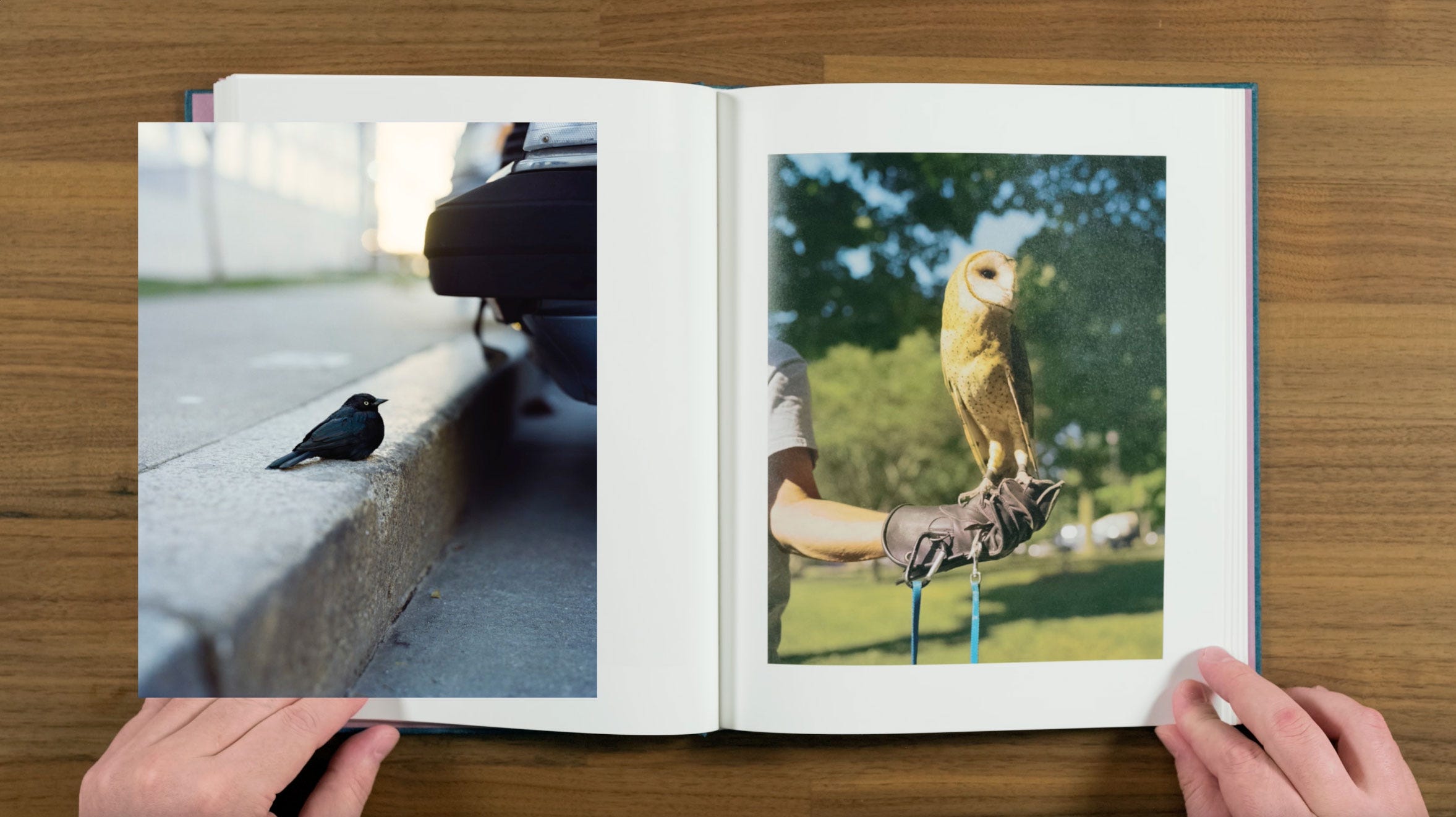
Photographs of birds are another reoccurring theme in Halpern’s work.
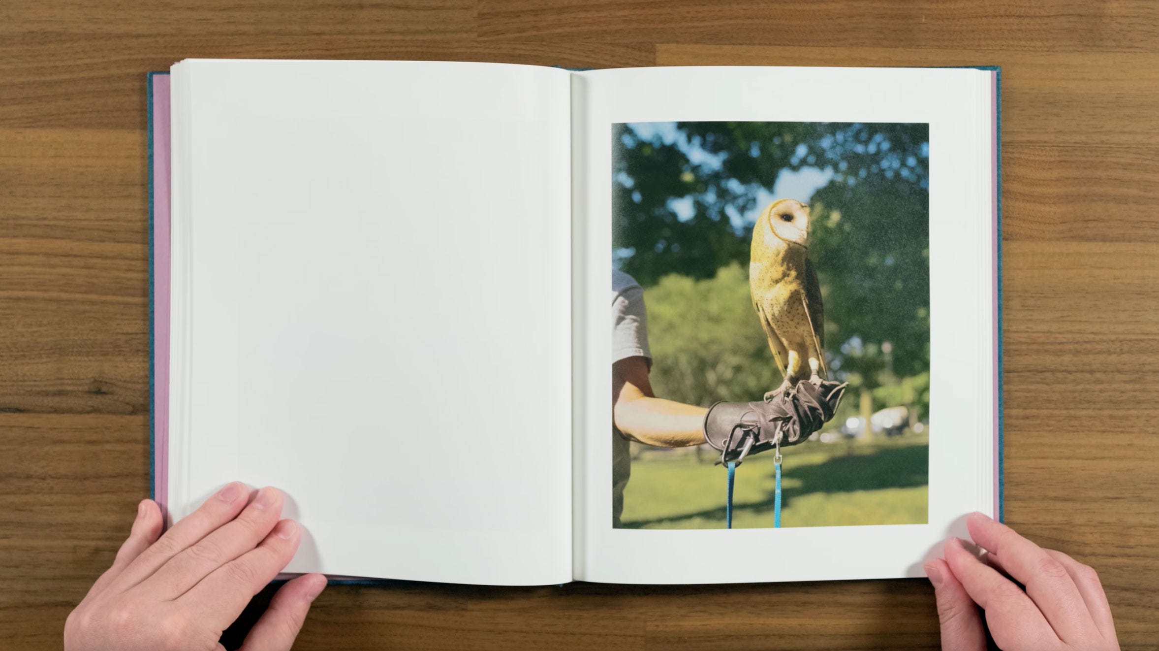
The depth of field he’s getting with his medium format Pentax 67 really helps elevate this image. It makes it feel like the owl is an another character in the story.
Now we’re getting into a warm sunny mood in the sequence. Thinking back, it’s almost hard to imagine the cold wintery place the book started at. You can feel the warmth of the sun on the girls face, almost as if you were the one sitting there with your eyes closed.
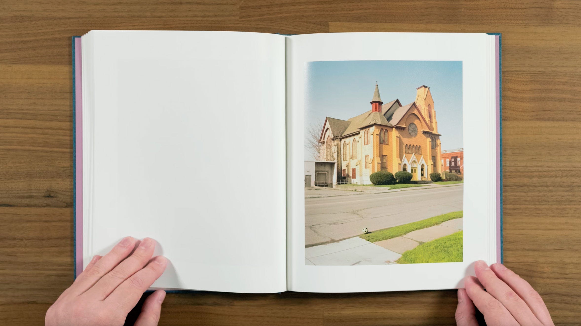
Now we’re back to a landscape in a very portrait heavy part of the sequence. This one is very graphic with two-tone church and striped soccer ball. In the context of the book, it almost reads like an imaginary place.
Here’s another really beautiful portrait. Speaking about his process Halpern says:
“Photographing people is almost always strange and awkward, but also wonderful and unpredictable. I get nervous because I’m actually quite introverted, I have to work up the guts. When I’m rejected, it’s devastating — but when it goes well, and when there is an unexpected connection, there is the rush of a sense of something beautiful and hopeful.”
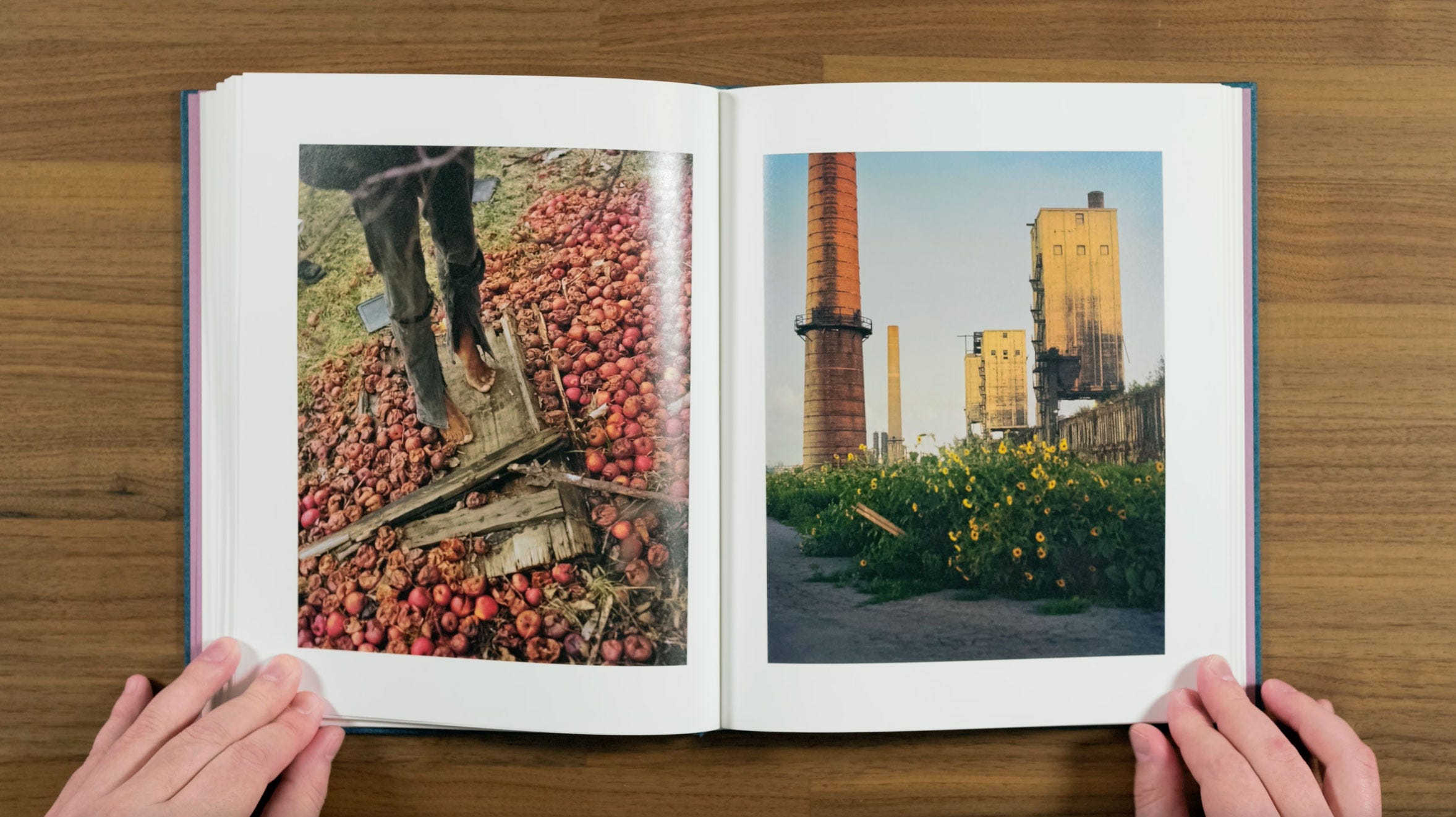
This is really striking pair. There are some palette similarities with the warm red and brown tones, but there also some really pleasing complimentary color contrast. I like how the apples and sunflowers sort of mirror each other, but there’s also this connection between the rotting apples and the decaying industrial structures.
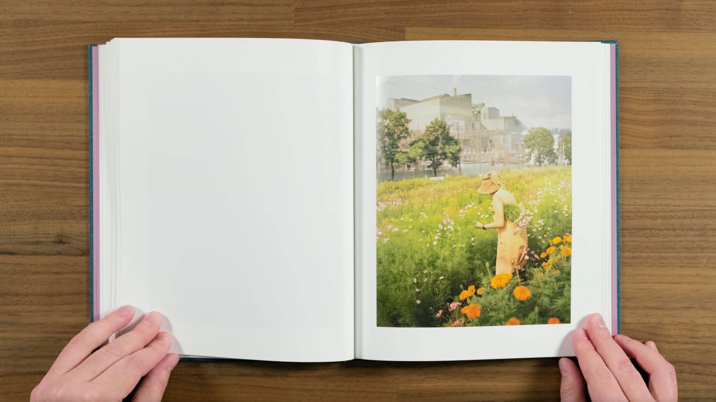
This image is another one of those two versions of the same thing that Halpern likes to do. On the previous page we have an old industrial site, which doesn’t appear to be used anymore, with flowers in front of it. On this page, we have a working industrial site surrounded by flowers with someone picking them. The addition of the figure, and the fact that’s a working mill, makes it different enough that they have a completely unique tone or mood.
Again, I usually feel that two versions of the same thing is hard to pull off, and would general prefer to separate images with similar subjects in order to make them into a reoccurring motif. But this book is in no way short on reoccurring motifs, so I think that really helps Halpern pull it off here.
Another of the many excellent portraits in the book. I like how the bike tire and lines on the pavement suggest a sort of circle motion around the frame returning you to where you started.
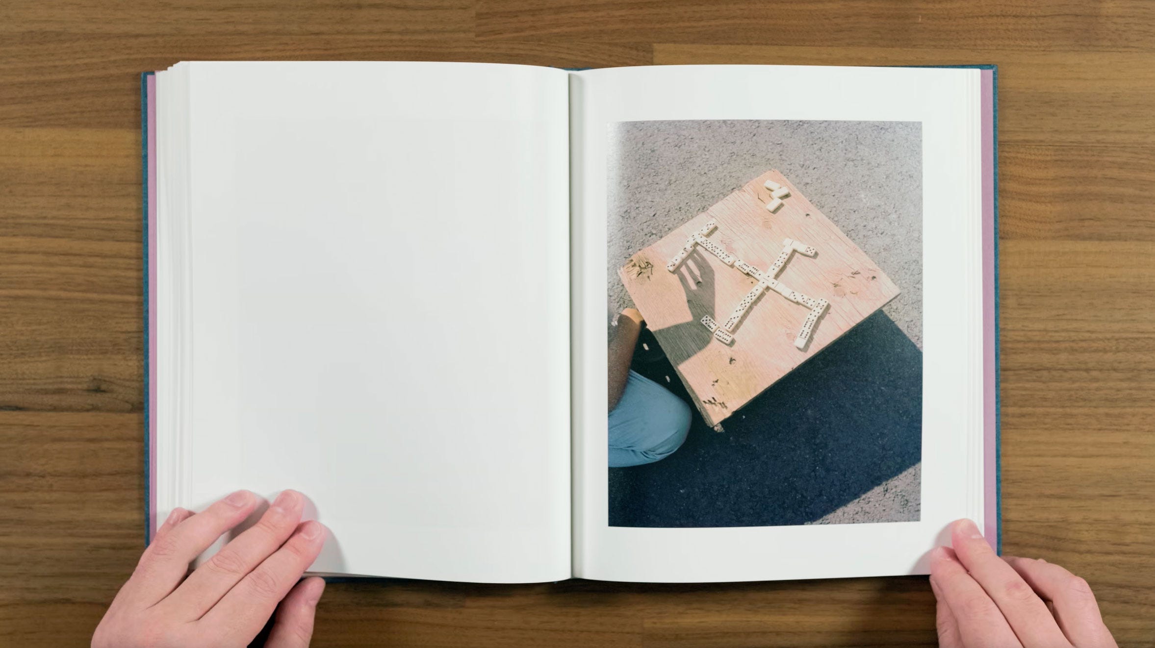
Back to the ongoing game theme in Halpern’s work.
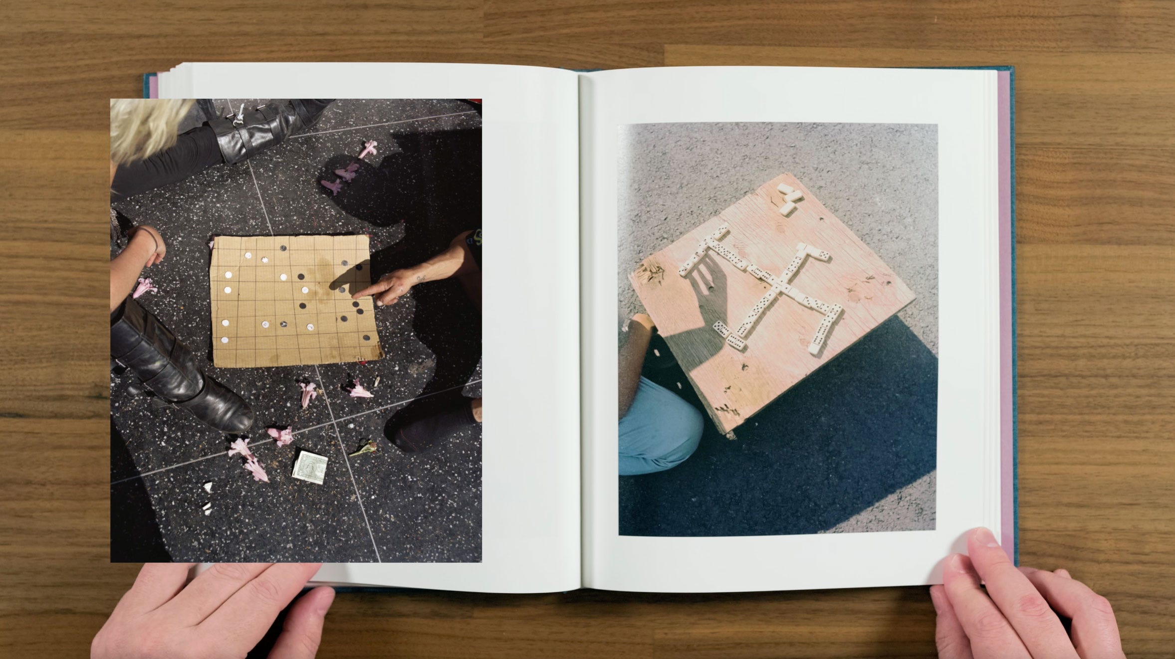
This image is reminiscent of the Go board in ZZYZX. Although with a considerably darker suggested symbolism. The way the shadow of the hand appears to grab the dominos on the left reminds me of the early image of the hand touching the angel drawing.
Another really striking portrait with a very soft, shallow depth of field. We’re getting a little bit a reoccurring band-aid motif from earlier portrait as well.
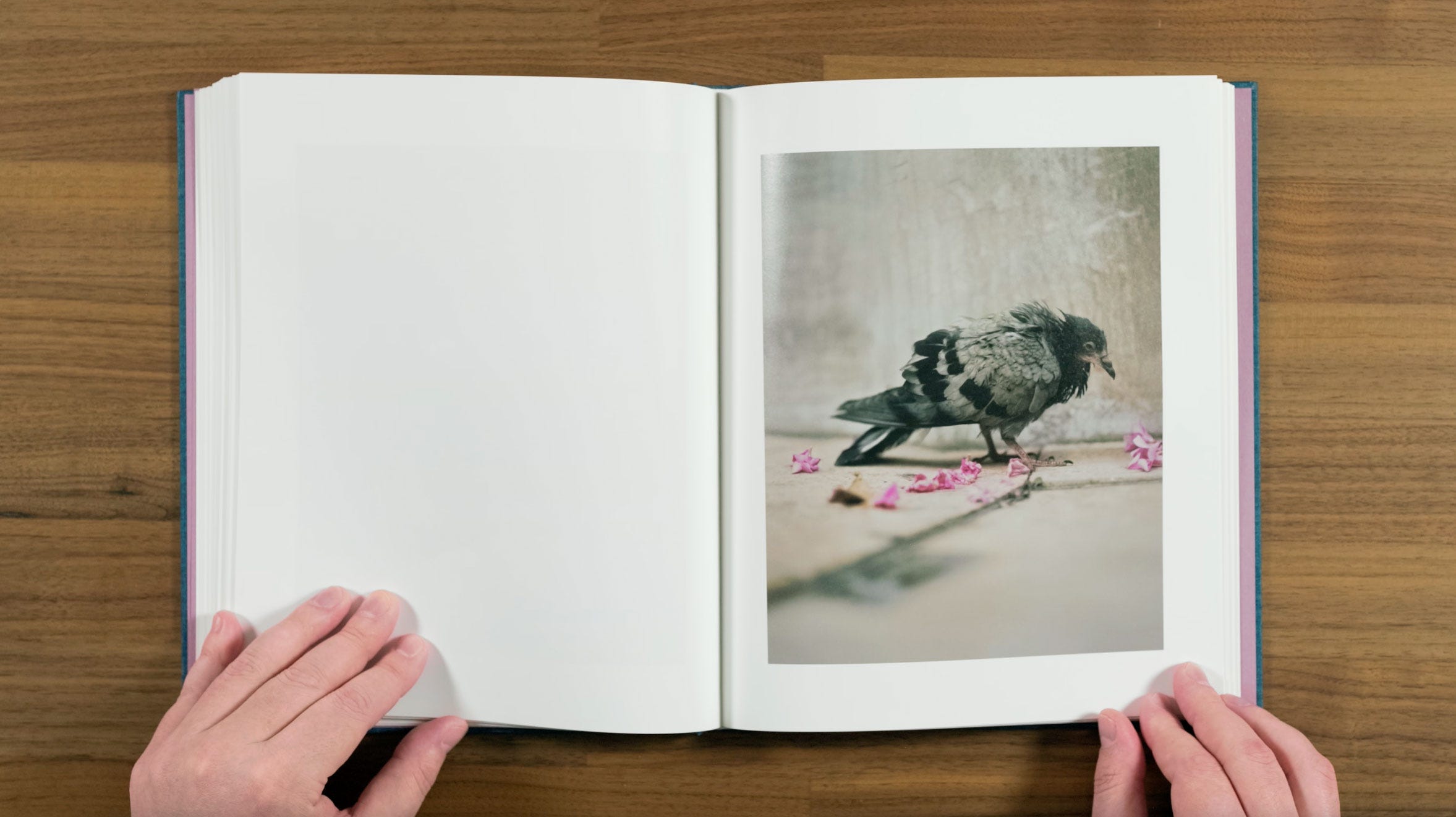
Here is another appearance of a bird photograph. I think this is probably the weakest image in the book on it’s own, although it’s still a very nice photograph of a pigeon. The depth of field and flowers are what’s making it, as well as tying it into the rest of the book.
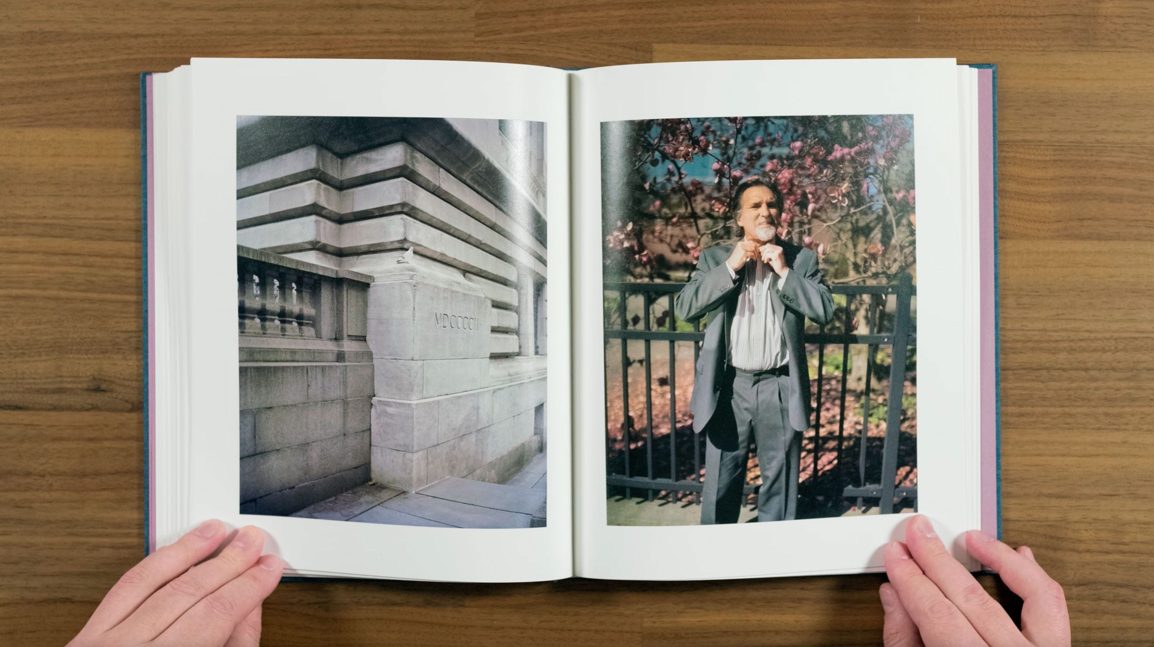
At first, I thought I could have done without the back to back pigeons. But then I realized that the pigeon on the last page had pink flowers with it, and now it’s the man who has pink flowers behind him. So I do think that it’s a cleaver little twist on the last two times we did back to back images of the same subject.
I really like these images as a pair too. This guy looks like he feels as if the pigeon is mocking him from it’s iconic, roman numeral engraved perch, while he struggles with the top button of his shirt.
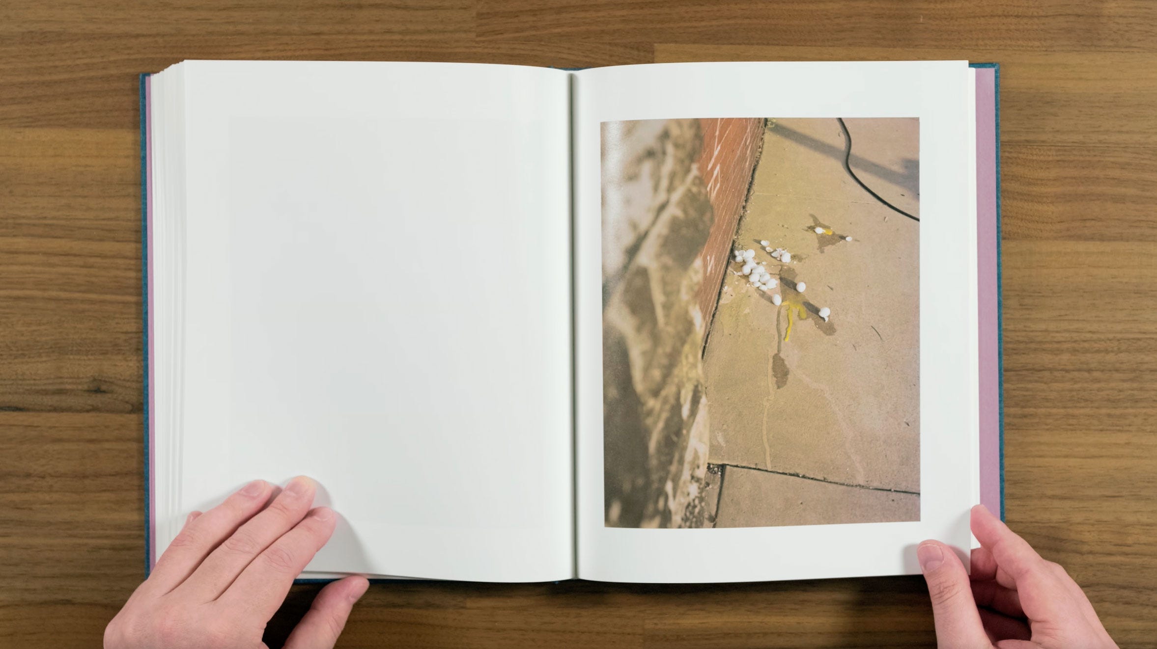
This one of the cracked eggs feels a little darkly ironic coming from the previous two bird images. It also continues the damaged, circular shaped foods on the ground motif, started earlier by the rotten apples.
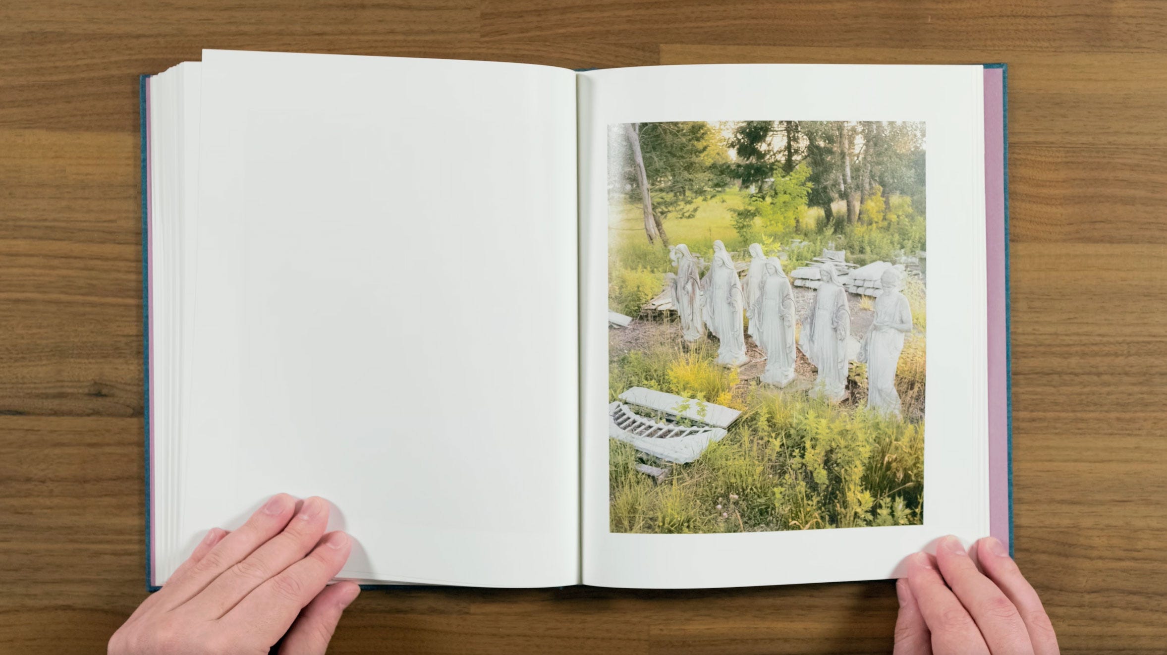
Seeing all the Marys lined up next to each other is quite surreal feeling. Although there’s a little odd man out thing going on with the Grecian figure on the far right. They almost feel like they’re looking back sadly at the cracked eggs from the last page.
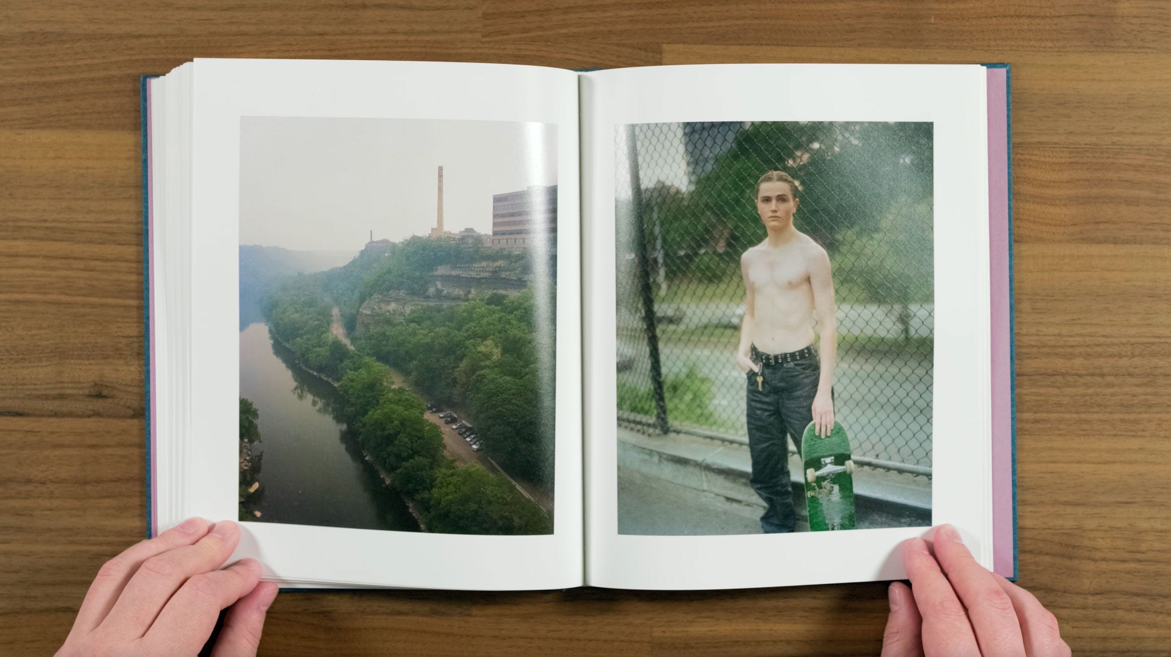
I really like this pairing of the portrait of the skater with an industrialized river valley. There’s a very nice contrast between subject matter. This is one a few portraits in the books that have a slightly odd look to them due to an issue with one of Halpern’s old lenses. I don’t think that it ruins the image, but I do kind of wish they were more consistent with the aesthetic in the rest of the book.
Going forward, we have several back to back portraits with nothing in-between to break them up. I’m not sure that I would have done this myself. For some reason, these back-to-back portraits feel more similar than the run several landscapes in a row we saw early in the book.
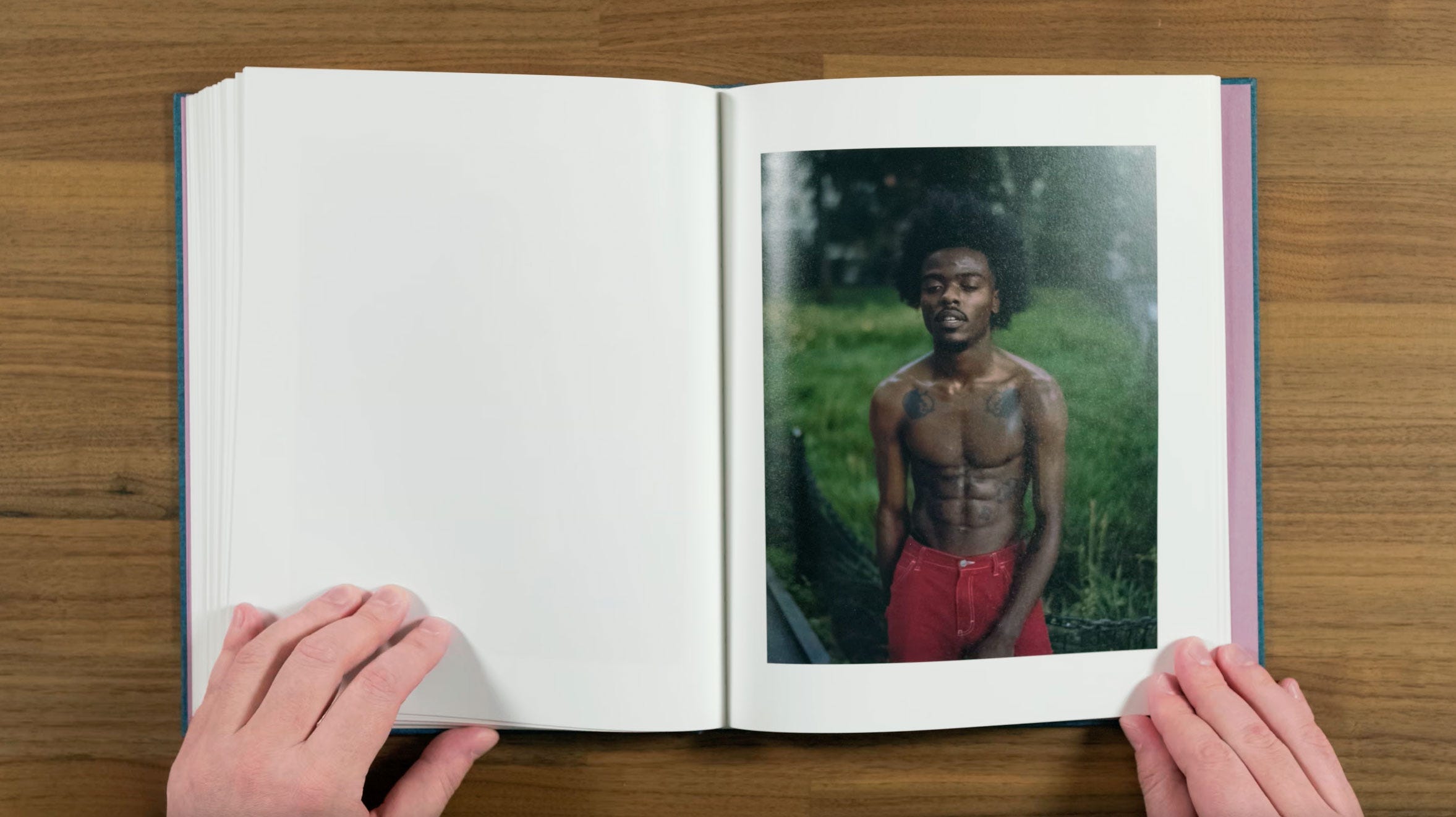
They are all really beautiful portraits though. Particularly this one. This dusky feeling light can be hard to pull off, particularly on a subject with darker skin, but this image really nails it.
This one changes the formula with a different, almost pained, or out of breath pose. The way the light is falling, and warm and cool contrast make this an incredibly striking image. Even if wouldn’t have necessarily put these last few portraits back-to-back, it’s not like they ruin the overall excellent way in which this book is sequenced.
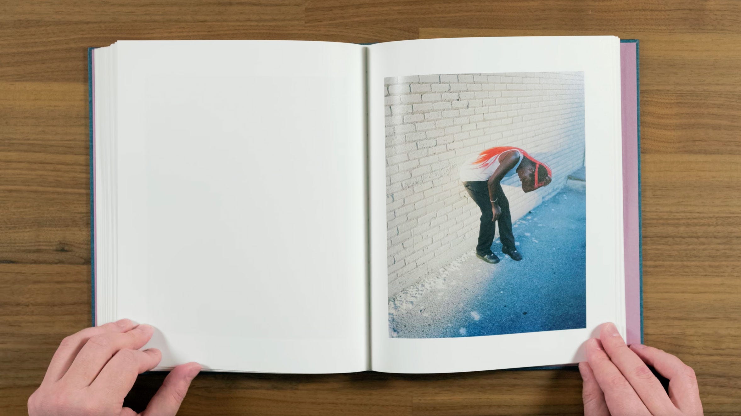
Here we move to the other side of the spread again, continuing the circular shaped foods on the ground motif. Although this time they look intact, and I don’t think they’re edible for human consumption.
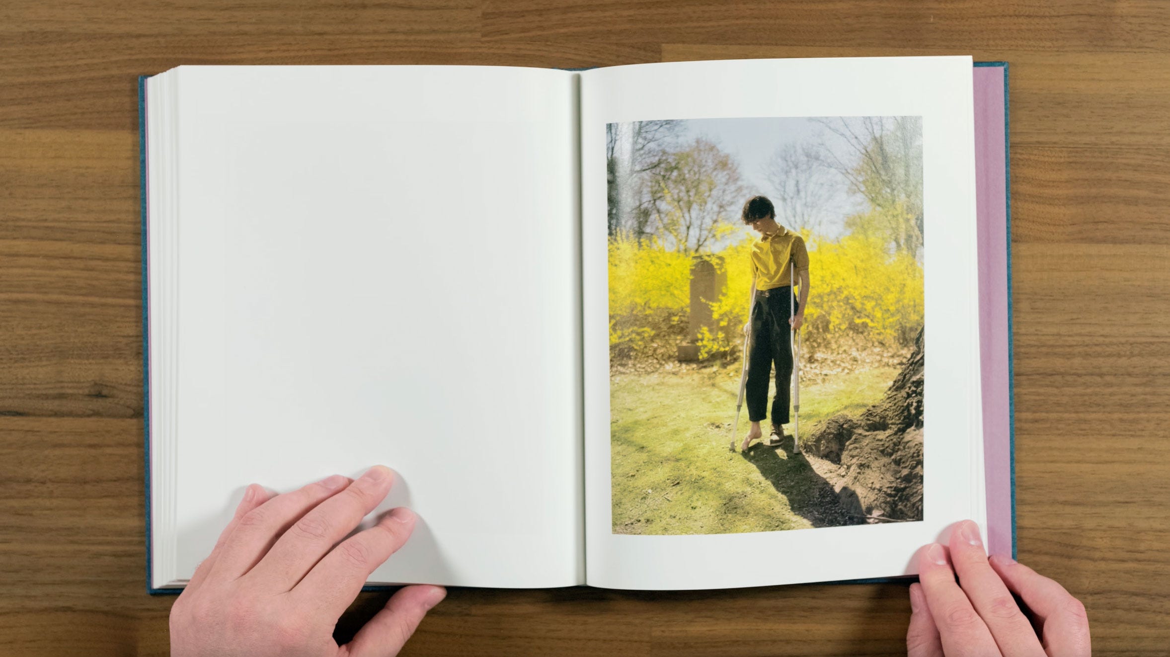
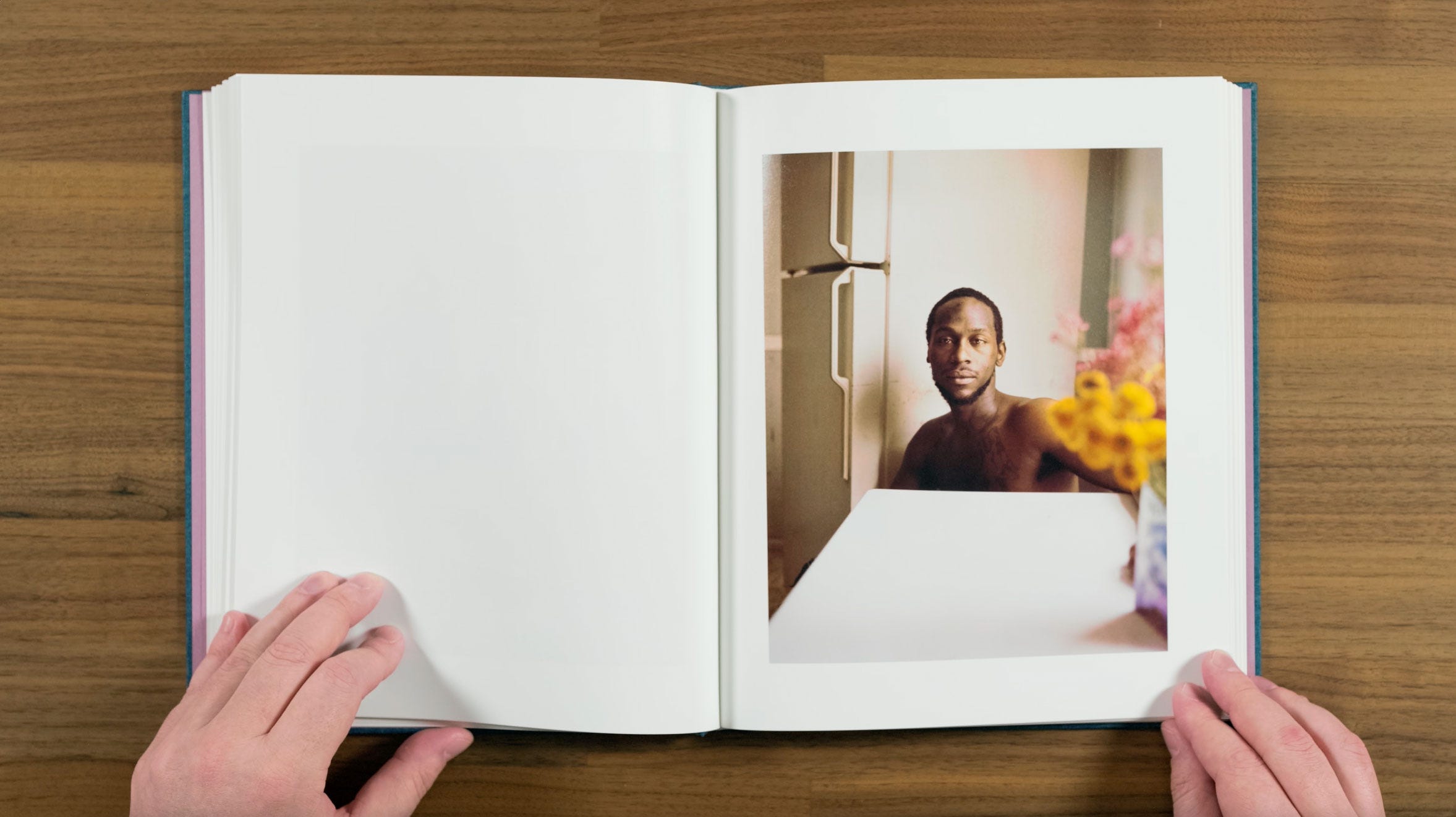
This portrait has a super eye catching yellow-on-yellow palette, with the flowers returning as a background element. The strangeness of this one really draws you into the story. It makes you think about how he got those crutches, and wonder where his other shoe went…
Speaking about the balance of different type of images in project Halpern says:
“I think the portraits are really the backbone or the building blocks of the work, and the landscapes and details sort of hover around them, filling the spaces between, fleshing out a narrative and creating a setting. I tend to not like the way my work looks when it’s edited to be all one type of picture or the other – just portraits or just landscapes. As for how I choose my subjects, I’d say they are people I want to keep looking at and thinking about, and whose likeness I continue to find interesting, compelling or beautiful even after looking at them for many months or years.”
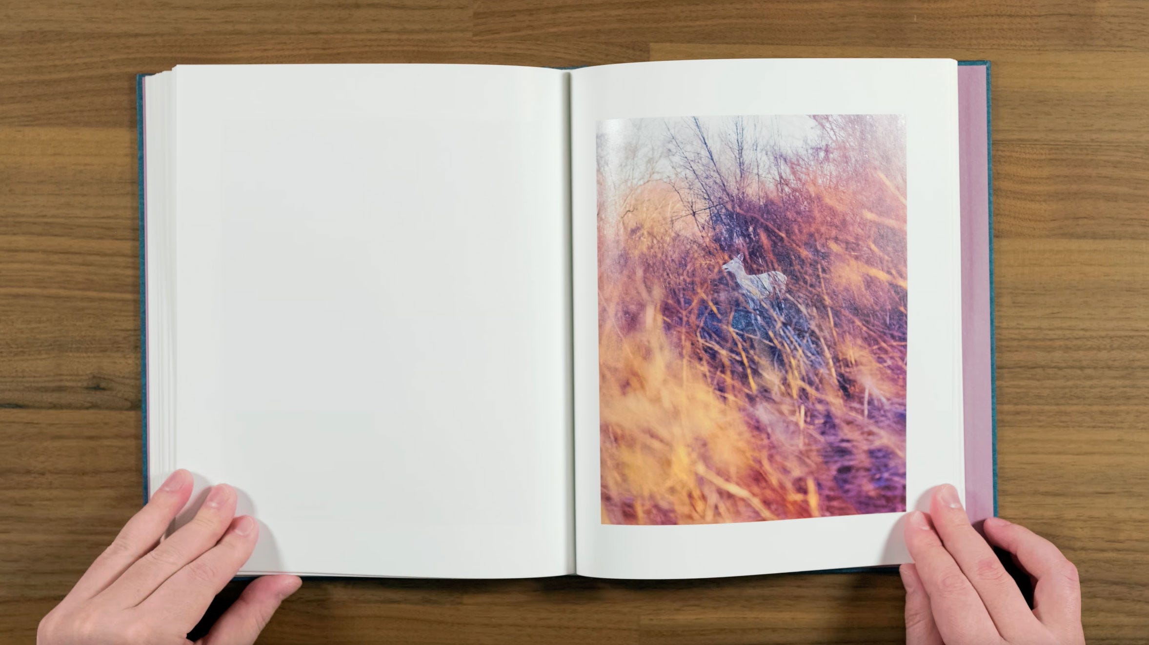
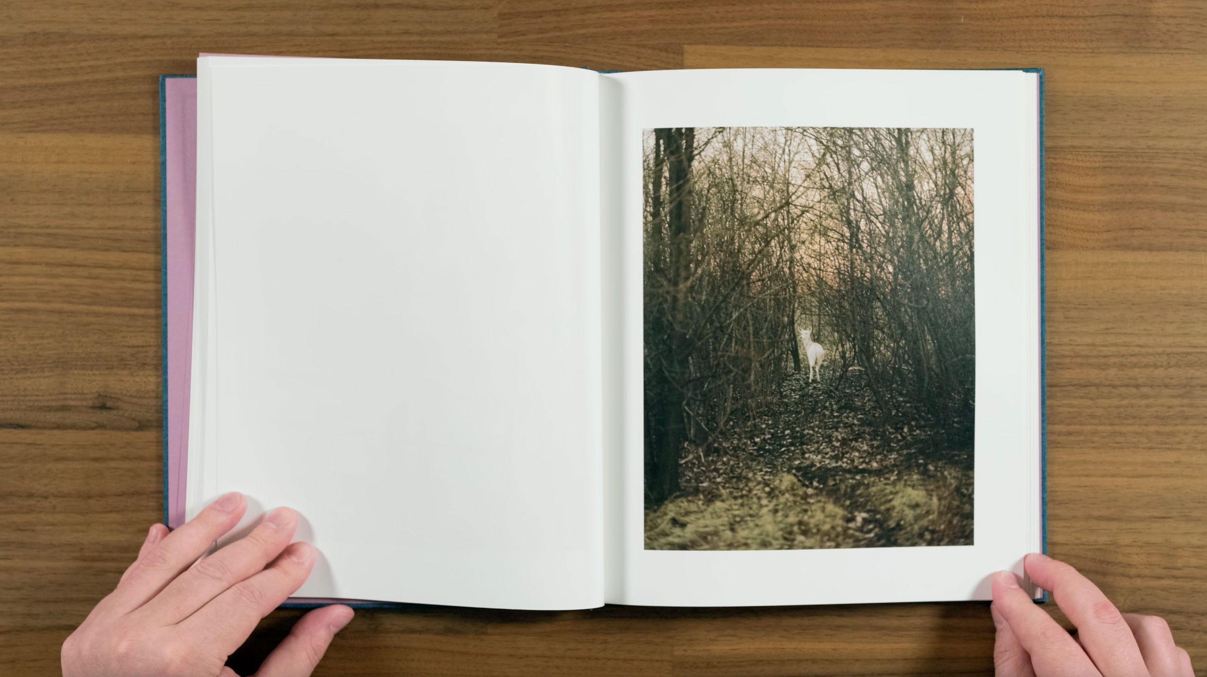
Here we get April the white deer for the final time, almost obscured by the golden light of the setting sun on the dense underbrush. There’s something rather forlorn about this one. To me, it feels like the point where the book starts moving into it’s final section.
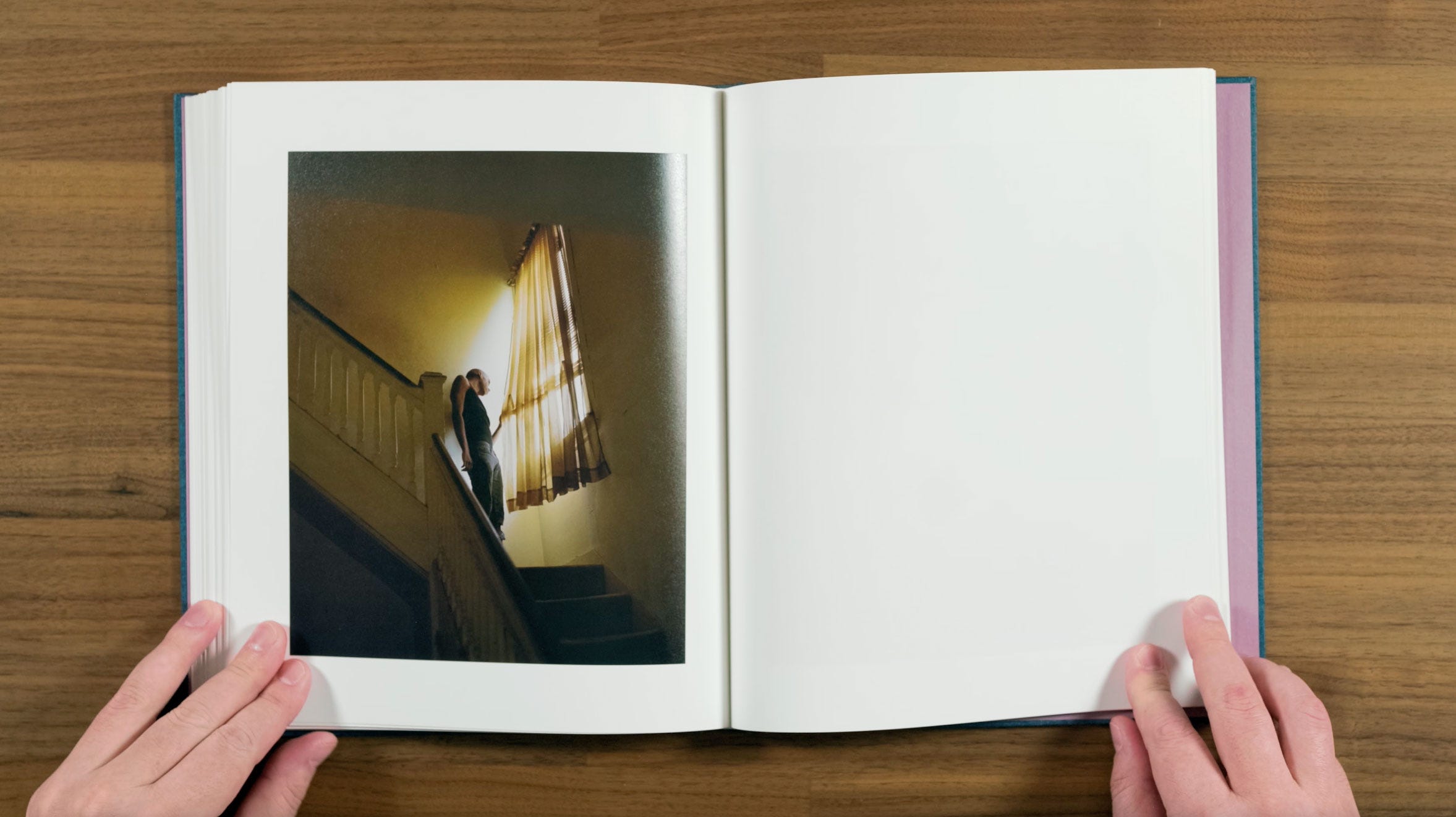
This next image continues that same feeling of building towards the ending. The way he’s peeking past the blinds make it feel like he’s on the lookout, waiting for something terrible to arrive. I find this to be a really striking image.
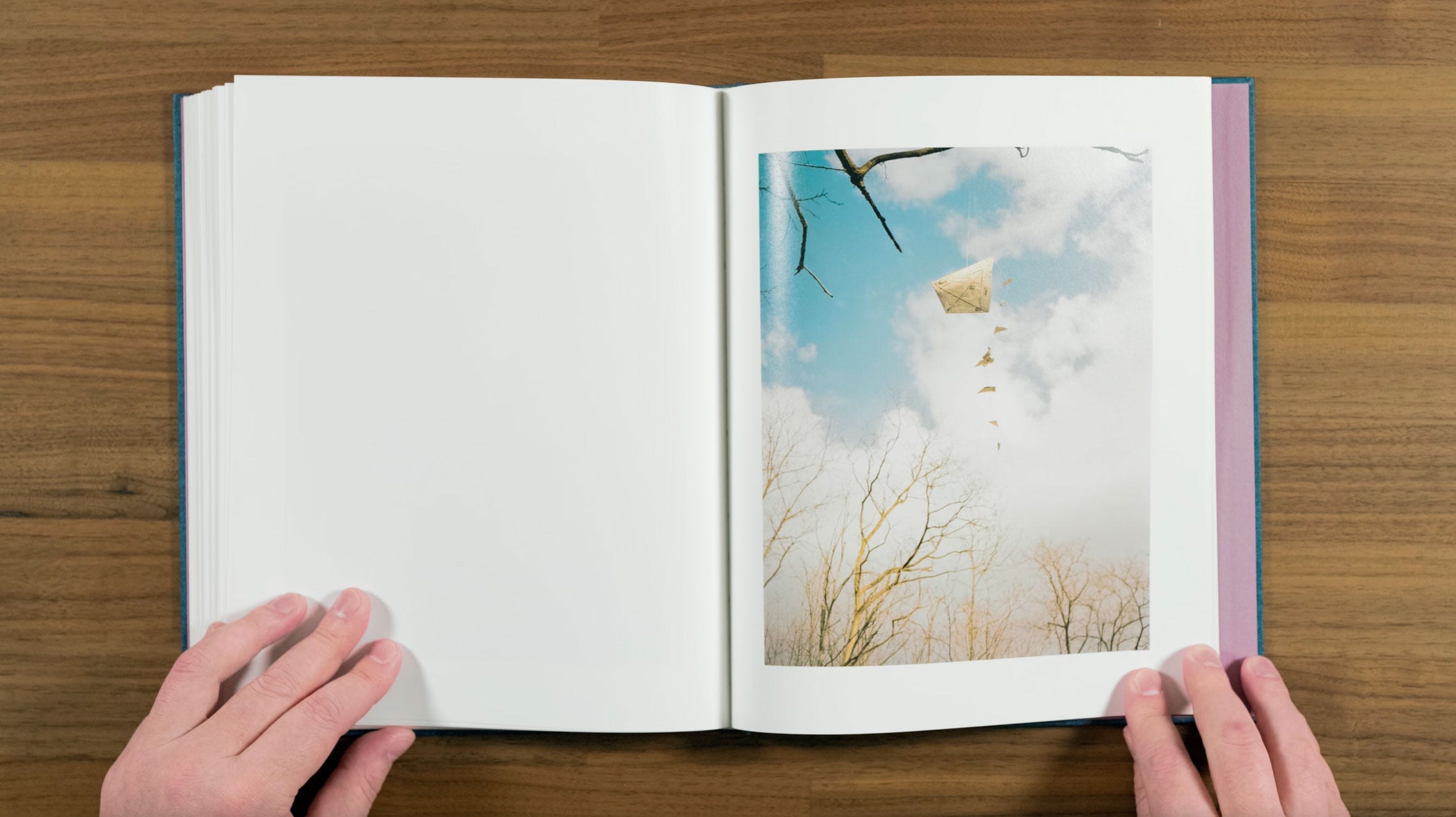
Which is then followed by the warm, but melancholy feeling of this homemade kite stuck in a tree. The trees are bare now, and kite flying season is at an end.
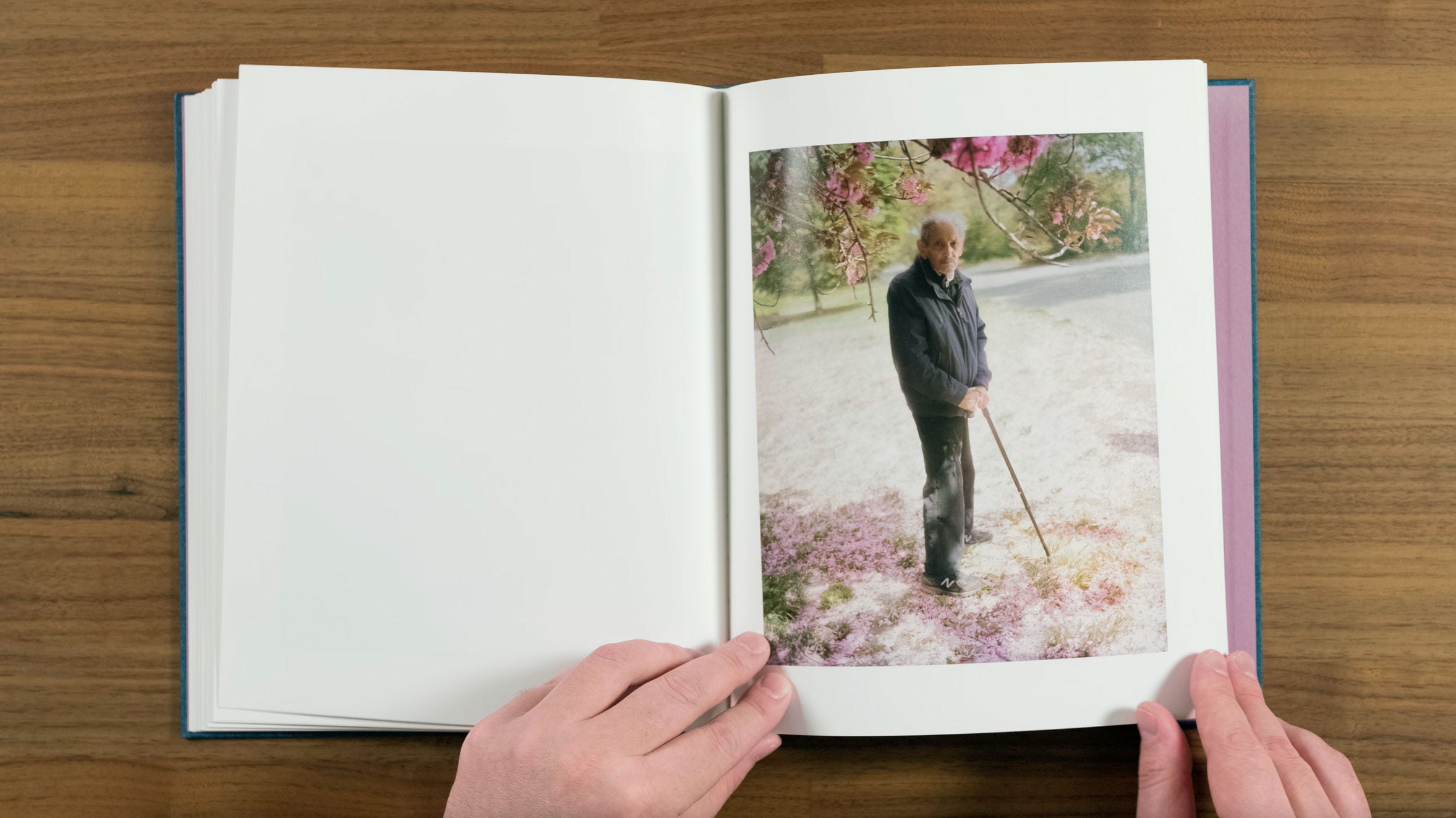
Here we have another portrait with flowers, but the most somber, longing version we’ve seen so far. This one is also effected by that same lens issue I mentioned earlier. Again, it doesn’t ruin it for me, but I do find it a bit little distracting.
I guess that might be one of the issues you face when making a body of work over such a long period of time. I assume Halpern either repaired or replaced the lens at some point though, since it isn’t present on all of the portraits.
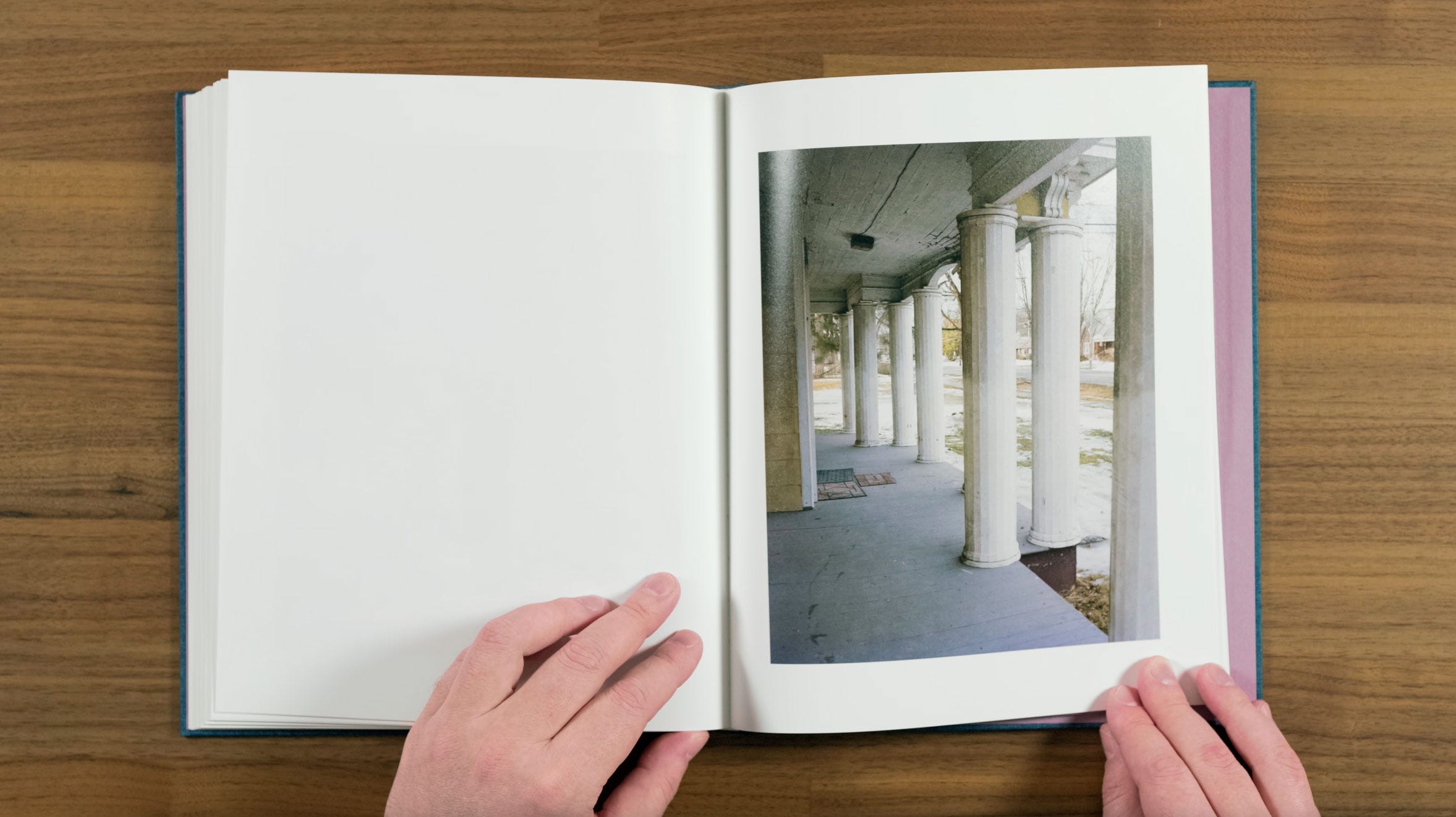
These pillars feel grand, but the crumbling ceiling and industrial grey floor betrays that grandiosity. Rather than show us any of Buffalo’s iconic landmarks, Halpern provides a settings for his personal vision of the place.
Next Page
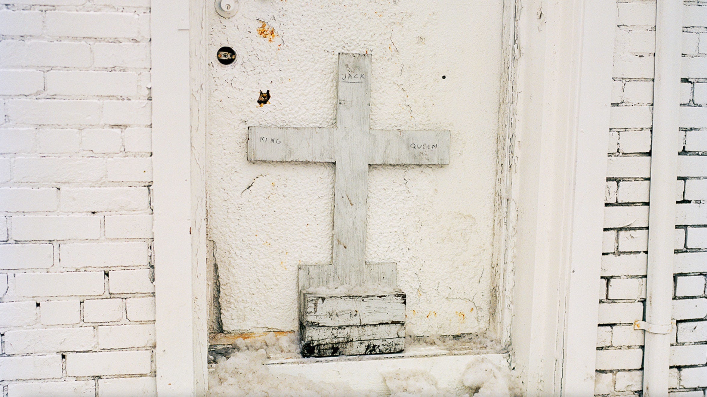
This is the image the title is taken from, although the word Jack is replaced with the word Knave. The title King, Queen, Knave is somewhat abstract in connection with the photographs in this book, but it definitely conjures up the idea of characters from playing cards.
This book is filled with all these characters from Halpern’s portraits, so the suggestion that they’re taking on roles or identities as Kings, Queens, or Knaves is something that stuck with me while looking through it. It kind of reminds me of the quote: "In this life we are either kings or pawns, emperors or fools" from the Napoleon Bonaparte character in Alexandre Dumas’ The Count of Monte Cristo.
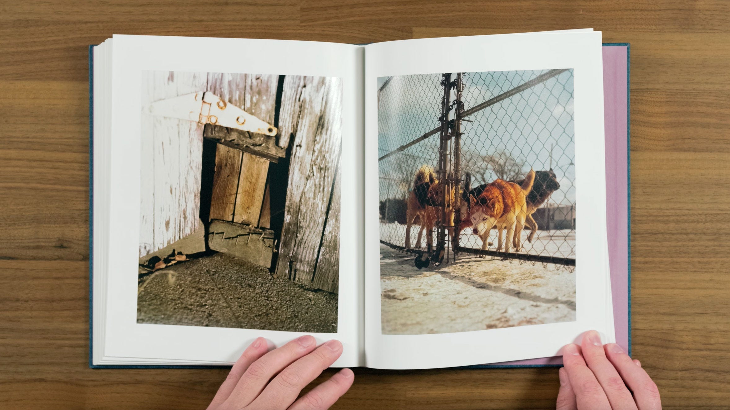
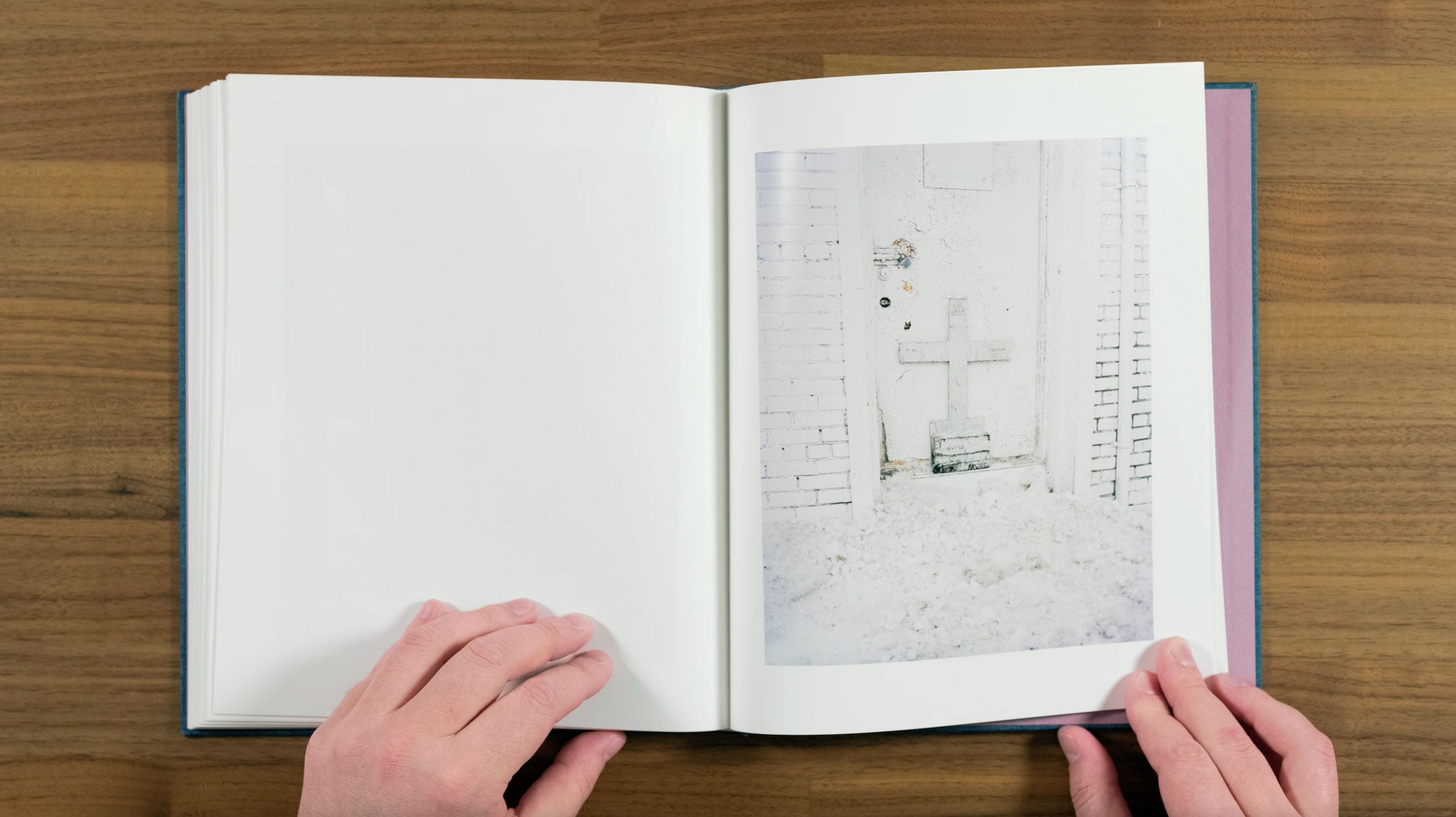
Here’s another nice pair that’s a little mysterious, and maybe almost a bit ominous. We have a hole caused by a missing piece of wood, and the evidence of the unusual and somewhat poorly executed repair behind it. And then we have these dogs, who look like they’re very intent on getting past their own fence, and finding out what’s inside that hole.
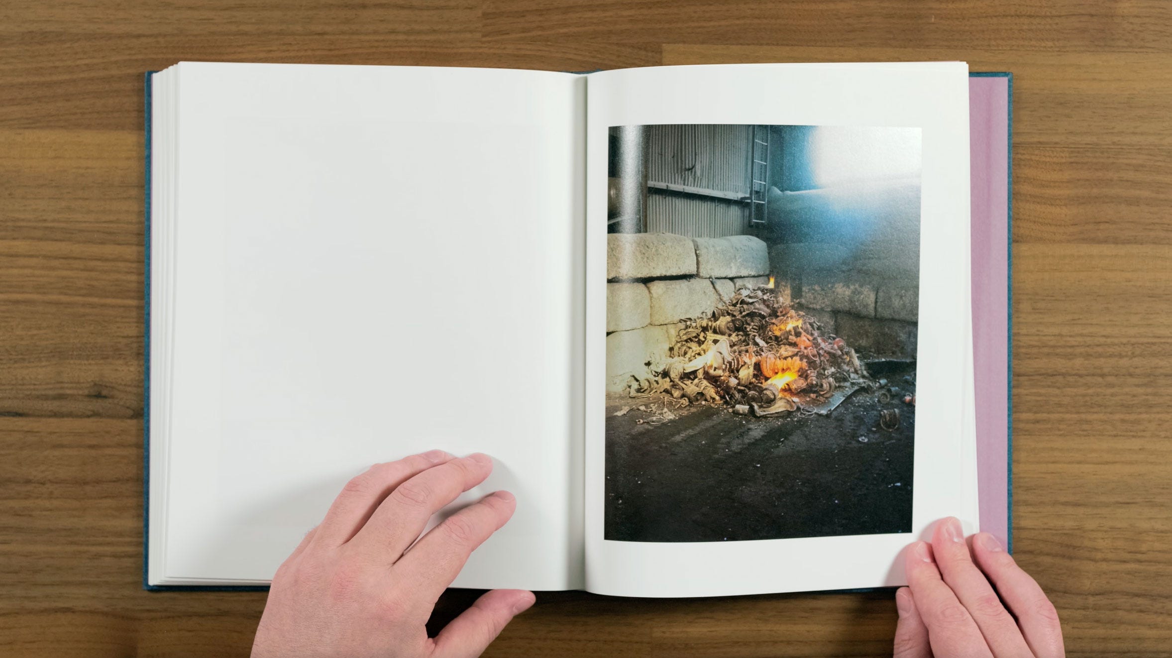
It’s followed by our last reoccurring fire photograph. It’s placement in the sequence almost suggests that this room is what the dogs might have found behind the hole. It’s quite a surreal image, as the objects being burned appear to be old metal parts which are glowing red hot. The source of the fire or why they’re being burned remains unclear to us.
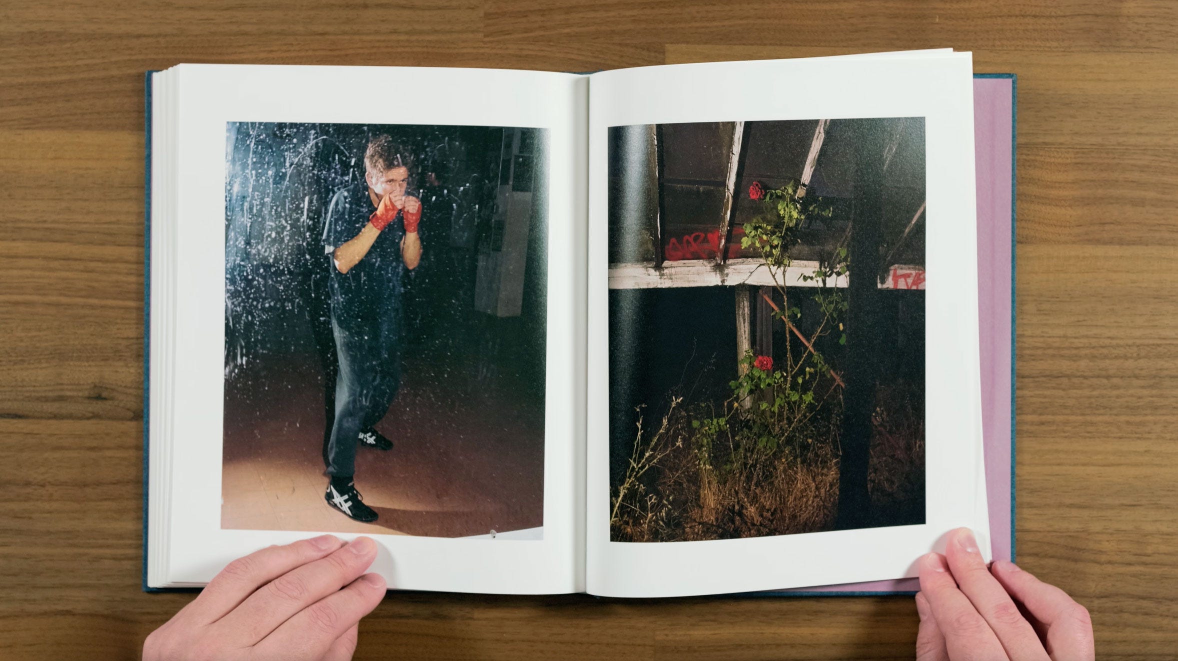
Here we get our final pair in the book. The flash on the dirty mirror creates an unusual illusion of space in the portrait of the boxer. The red wraps on his hand mirror the two red roses and the graffiti. The figures stance, combined with the roses large visible thorns, create a sort of violent implication.
These are the first images with this kind of apparent direct flash, since the one of the fence in falling snow that I particularly admired early in the book. But somehow they don’t feel out of place in this increasing surreal crescendo Halpern is building towards.
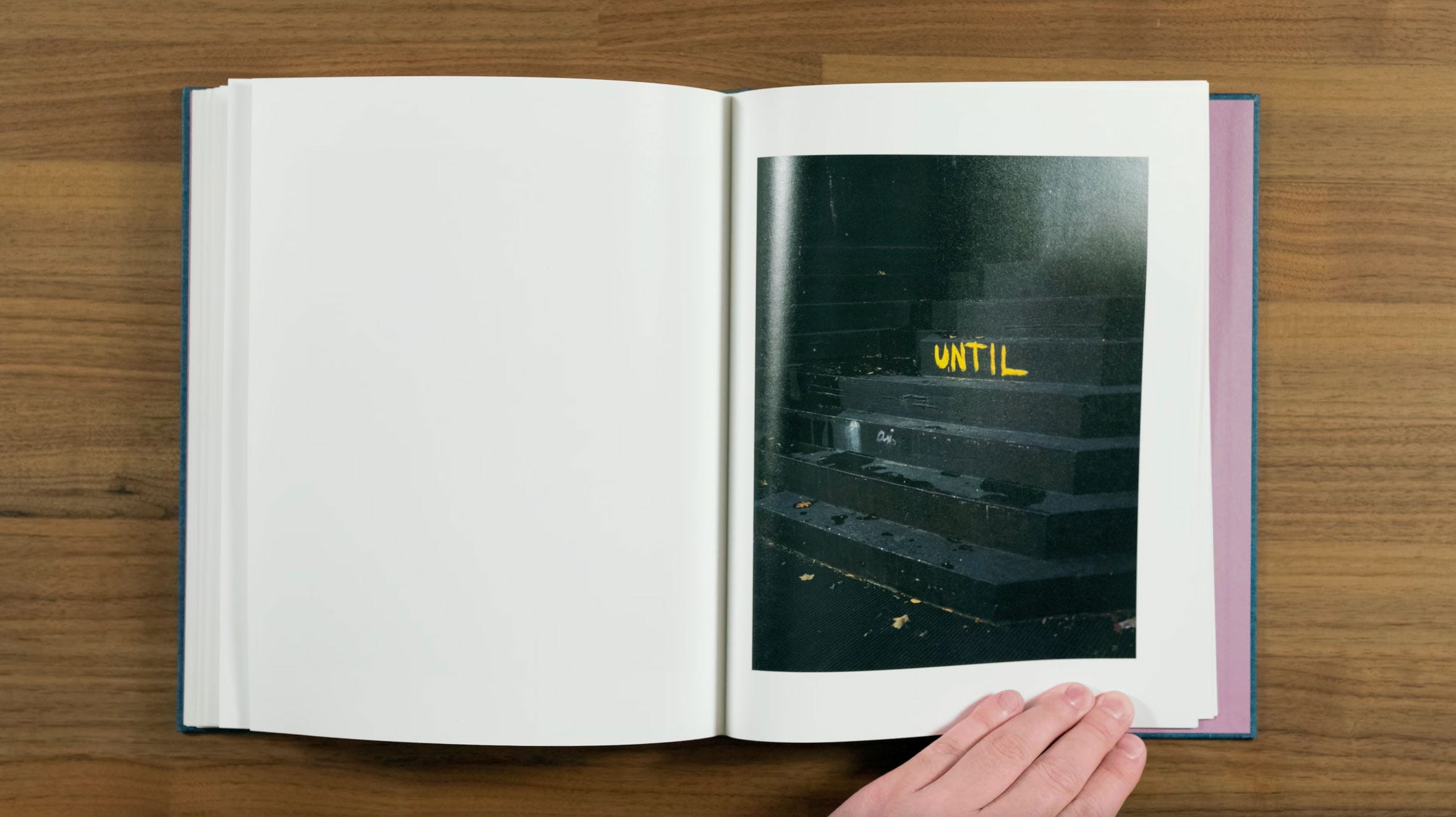
The word UNTIL written in yellow on these completely black steps feels quite ominous, maybe even threatening. I’m a big fan of photographs of words without any apparent context. I also really love it’s placement sequence as the book builds toward its conclusion.
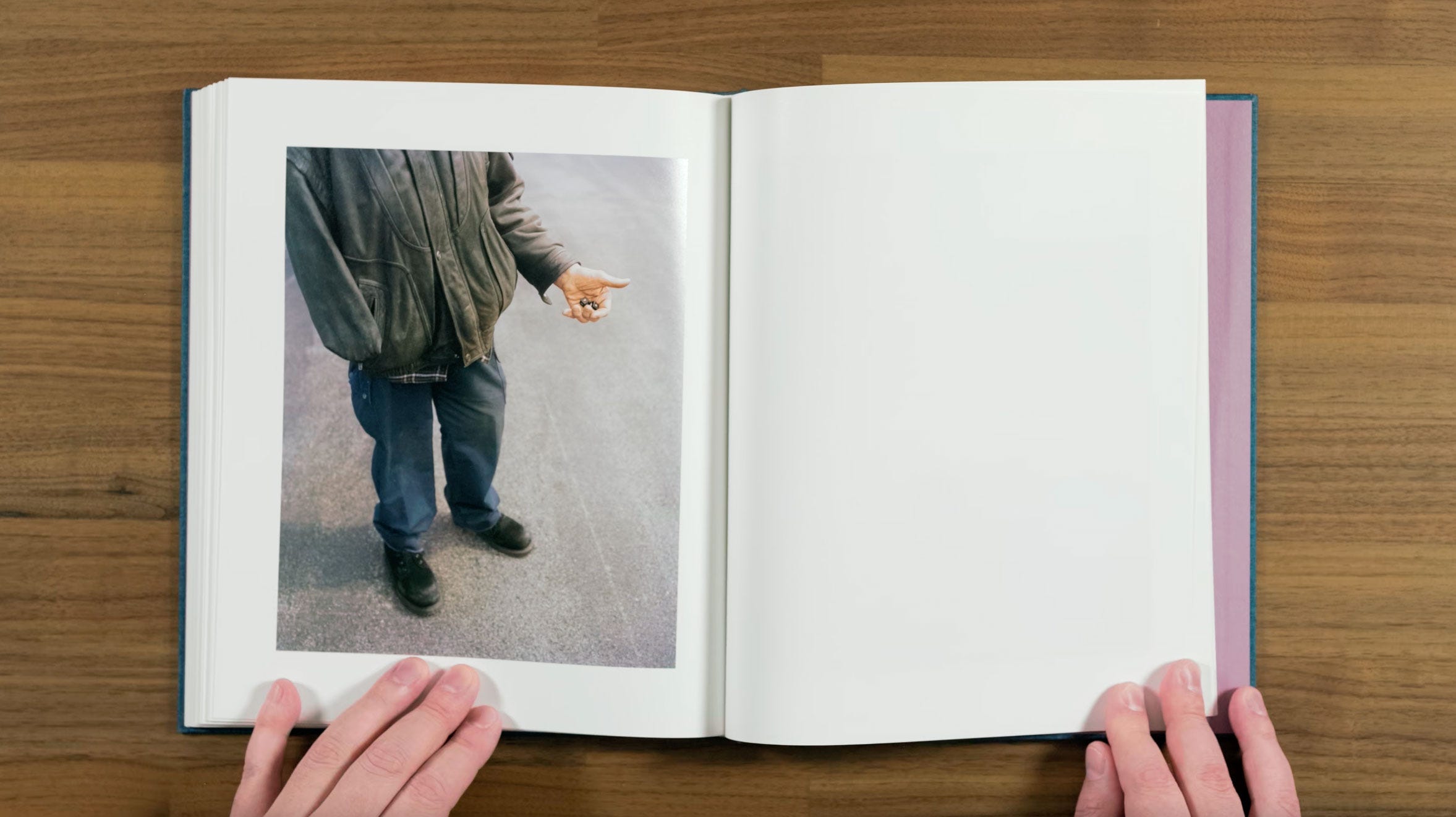
Here we swap to the other side the spread again for a little rhythmic break. We also move back into the light from the darkness we’ve been in for the last few spreads. But the mood is still ominous. The word UNTIL still is on our mind from the last page, as a one-handed man cradles a pair of unusual dice, continuing the game motif. The implication feels like: Until… he rolls them?
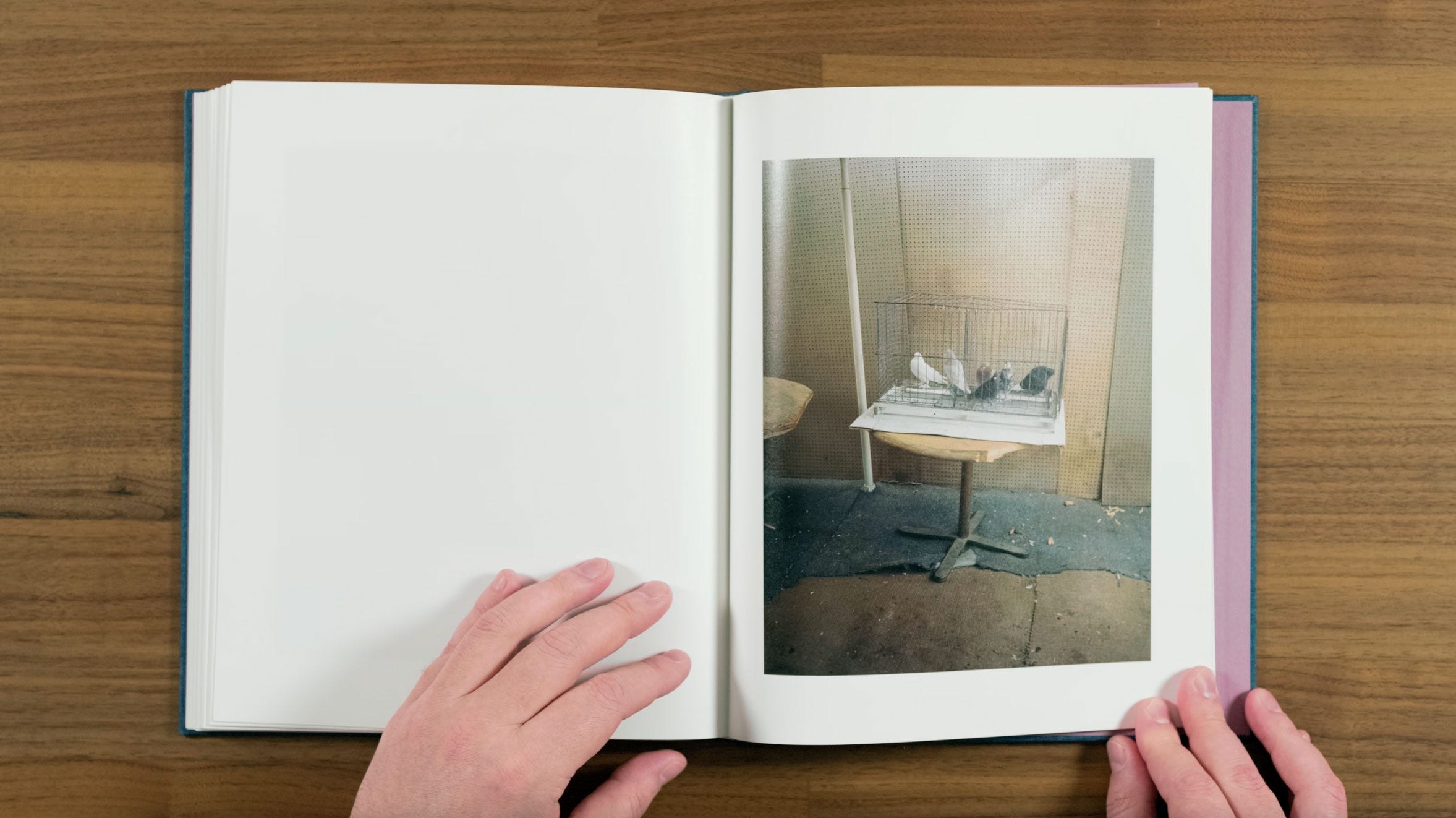
Now we have our last reoccurring pigeons, who previous roamed free, but are now caged in this particularly shabby looking room. At this point, we’re free associating with the motifs the book has already setup for us.
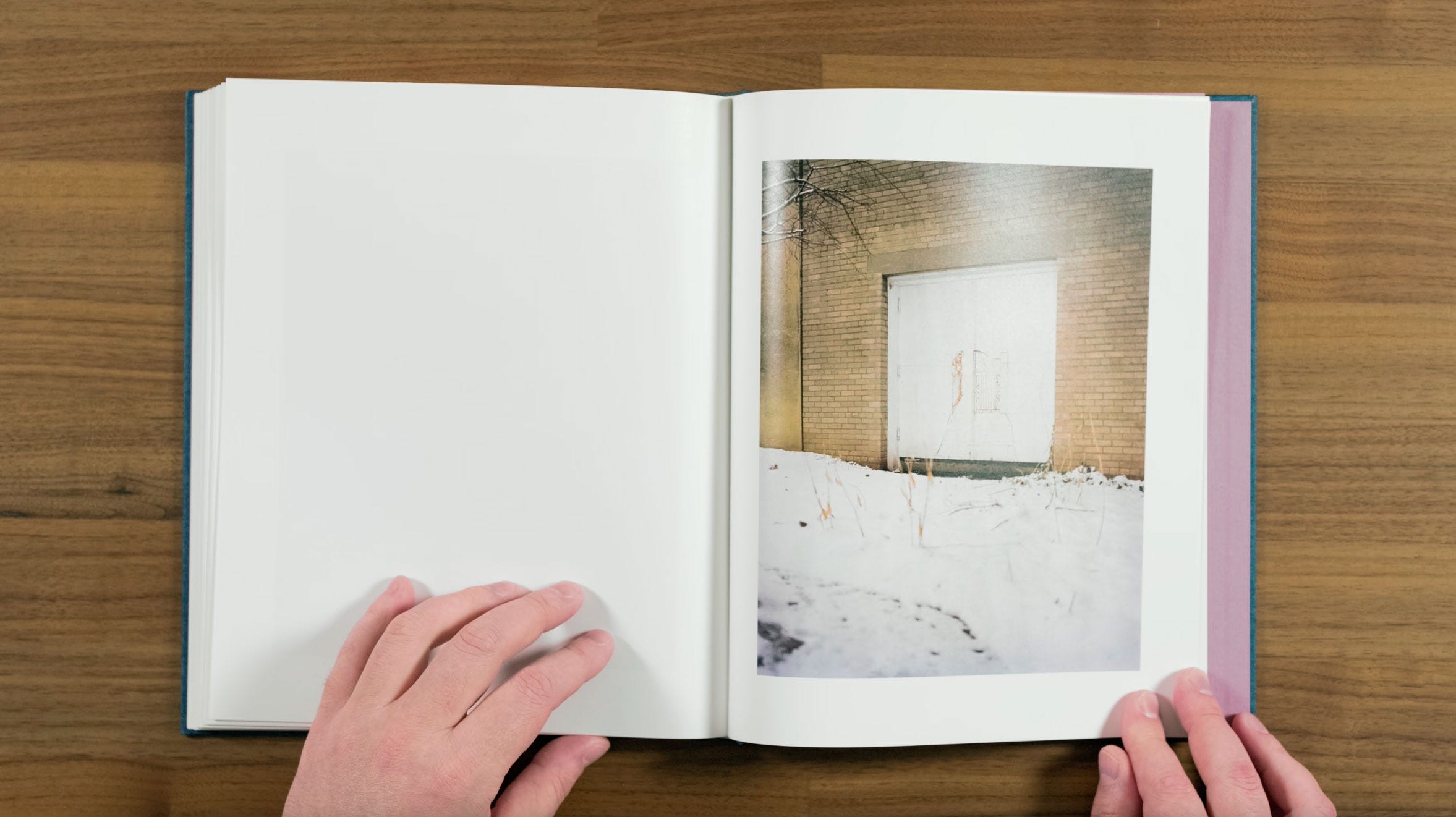
Then we have an old industrial door, with a faintly painted set of gates on it. One of the gates is open, almost as if Halpern is inviting us to come through it.
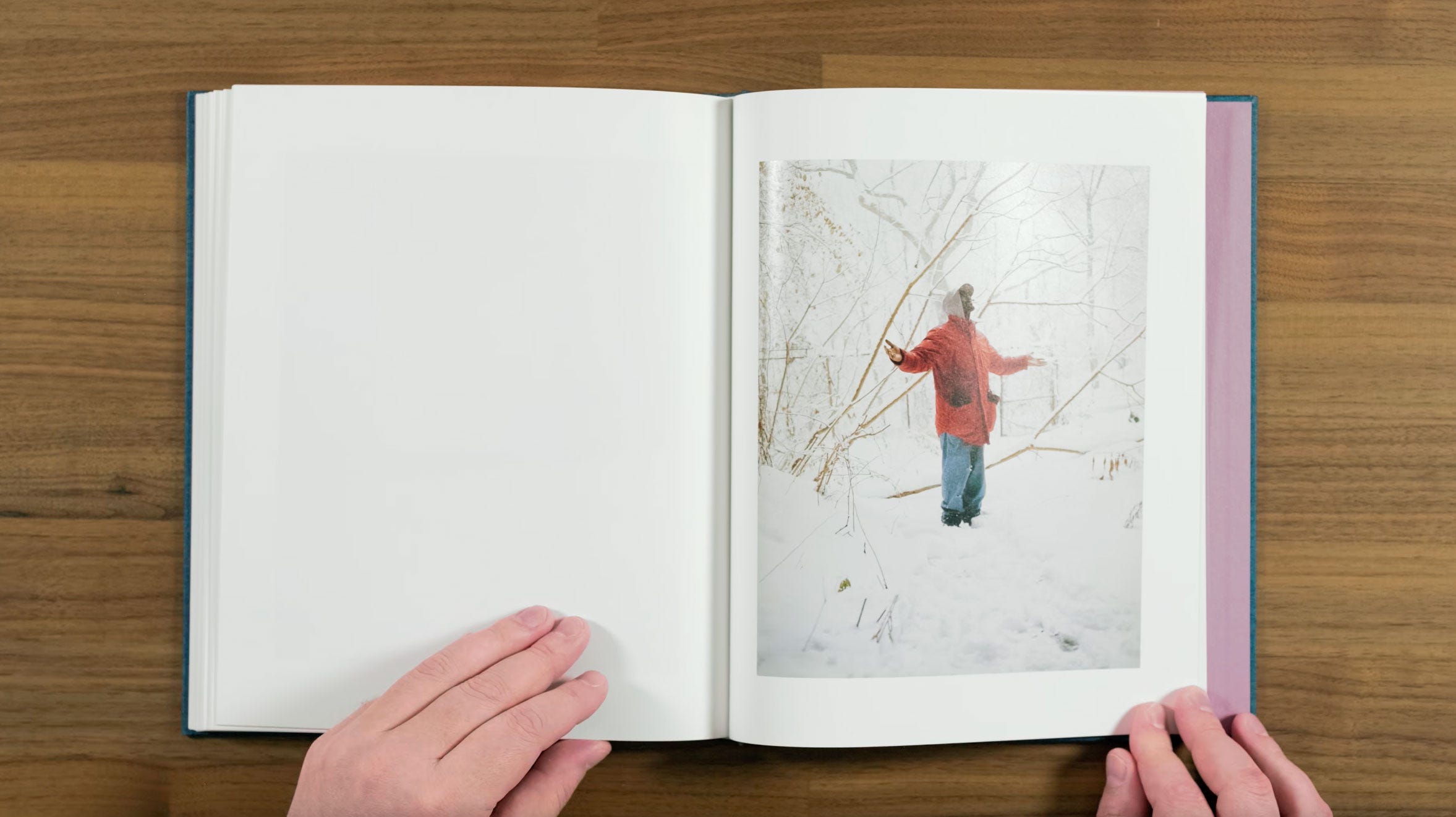
Once we do, we have our final portrait. A figure who appears to as if he was released back into the freedom of the snow covered woods. It’s almost a Shawshank Redemption style moment.
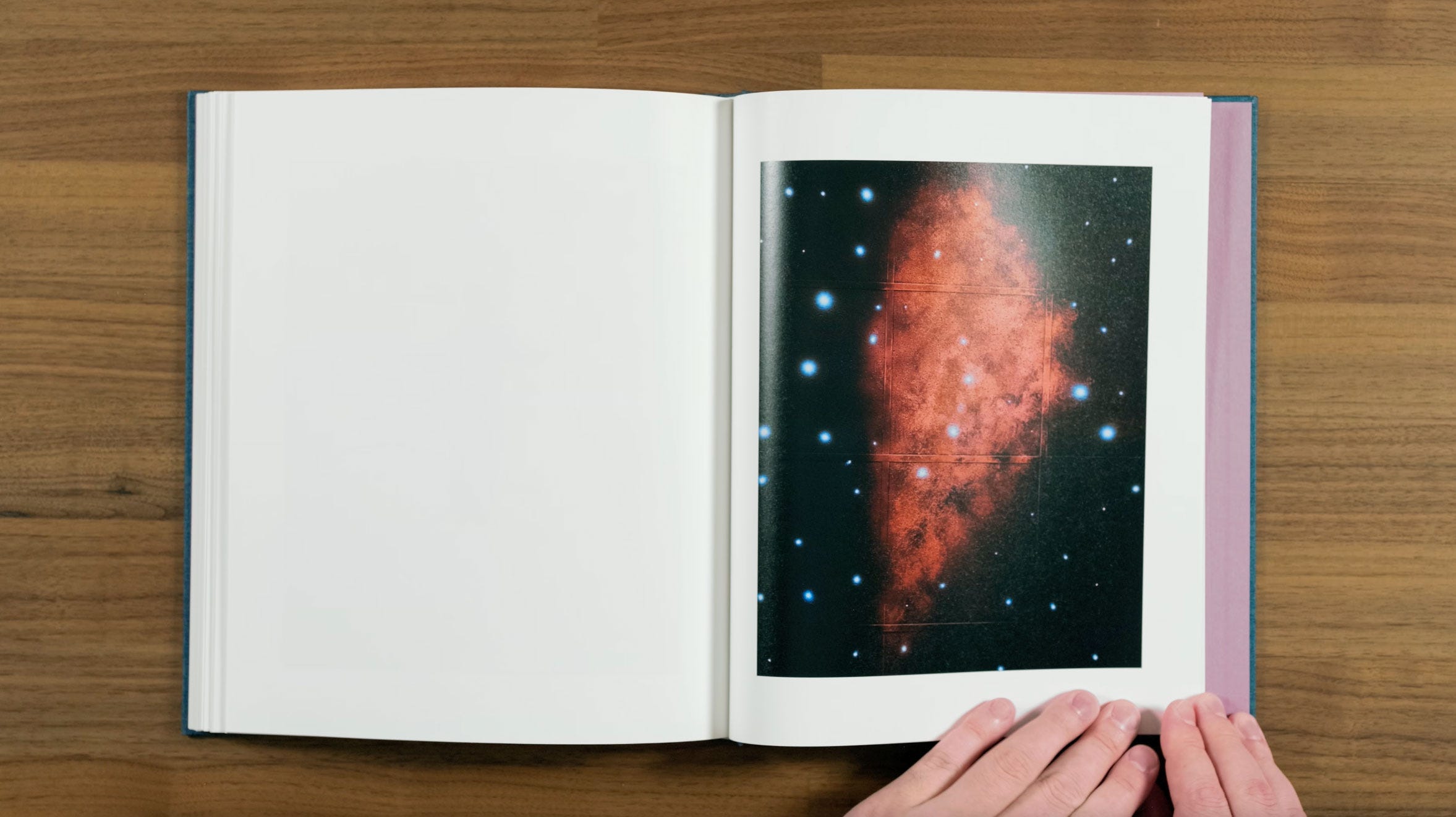
Now we’ve come full circle to the galaxy or nebula painted the ceiling tiles from the cover. I really like this placement in the book relative to the cover. There, it was suggestive of what was to come, but also very different from the images we were getting until this surrealist build up at the end. Here, it feels like we’re almost leaving the terrestrial world of Buffalo behind for some type imagined cosmic journey.
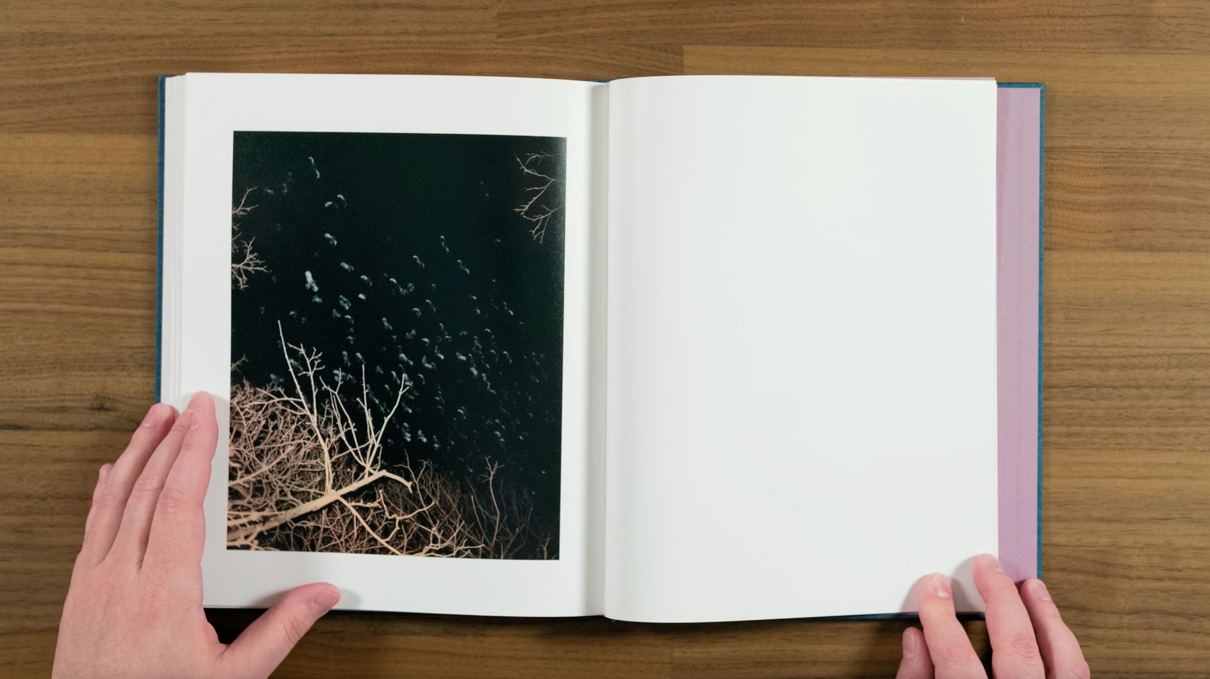
Here we get our final image, which switches sides one last time for a concluding rhythmic emphasis. A flock of birds flying freely, like the stars in the previous pages galaxy. I think this image is an excellent note to end the book on.
Next we get a credits and thank you page.
Then lastly, a plain book cloth back cover.
Conclusion
So the question is, should you buy this book? Mack the books publisher, describes King, Queen, Knave like this:
“An idiosyncratic vision of a city amidst its contradictions, defying familiar narratives of post-industrial decline and embracing an enigmatic strain of reality verging on surrealism. Halpern’s mesmerizing sequence unfurls as a stage across which distinct and unpredictable characters appear in and amongst solitary buildings, snowdrifts, and sun-bleached scenes of everyday transcendence.
The images often locate their subjects within the specificities of the season and balance a historical project with the immediacy of a moment in its individual radiance. Embracing themes of reversal and ascension, Halpern confronts the complexities of his birthplace and of contemporary America at large, seeing beauty intertwined with ugliness and redemption with despair. This lyrical new work is testament to the endless complexity of a place at once familiar and unknown.”
That description is obviously really hyping up the book, but I do honestly think that it fully delivers on what that grandiose marketing description promised. It truly embraces the photobook form to tell a unique visual story. The sequencing seamlessly takes you on what turns out to be a pretty wild journey when looking back it, without ever loosing you along the way. I definitely think that this is Gregory Halpern’s best book so far, and one of the most interesting and well executed contemporary photobooks I’ve ever seen.
At $70 (or $75 for a signed copy) it’s a little more expensive than the average photobook, but it’s very well printed and makes for a beautiful object. It’s definitely worth adding to your collection if you enjoy this kind of photography.
If there are other books you'd be interested in seeing me review, let me know in the comments. If you’d like to support what I’m doing, buy a book, magazine, or print from Subjectively Objective. If you’d prefer to give ongoing support through Substack, you’ll receive coupons equal to your subscription value that can be used for anything in the Subjectively Objective shop.
Good gosh - both the book and your patiently thorough review are stellar. Putting that on my "buy" list. Thank you, Noah! Glad to have found you on Substack... and previously via You Tube.
Great work reviewing this. I am so fascinated by the pacing of it, and would love to know more about how they landed on the current structure- in particular when, how they go to the left hand page with a solo image. I own this one and feel like it still has a lot to teach me about editing and sequencing. I also love the intentional absence of words.