


PHOTOBOOK REVIEW: Todd Hido - The End Sends Advance Warning
An in-depth review of Todd Hido's latest photobook, analyzing the photographs, and breaking down how it functions as a book.


This article was adapted from my video reviewing The End Sends Advance Warning, so I’d love to hear your thoughts on how it works in written form. Do you like this observational, conversational style, or would you prefer something a little more formally written? Let me know in the comments.
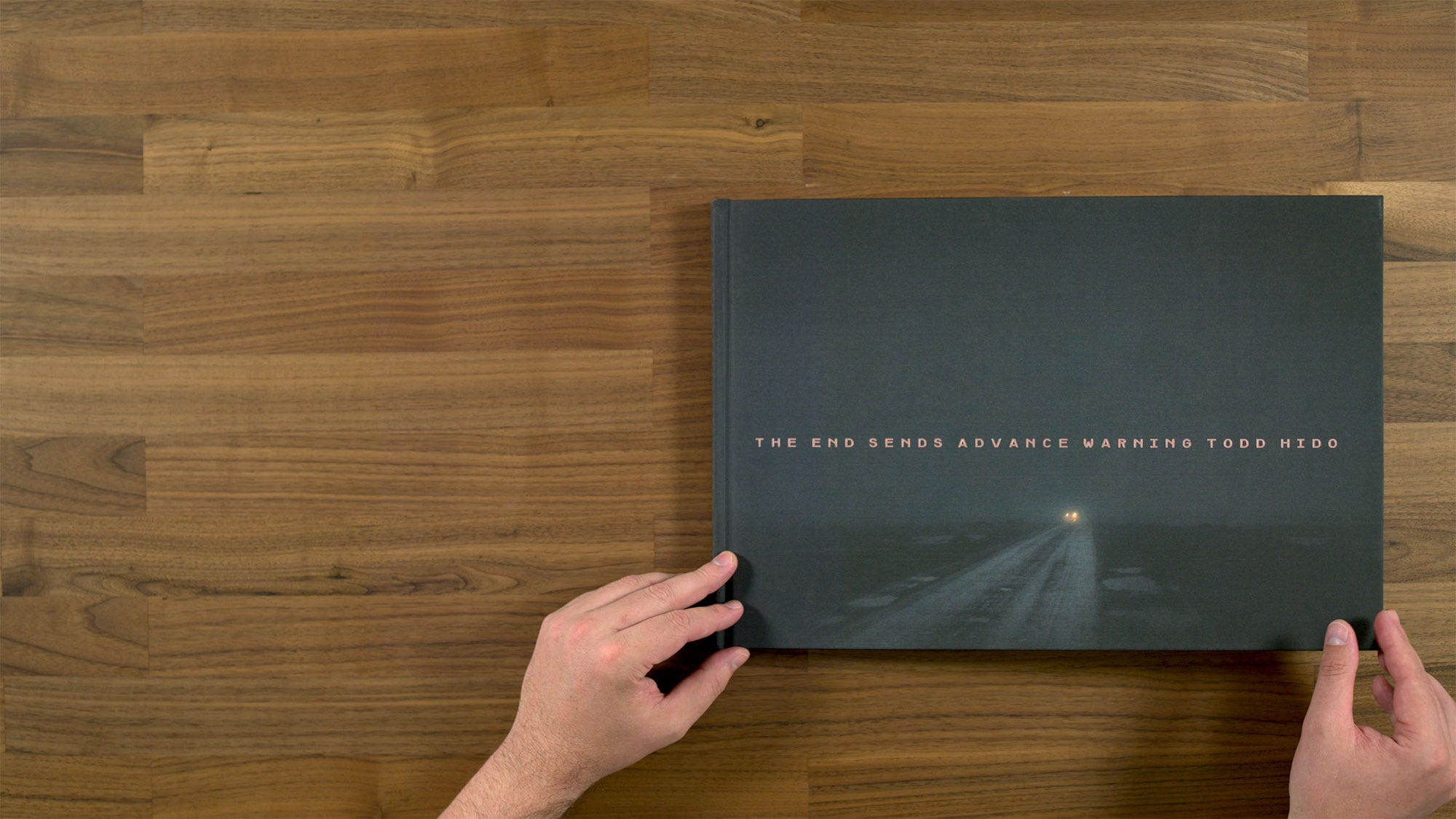
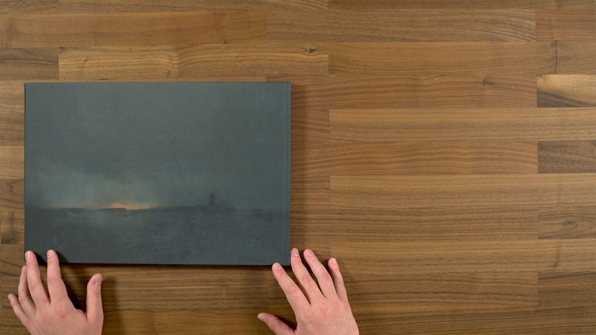
The first thing you’ll see when looking at Todd Hido’s latest book, The End Sends Advance Warning, is that the cover image has been offset printed onto linen. It has a very soft touch type of quality, which has a nice tactile quality, but actually makes for a little bit of a fragile book, since it’s quite easy to scuff. You can see it has a relatively low DMAX, which gives the image a soft, moody kind of quality.
The title is foiled onto the cover in a sort of salmon color. Something interesting to note about this project, is that it’s actually a continuation of sorts from Todd’s previous book, Bright Black World. In fact the title, The End Sends Advanced Warning, is actually taken from the essay to that book. It's also interesting to note that these two projects are the first ones that he's ever shot outside of the US.
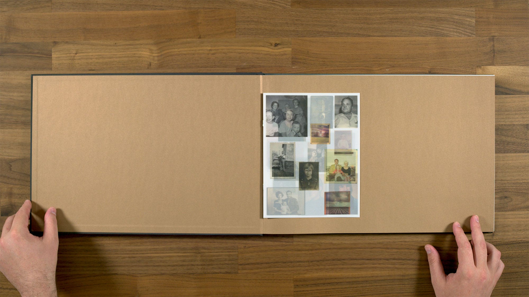
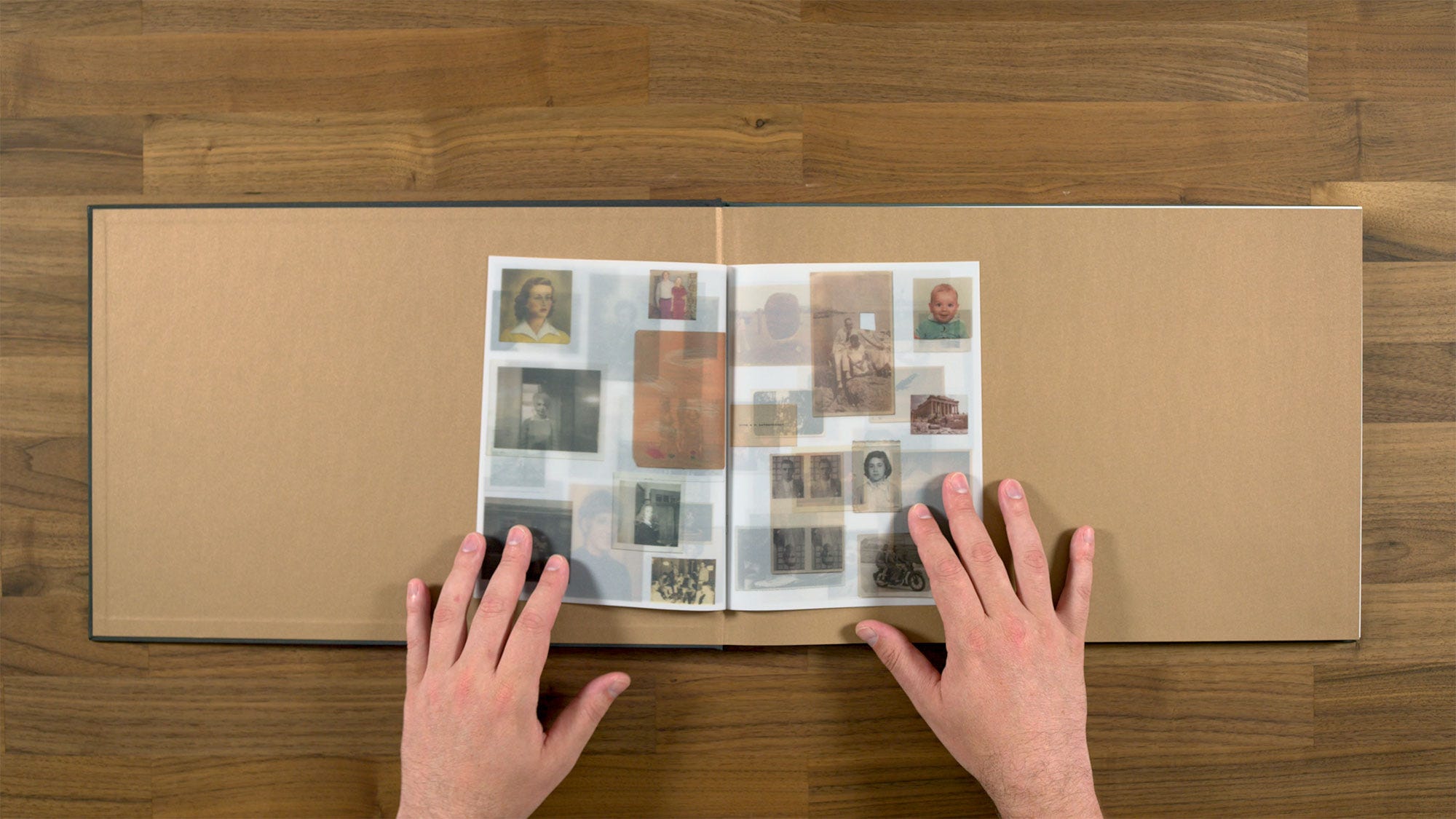
Once you open the book, the first thing you encounter are the somewhere metallic bronze end papers, and this little vellum booklet. Within the context of the book, you don't really have any information regarding what the booklet is about or why it’s included. But in reading and listening to interviews with Todd, you find out that these are actually images of him and his wife's family. So although it’s a bit of a non sequitur in the context of the book, it does give you a certain kind of nostalgic mood that stays on your mind as you look through the rest of the book.
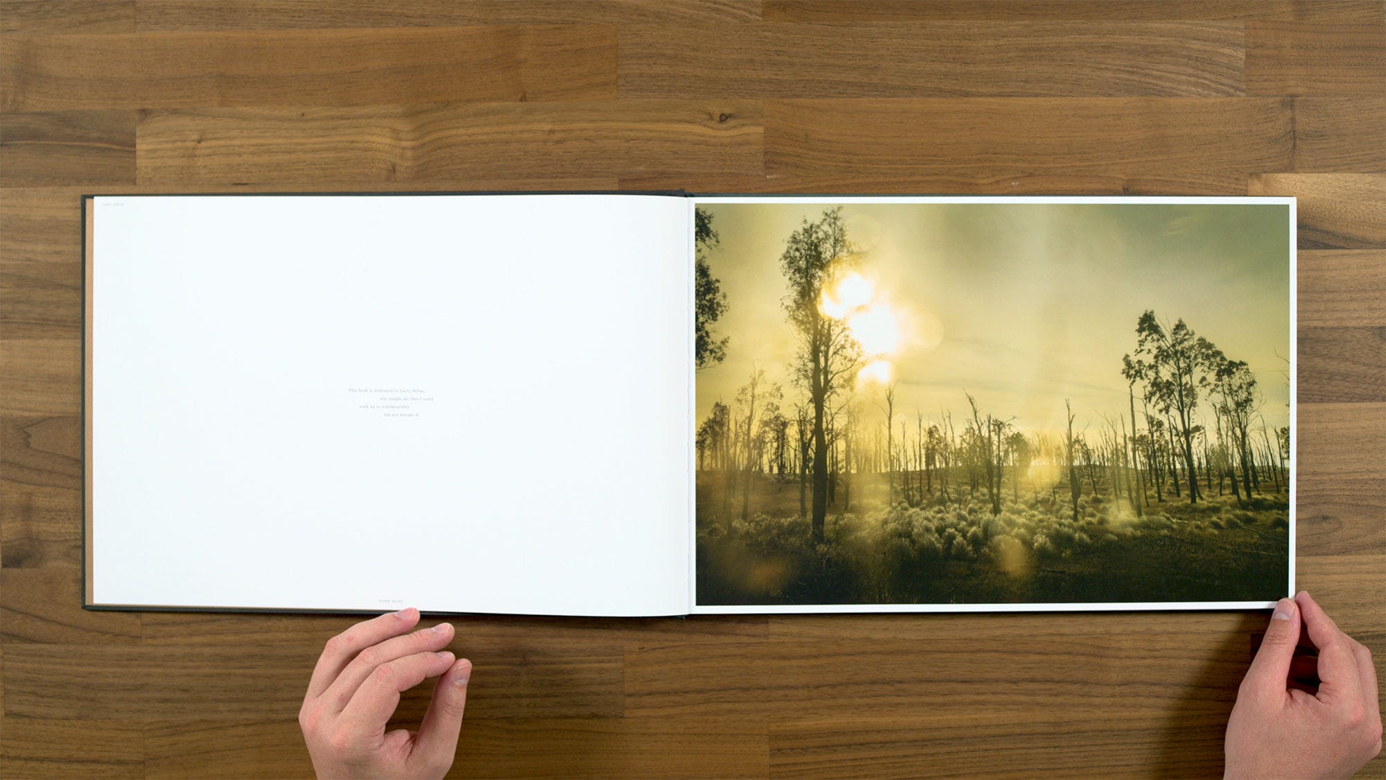
After the title page, we get to our very first image, which is a perfectly nice, if somewhat subtle start to the book. Fun fact, I saw on Instagram that Todd gave a little shout out to Jason Momoa for taking to him location in Hawaii. (Apparently they’re good friends). Jason Momoa is also the one who introduced Todd to Leica cameras, which is what was shooting with for this book. He used two different digital Leicas, an S3 medium format and an SL2 full frame one. This is from the full frame here.
There's a little dedication on this page that reads:
“This book is dedicated to Larry Sultan, who taught me that I could walk up to sentimentality, but not become it.”
Todd has mentioned that after his mid-career Aperture survey, Intimate Distance, he'd had a change of heart about only photographing in America. He said he used to feel like his work was only meant to be done in places that reminded of him of home, but for this project, he wanted to move to places that were new and unfamiliar to him.
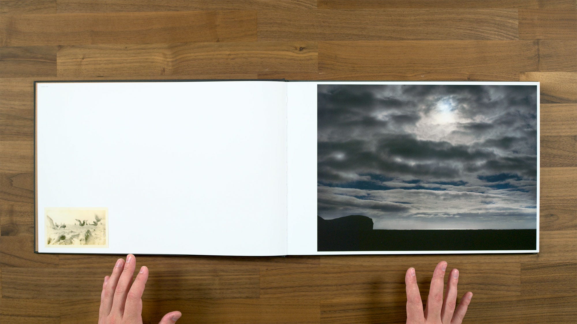
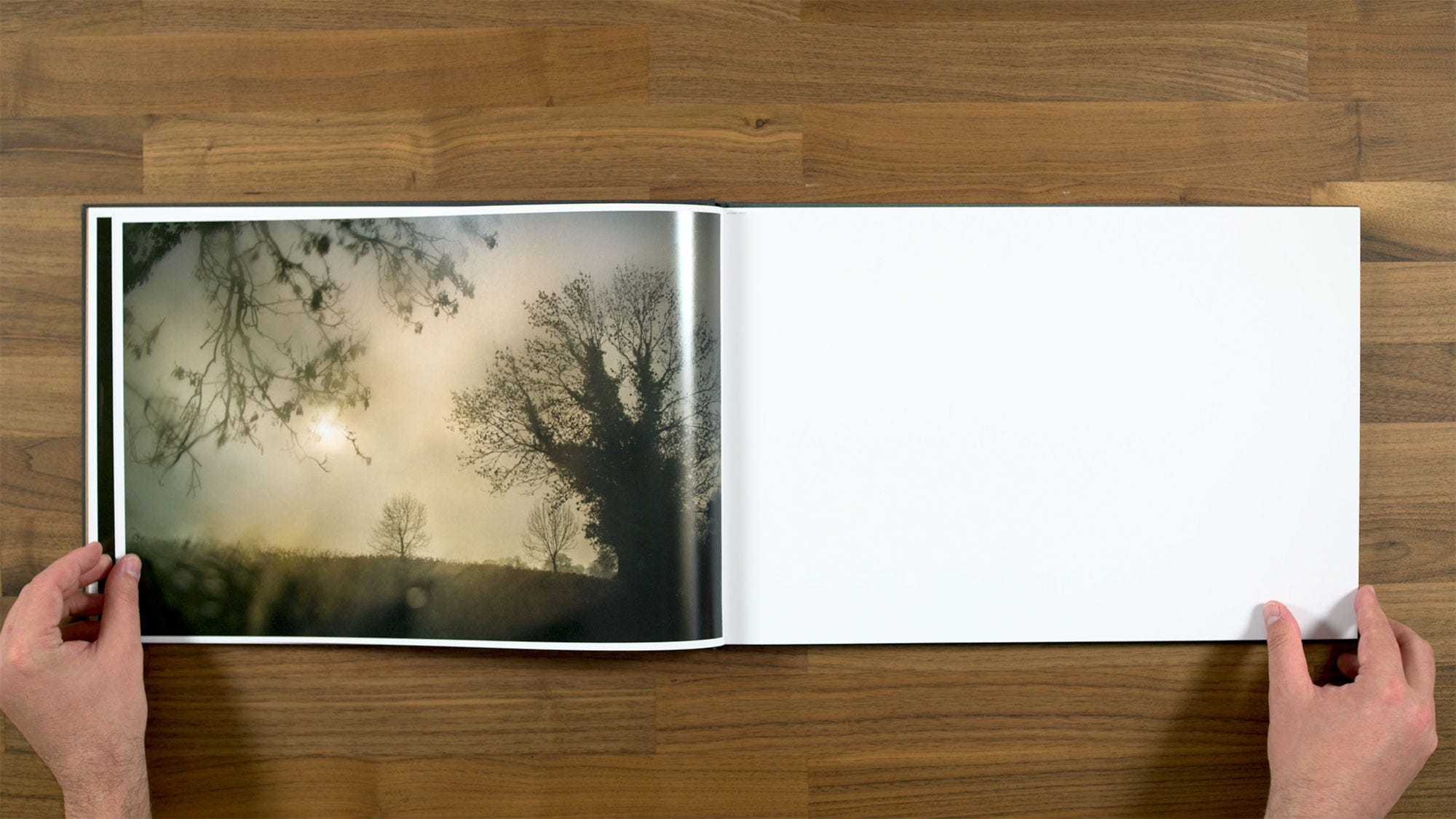
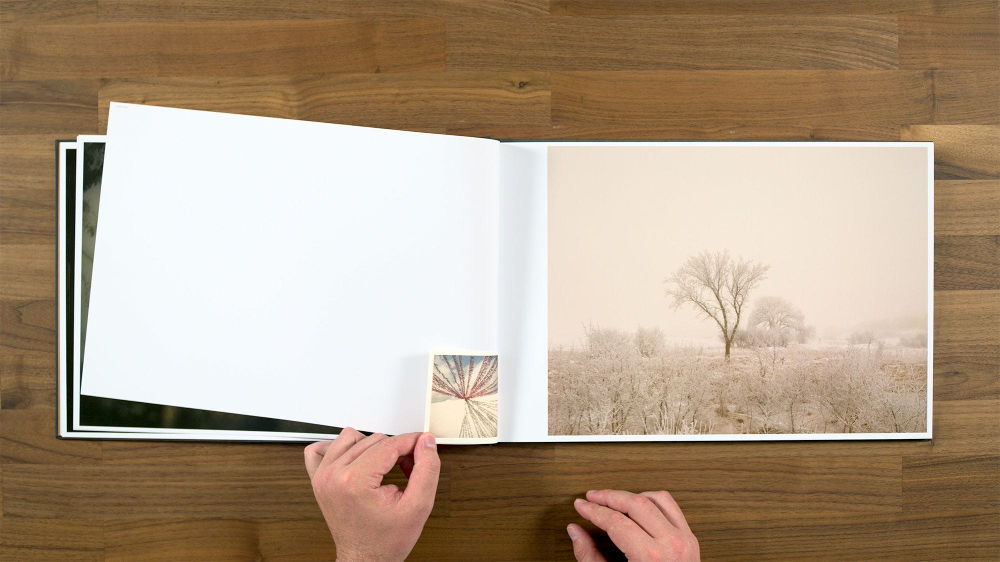
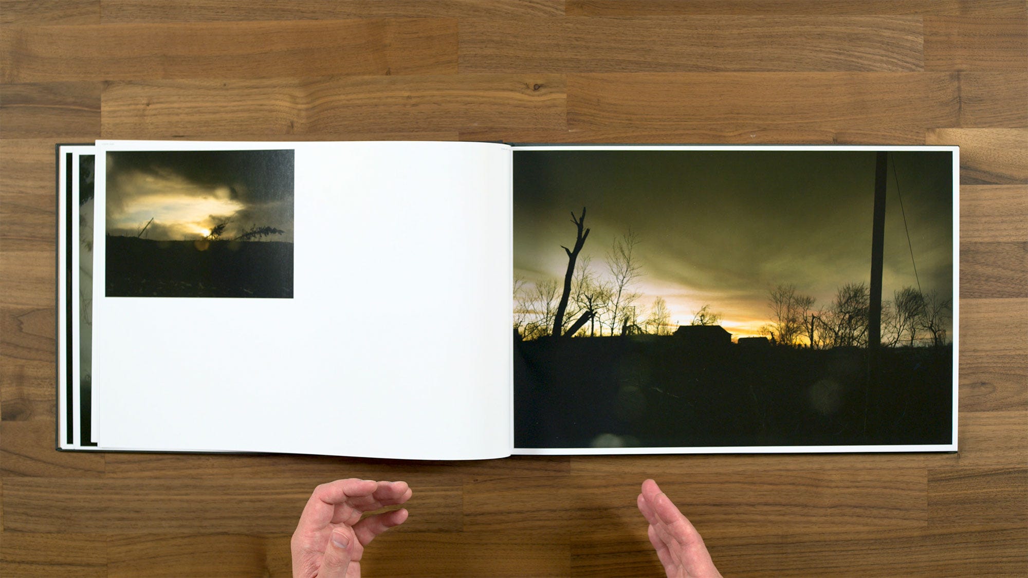
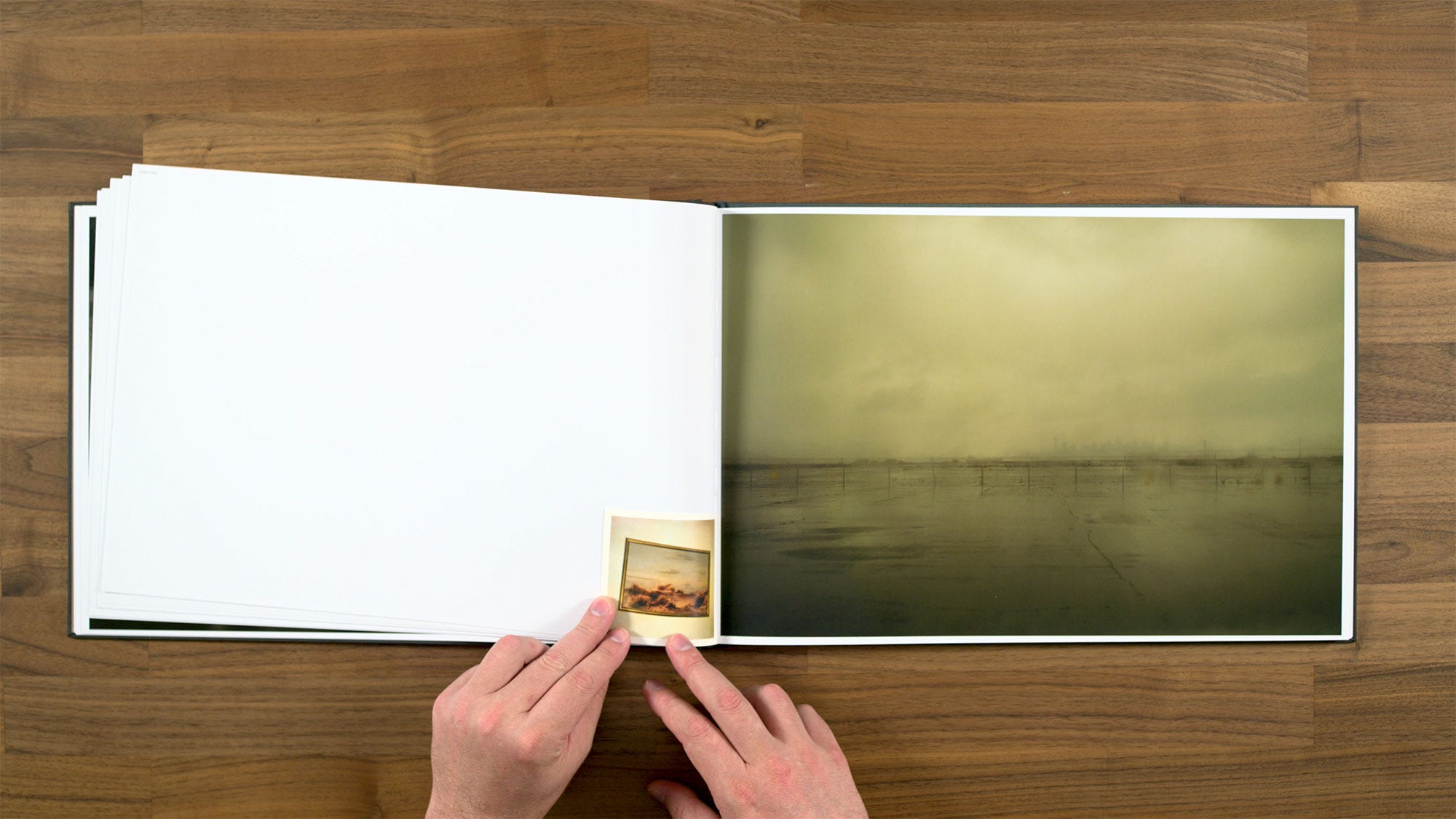
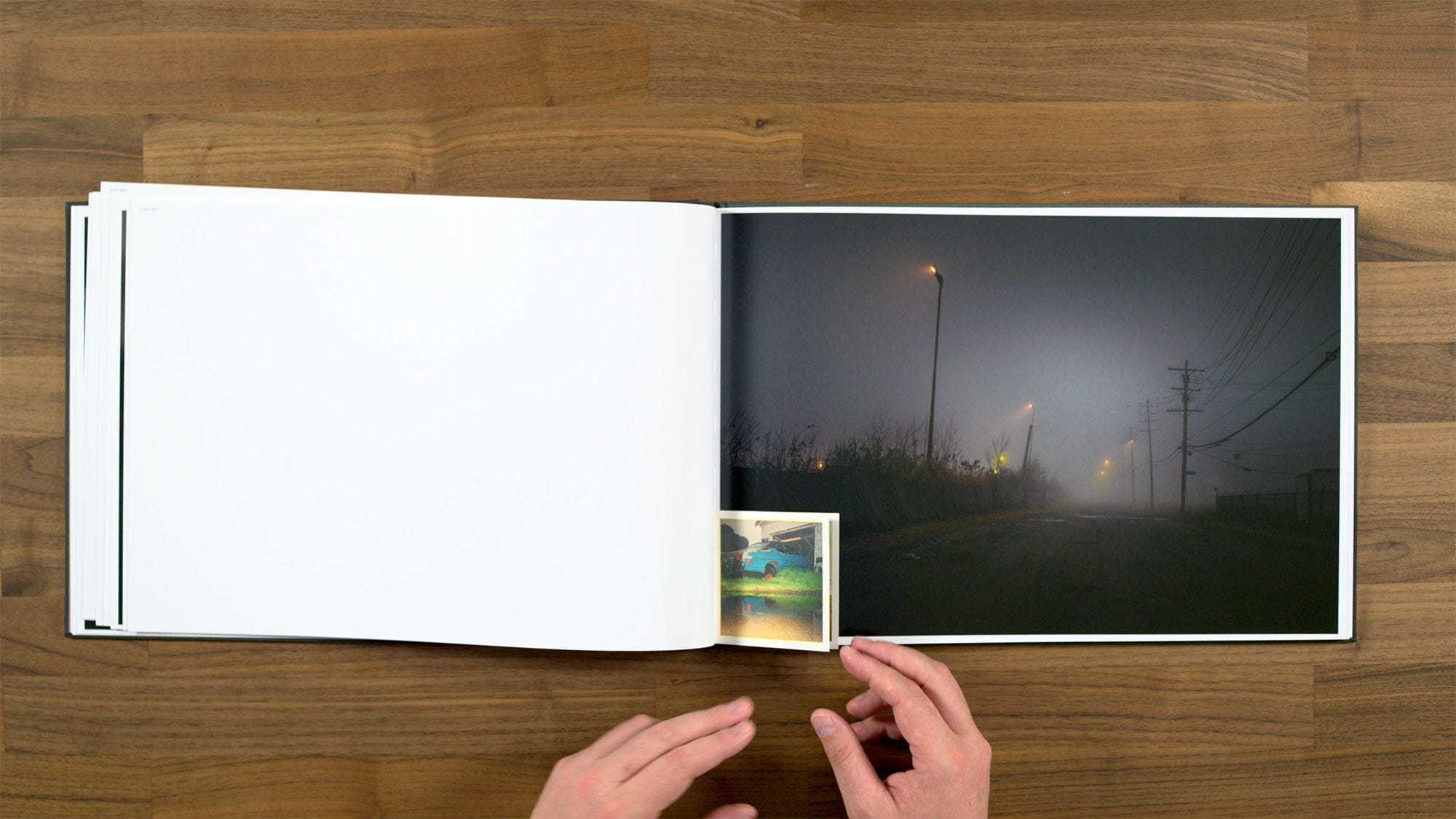
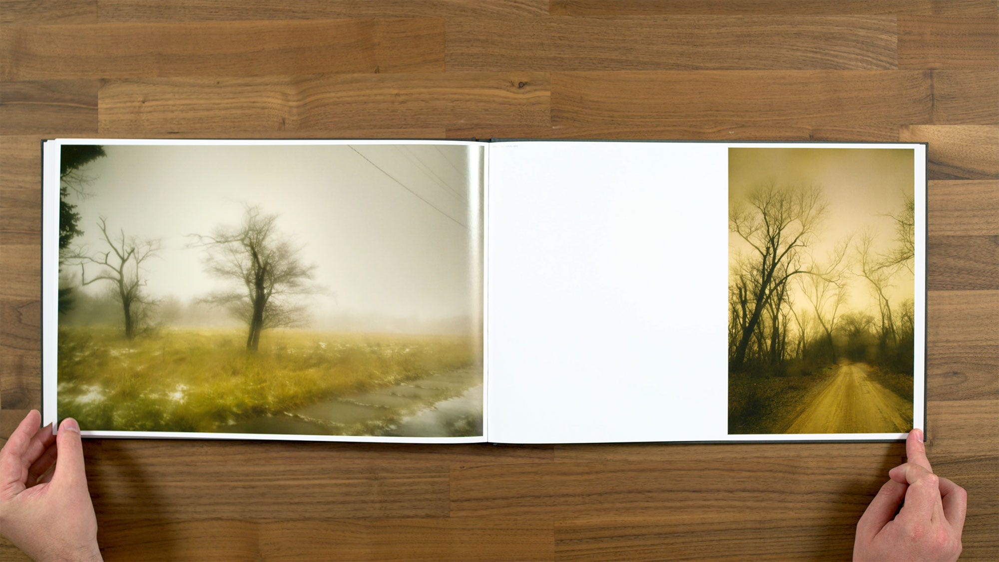
This one feels like a little bit of a letdown as the second spread in the book. The first one was already somewhat subtle, but this main image is very subtle and also quite dark (maybe even too dark to really read properly). This spread also beginning of these little tipped-in or bound-in images. Todd talks about these as being specially inserted little motifs that are either echoes or remembrances of the past. Something that maybe gives you an inkling of what may have happened there prior, or maybe it's like a daydream of the future.
I do think that some of them later in the book work quite well. This one, however, feels a little bit visually disconnected, particularly as a way to begin using this element in the book. Maybe by pairing an image of a beach at night with an old sepia toned image of seagulls is meant to be ‘a remembrance of seagulls past,’ but I'm not sure that it’s really working. I definitely don’t enjoy its placement in the sequence, as it feels like it sort of throws off the books rhythm just as it’s beginning.
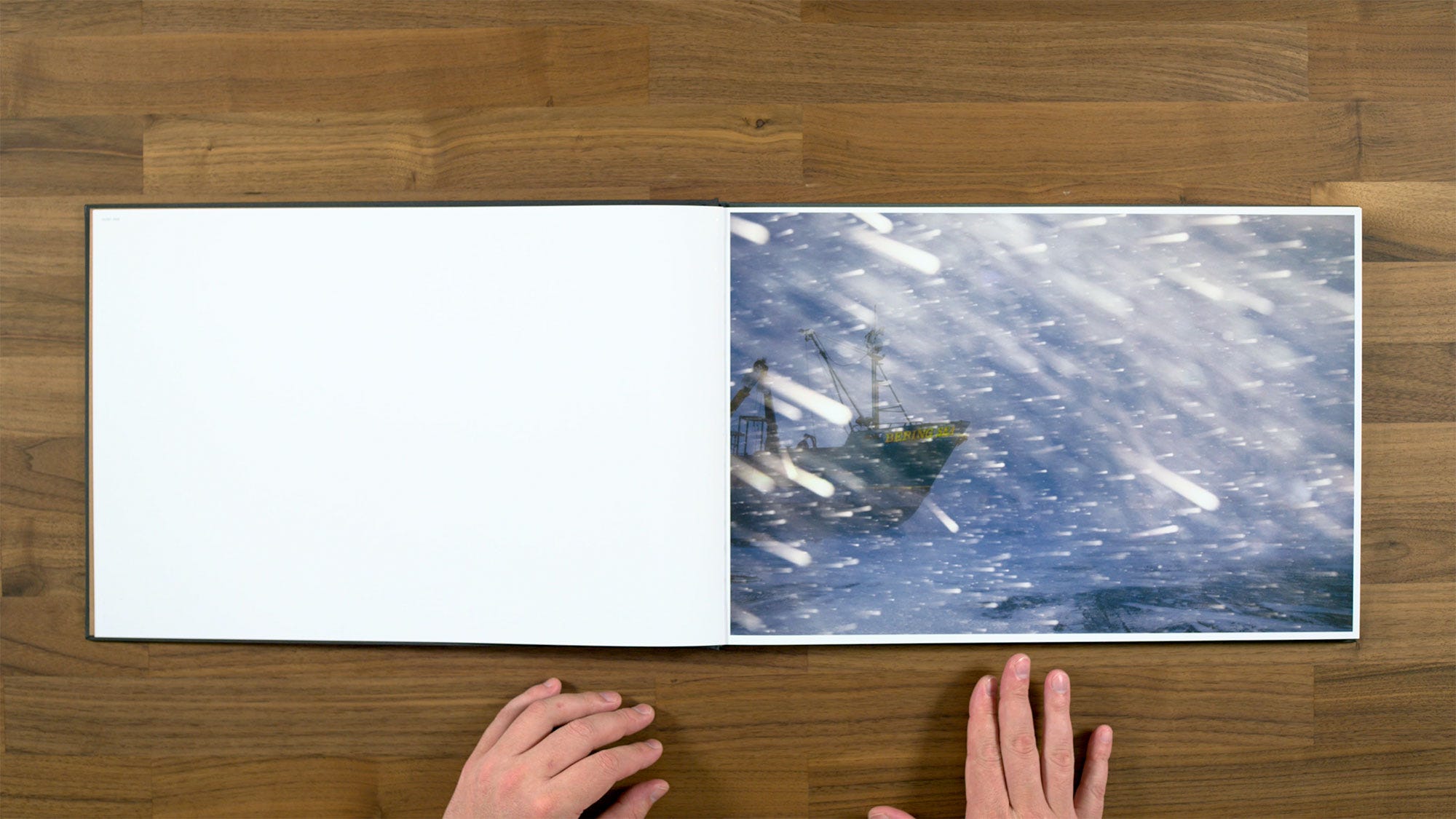
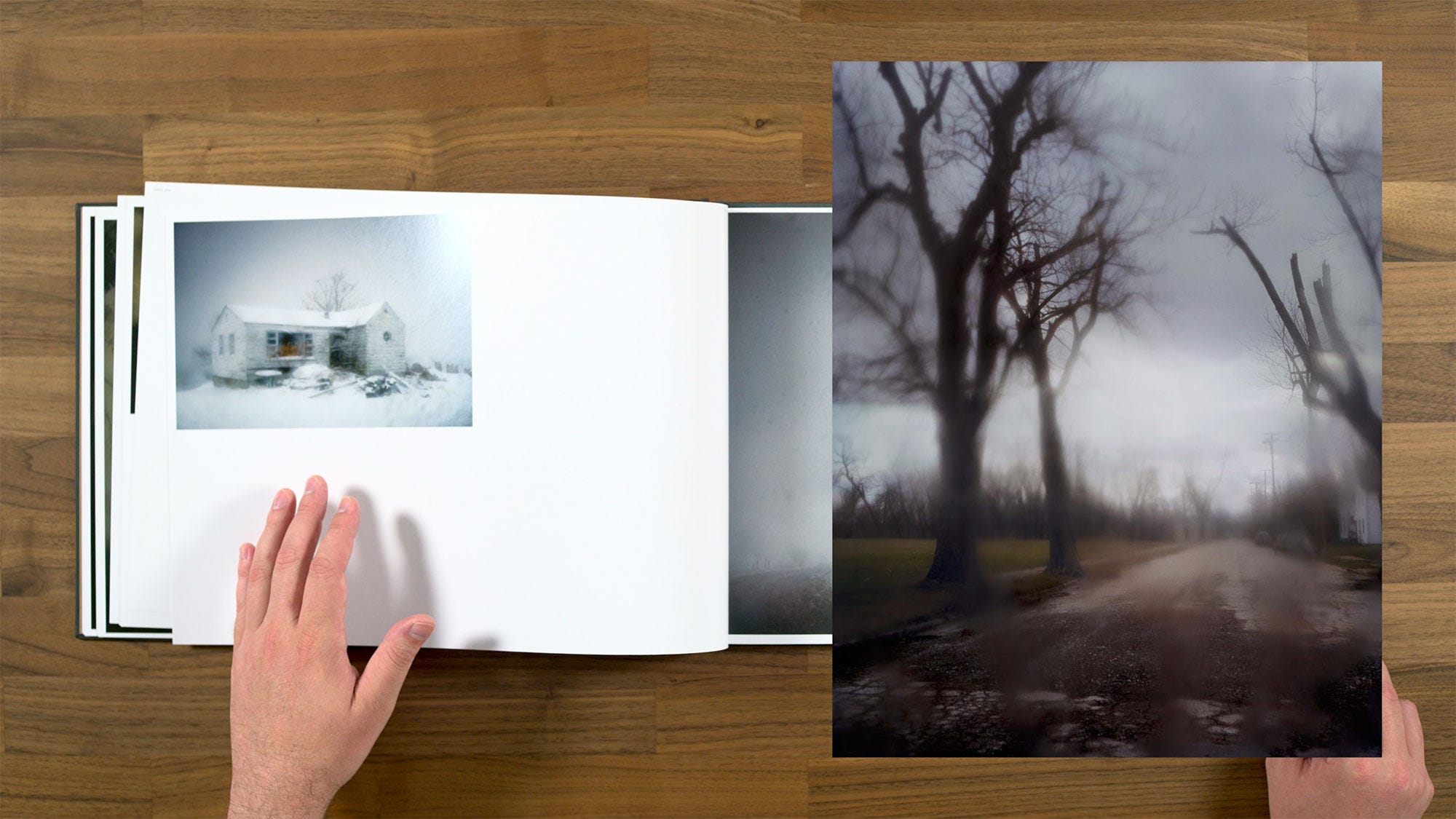
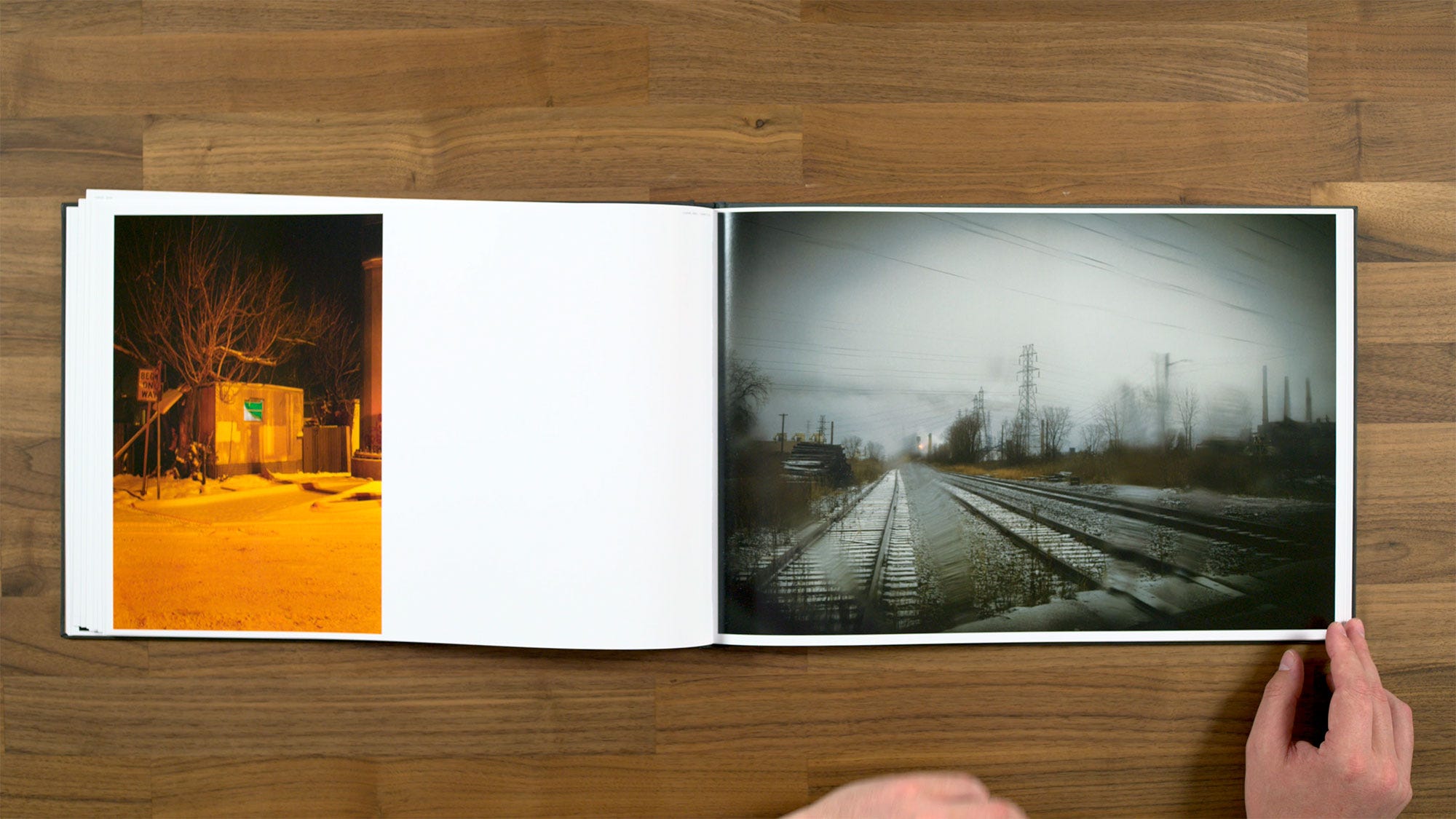
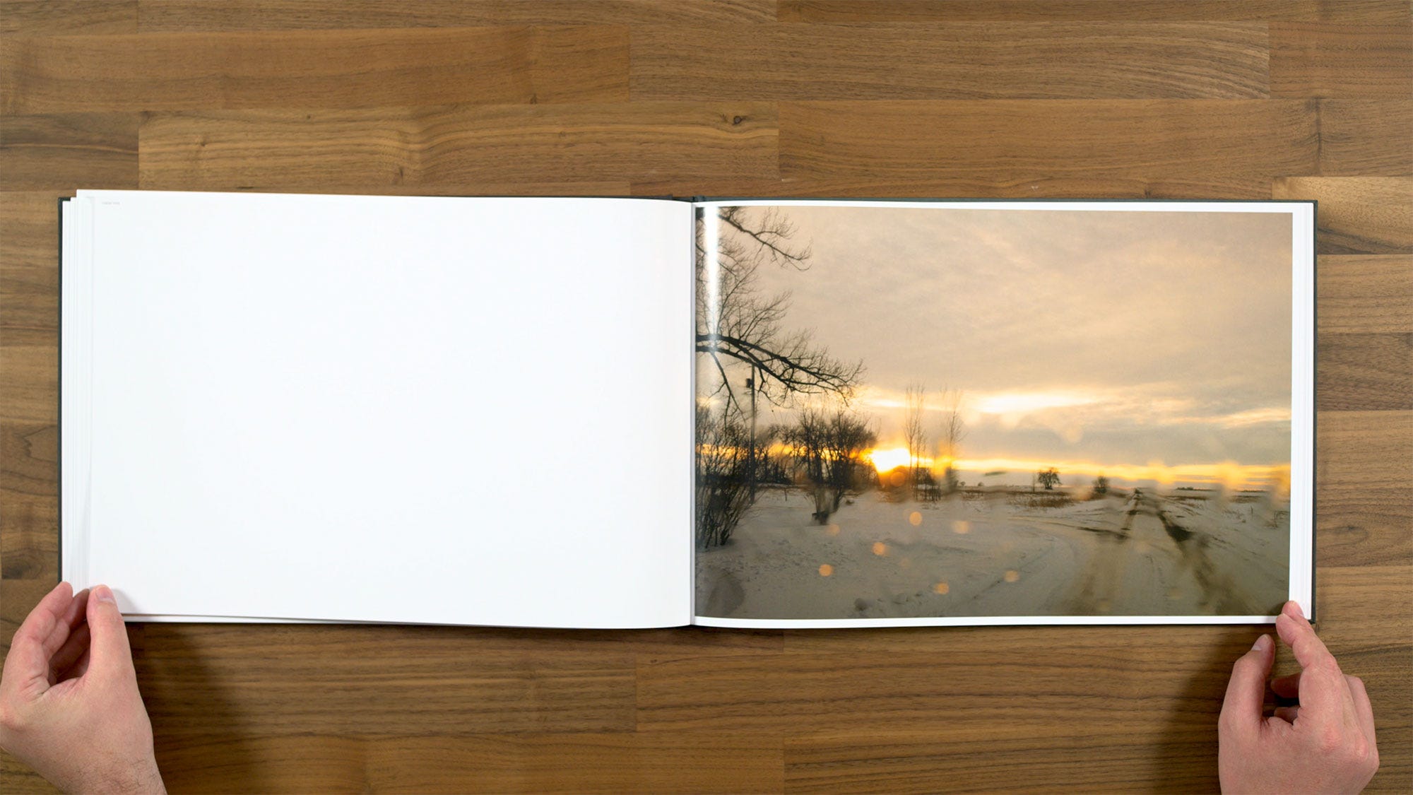
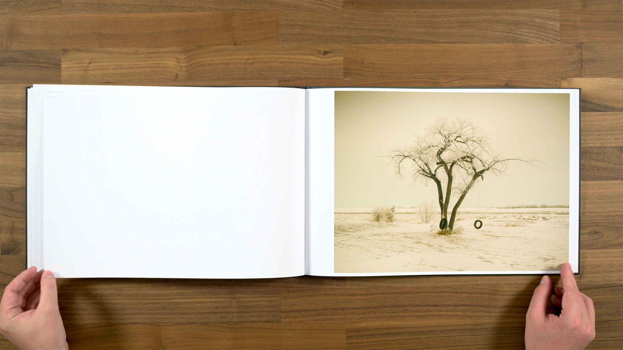
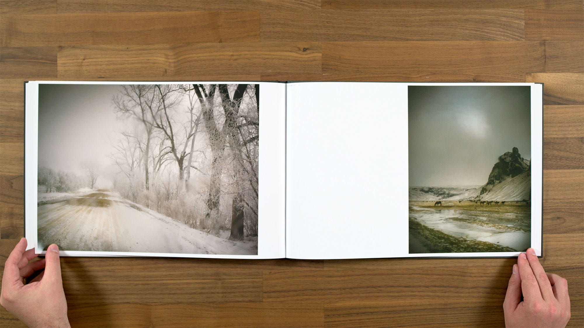
We do start off on a really strong note with this next image though. I personally always like to start a book off on a high note, with bold image that really grabs your attention and draws you in. So this would actually have been a great opening image in my opinion. I love how the flash is interacting with the falling snow in a Lars Tunbjörk type style.
I think the images on this spread are a nice complement to each other, there’s quite a bit of conceptual distance between them. The one on the left has a particularly classic Todd Hido kind of feel, but they each have their own distinct subject matter. This gives you as the viewer plenty space to draw your own connections between the photographs, because they're not directly related to or repeating each other.
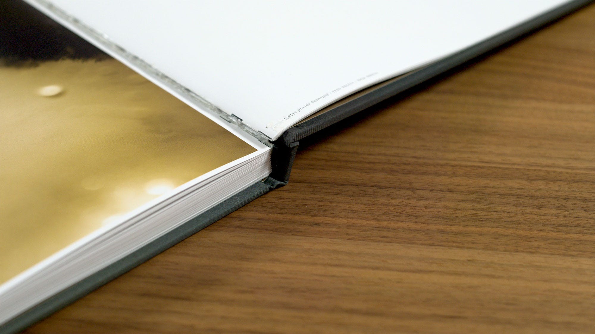
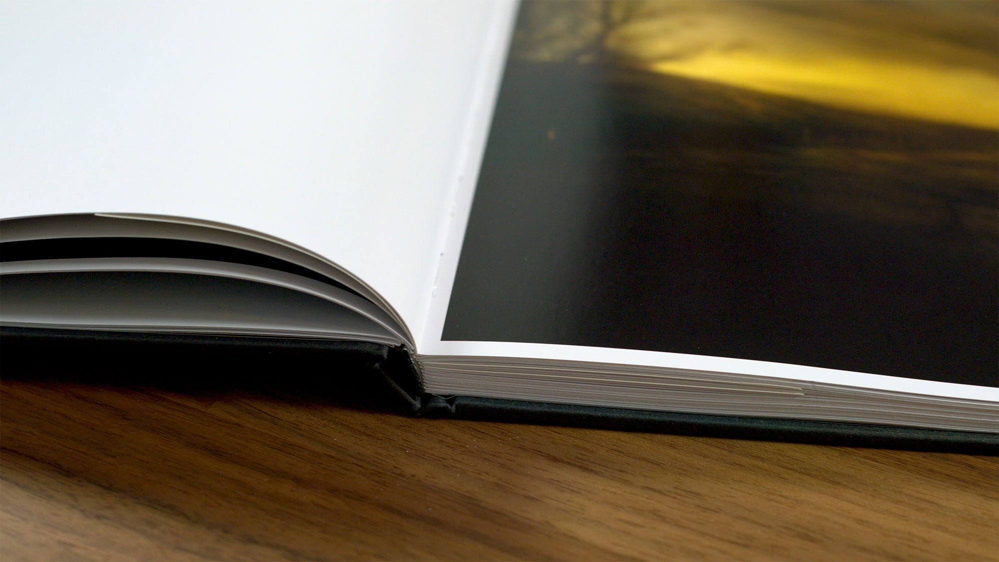
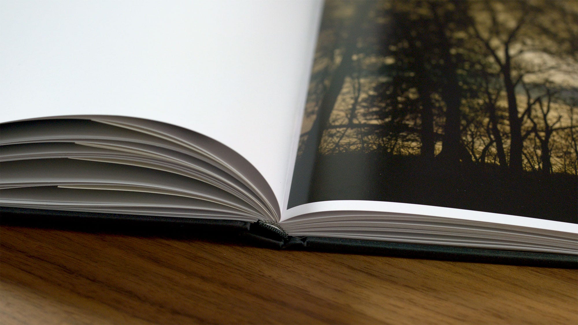
In this copy of the book, you can see that this page is unfortunately a little bit misfolded. Binding such large pages often requires more steps that are done by hand, or with different (usually less precise) binding equipment than what they’re typically usually using. As a result, you’ll often will run into more quality control issues by making a book with really large physical dimensions.
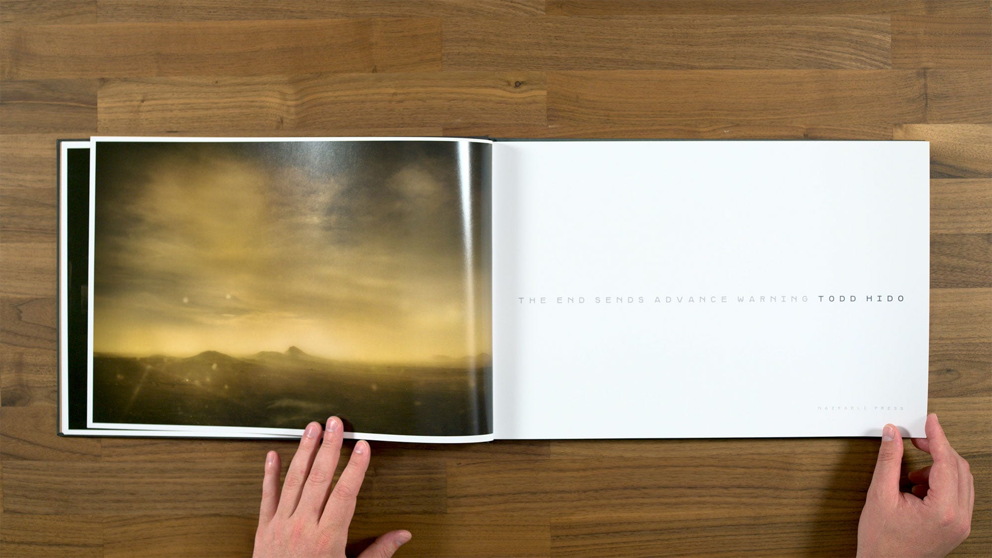
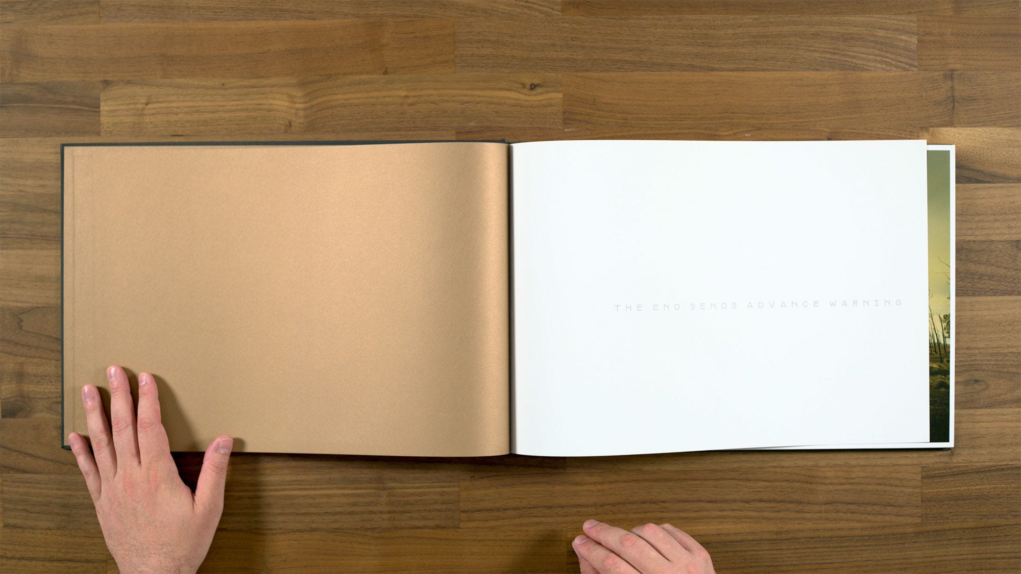
Here we discover that the first part of the book that we’ve already seen was actually more of a prelude. We get a second title page before launching into the full body of the book.
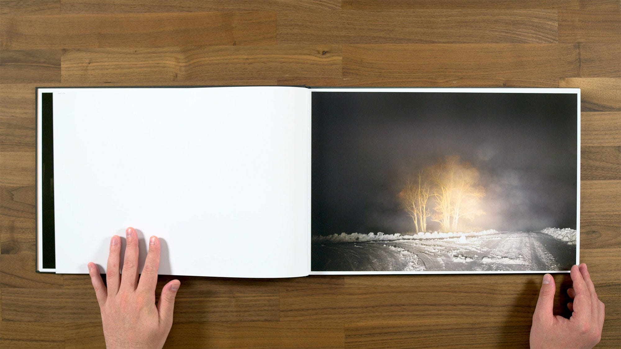
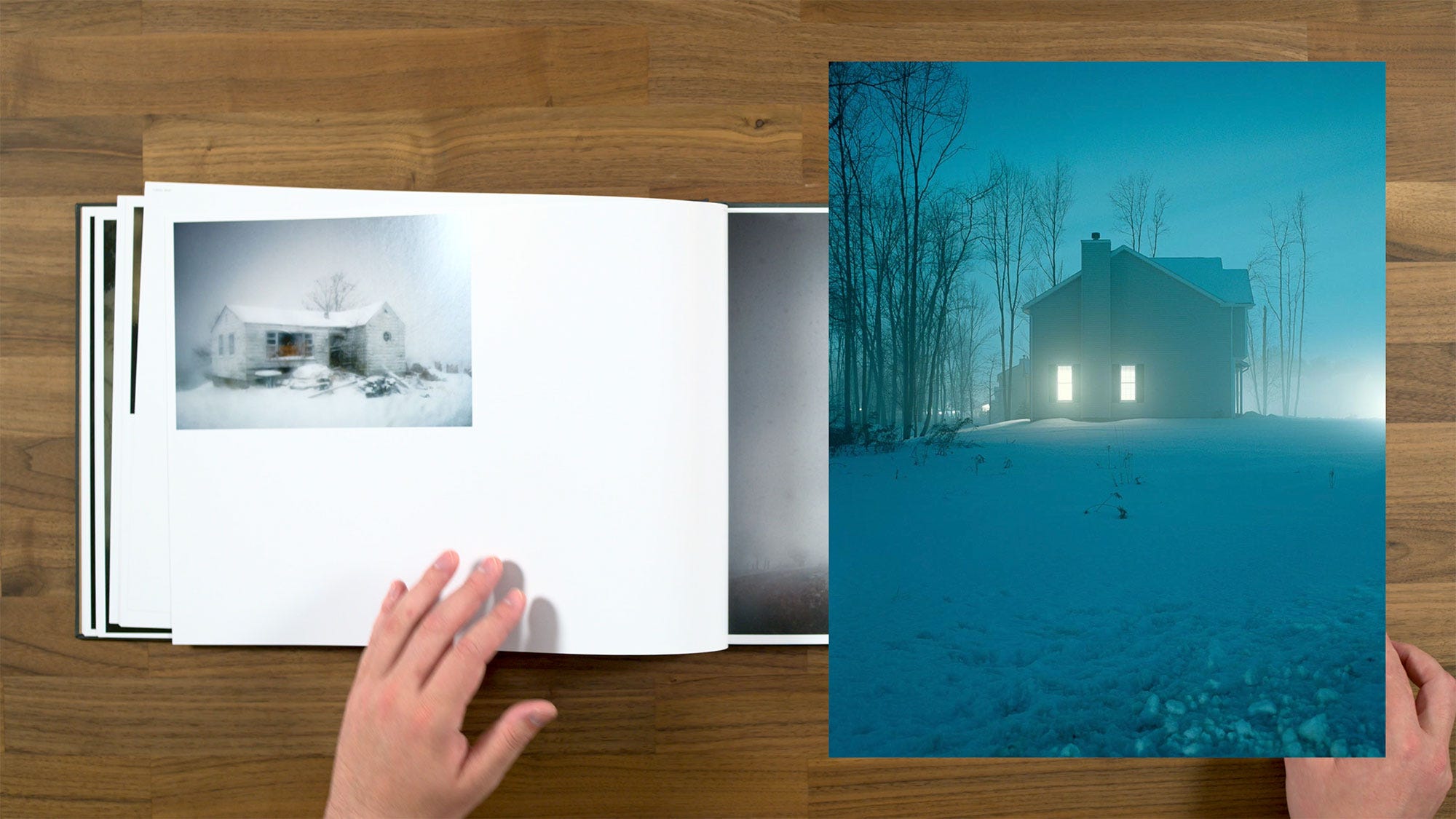
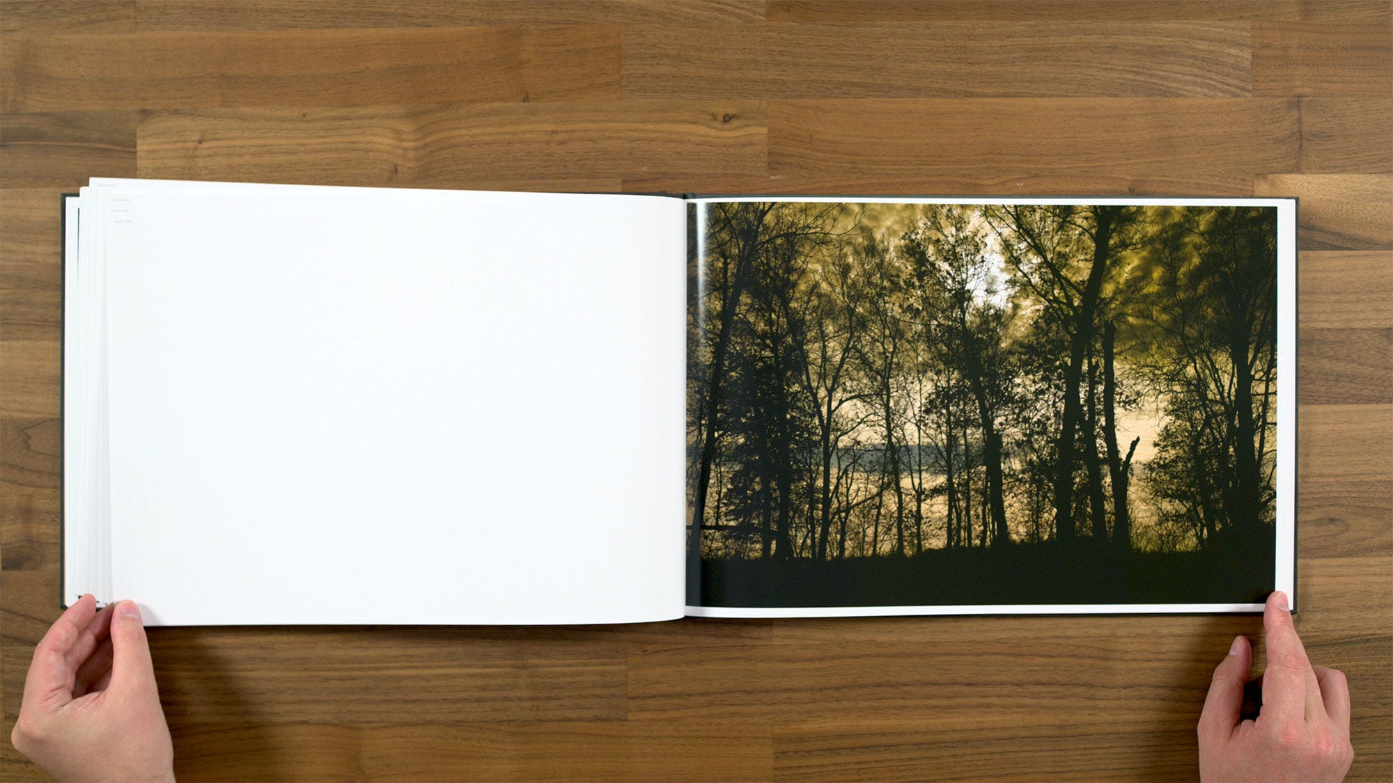
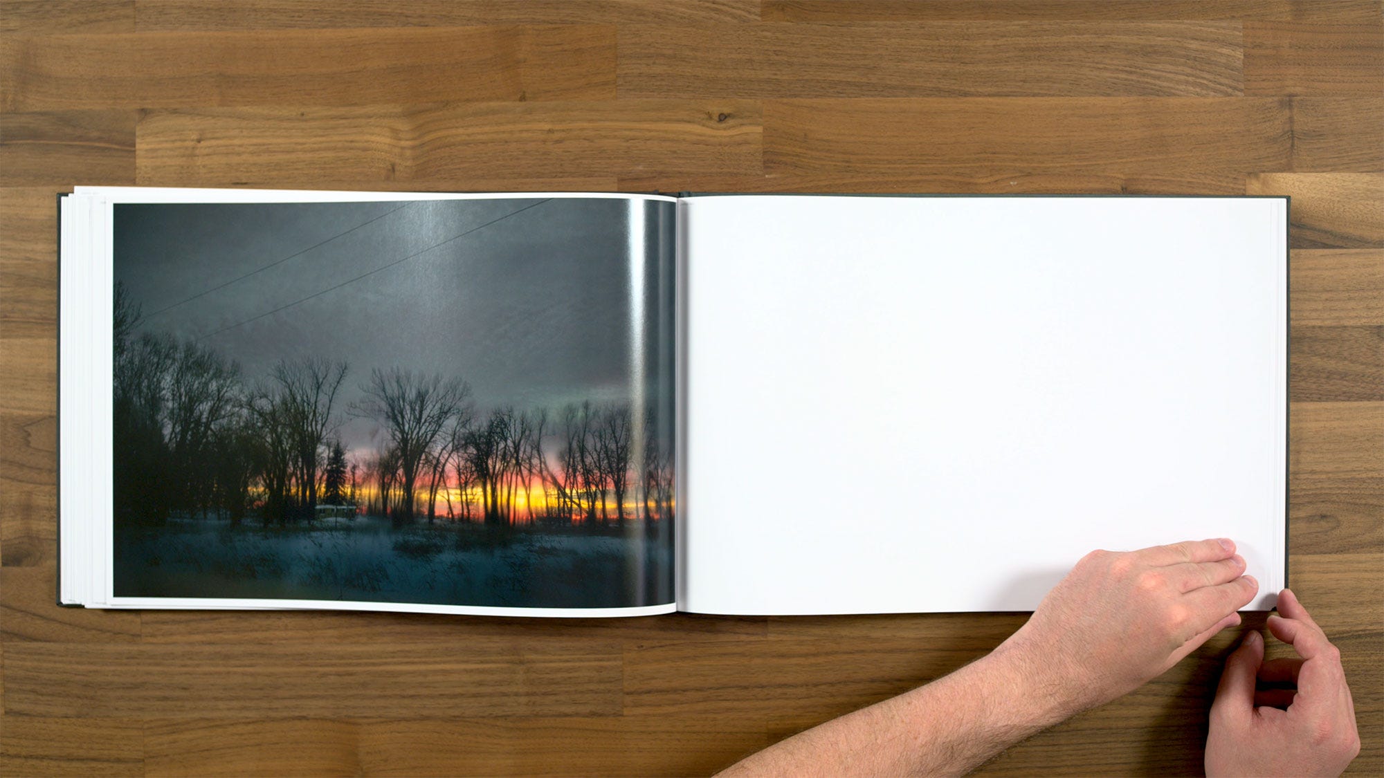
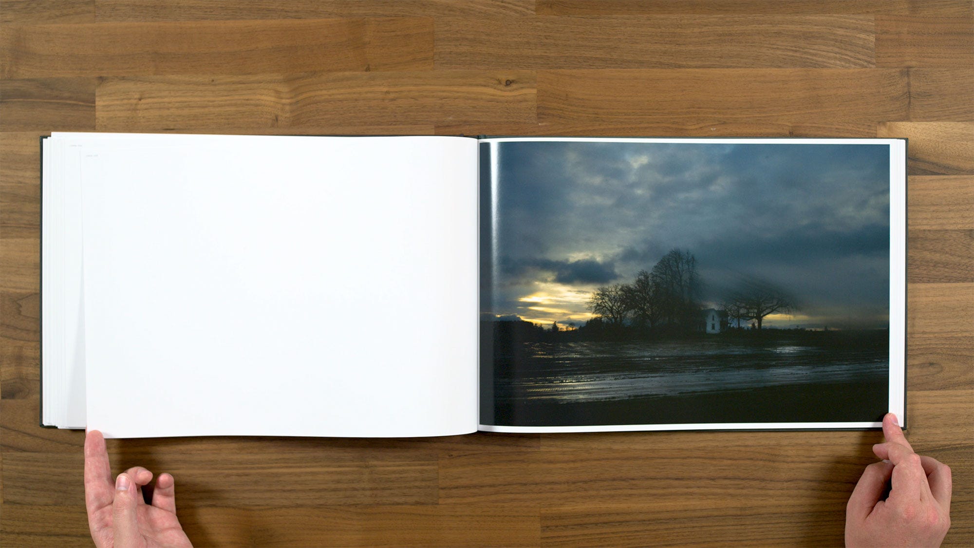
Todd has said that he will often revisit places that he's photographed before. This image is from the exact same location as the cover of his earlier book, Roaming (only this one's at night).
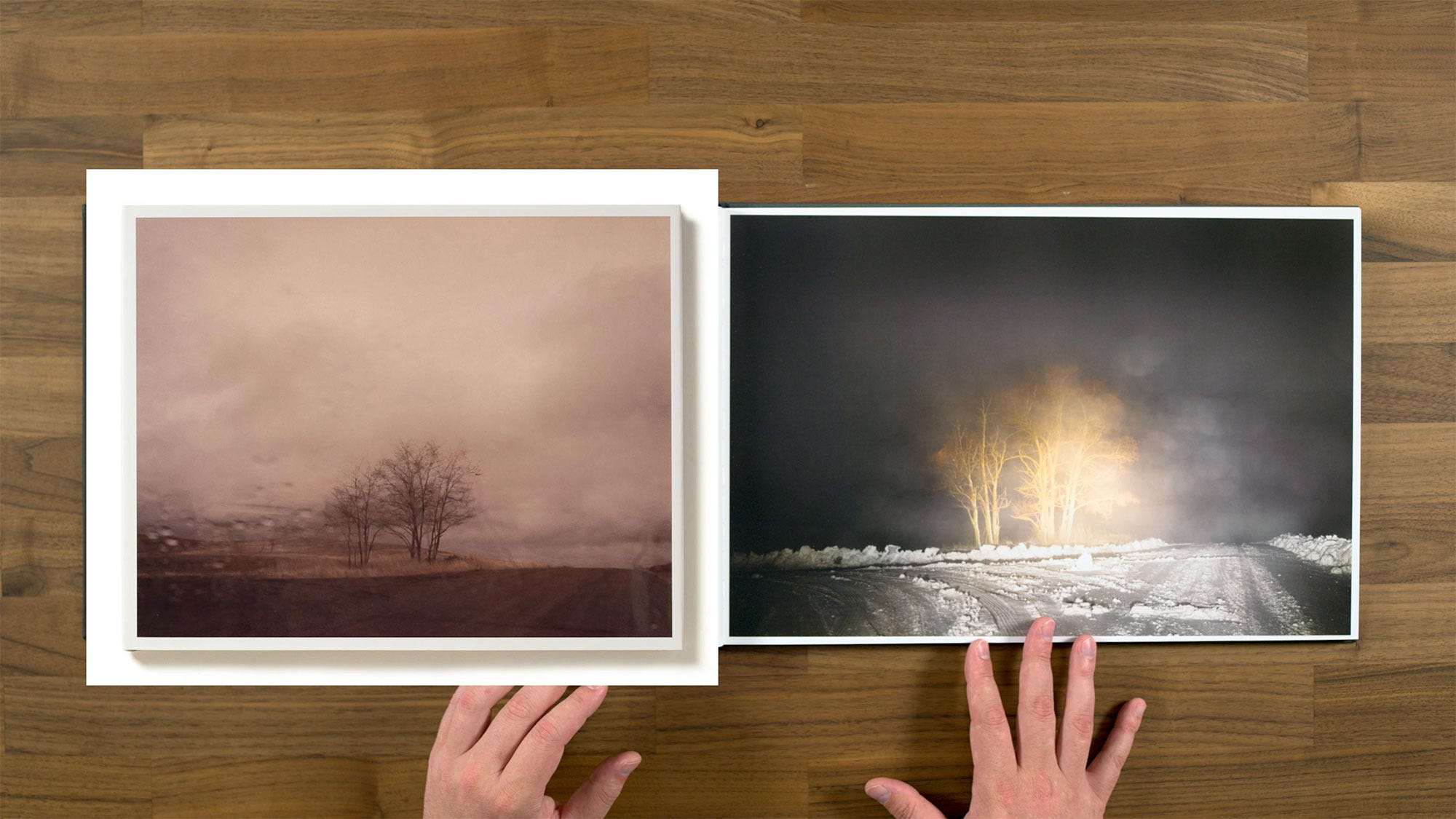
They're almost kind of reverse images of each other. The trees are the darker area in the Roaming version, whereas in this version, the lit trees are popping out against the dark sky. I find it to be quite a striking image.
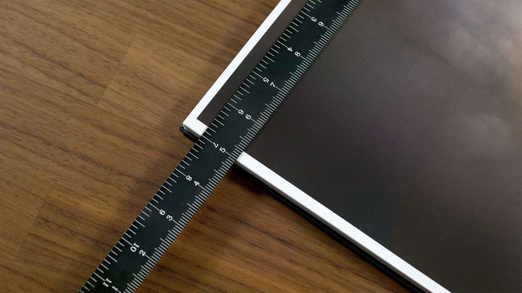
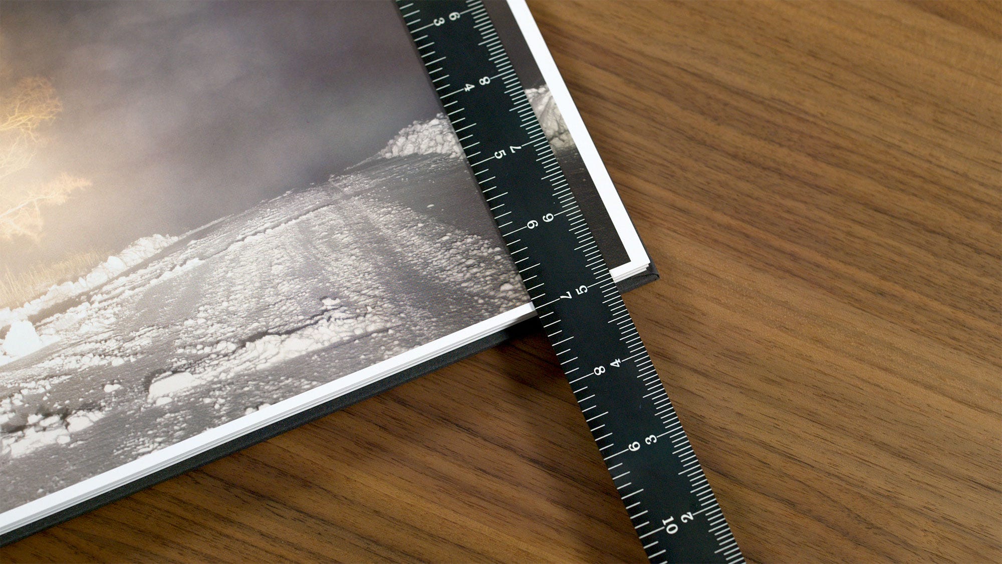
Something I wanted to note here when it comes to design and production, is that this book has very, very small margins around really large size images. You can see that it looks like they're intended to be slightly less than 1/4” margins. But this page was actually trimmed a little bit crooked, and so you're down to about an 1/8” margin on the bottom. As a result, you also have a little bit of extra margin on the top.
This is definitely is not something that was intended on purpose, also it is a fairly common production issue. It’s definitely something you need to be aware of as a book designer. You may want to create a design utilizing really small margins, but producing books is not like making fine art prints. Commercially mass produced books is typically have an 1/8” margin of error, so inevitably your trim will sometimes be a little bit off. If you don't want that ever to be an issue, you’ll need to use larger margins in your designs.
For instance, if you had 1” or even 3/4” margins, being an 1/8” off would not be super noticeable. But with 1/4” margins, being an 1/8” off is definitely is a noticeable issue, as you see here. This is obviously a trade off that Todd Hido and Nazraeli Press (who published the book) were willing to make in this instance, since I’m sure they were aware that the with such small margins, some copies would have issues like this.
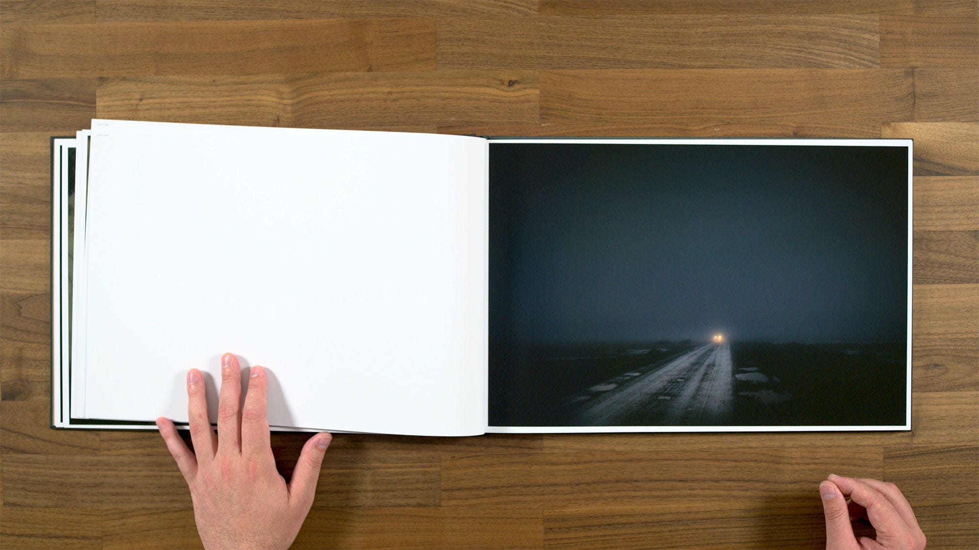
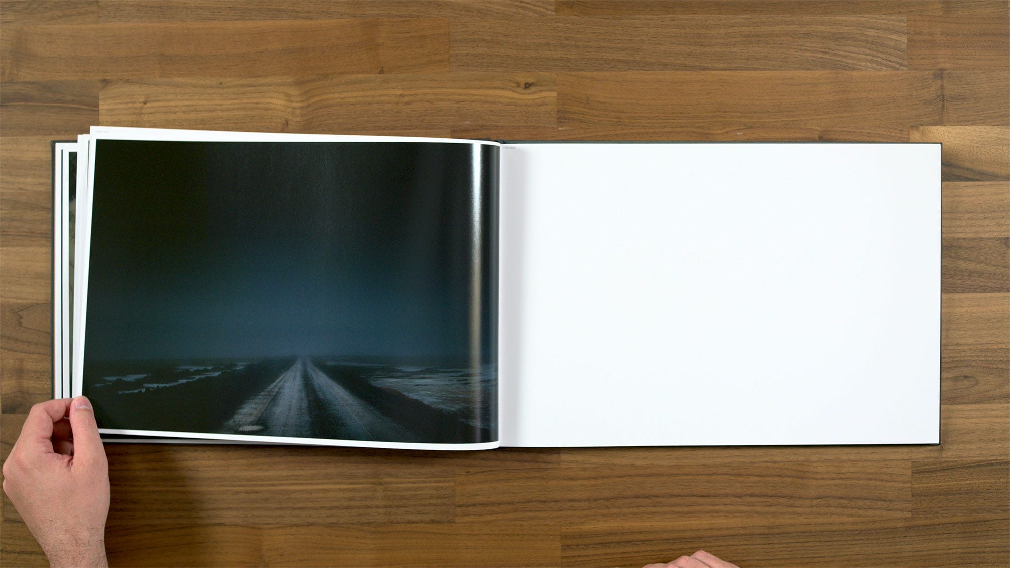
Here we have a nice little sequence where images on subsequent pages are different enough to surprise you. You don't feel like you're seeing exactly the same thing back to back.
Compared to the first tipped in image, this time we have one that’s sewn into the binding. I feel like there's a lot more connection I'm able to draw between the photographs on this spread versus the first time we saw these little inserted motifs. These ones definitely feel like they're talking to each other, and they have something to say.
Looking through this book, my impression is that it's very much in the tradition of Todd Hido’s previous books like Roaming, A Road Divided, or even the one that he made right before this, Bright Black World. So if you are a fan of those books, this book definitely feels like it's in the same vein.
Looking at the margins, you can see that the gutter is the same size as the edges of the page. Later on though, we'll see that's not always the case.
Here we get to a part of the book that I personally think would have been a bit stronger if they hadn’t paired these images together. Actually, it might have been even better to simply cut these two. Both of them are pretty much just silhouettes without a much shadow detail or graphically interesting negative space.
At first glance, it almost feels like you're looking at two versions the same thing. I don't feel like they do much to inform each each other either. If anything they end up as somewhat less than the sum of their parts.
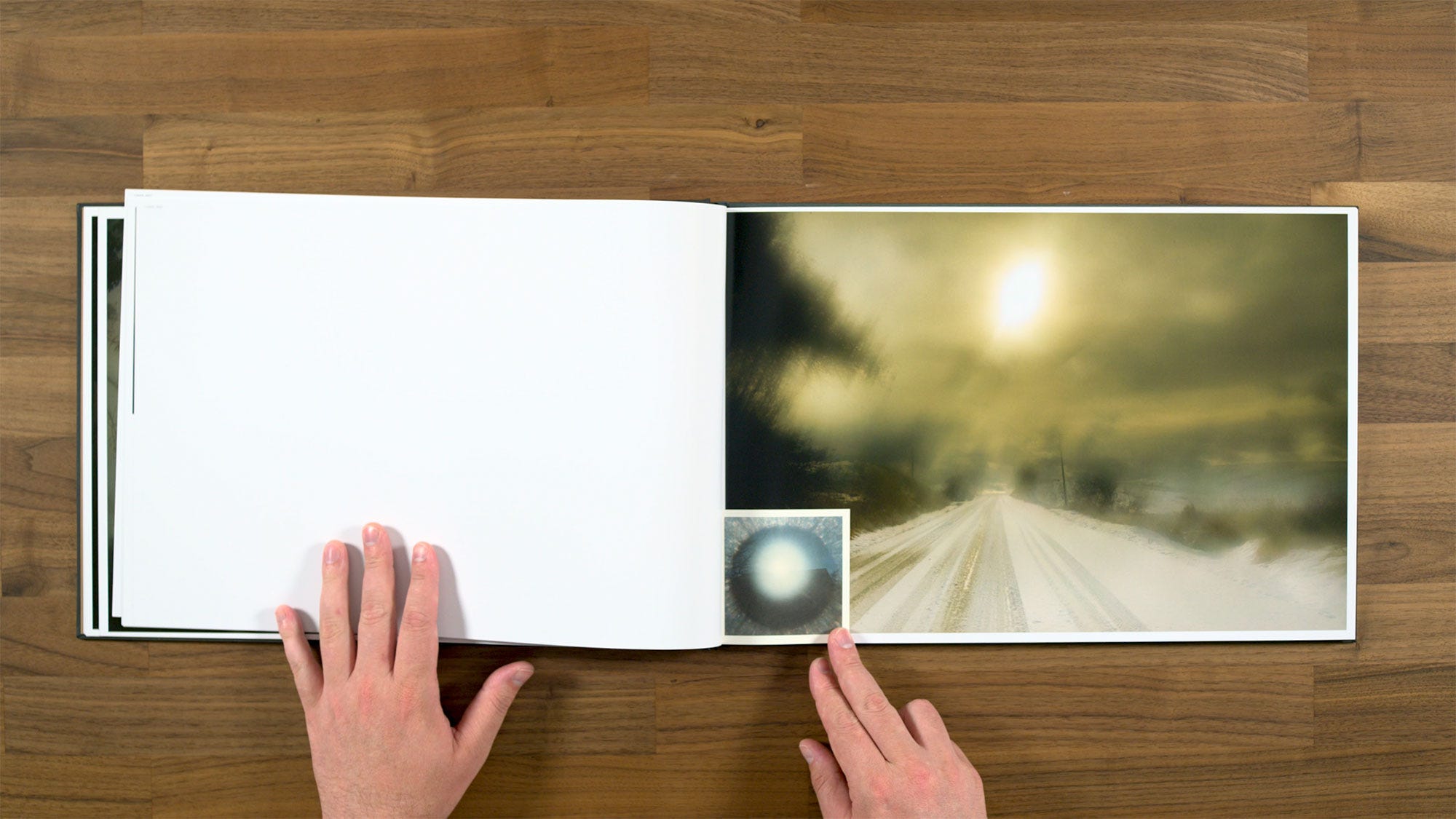
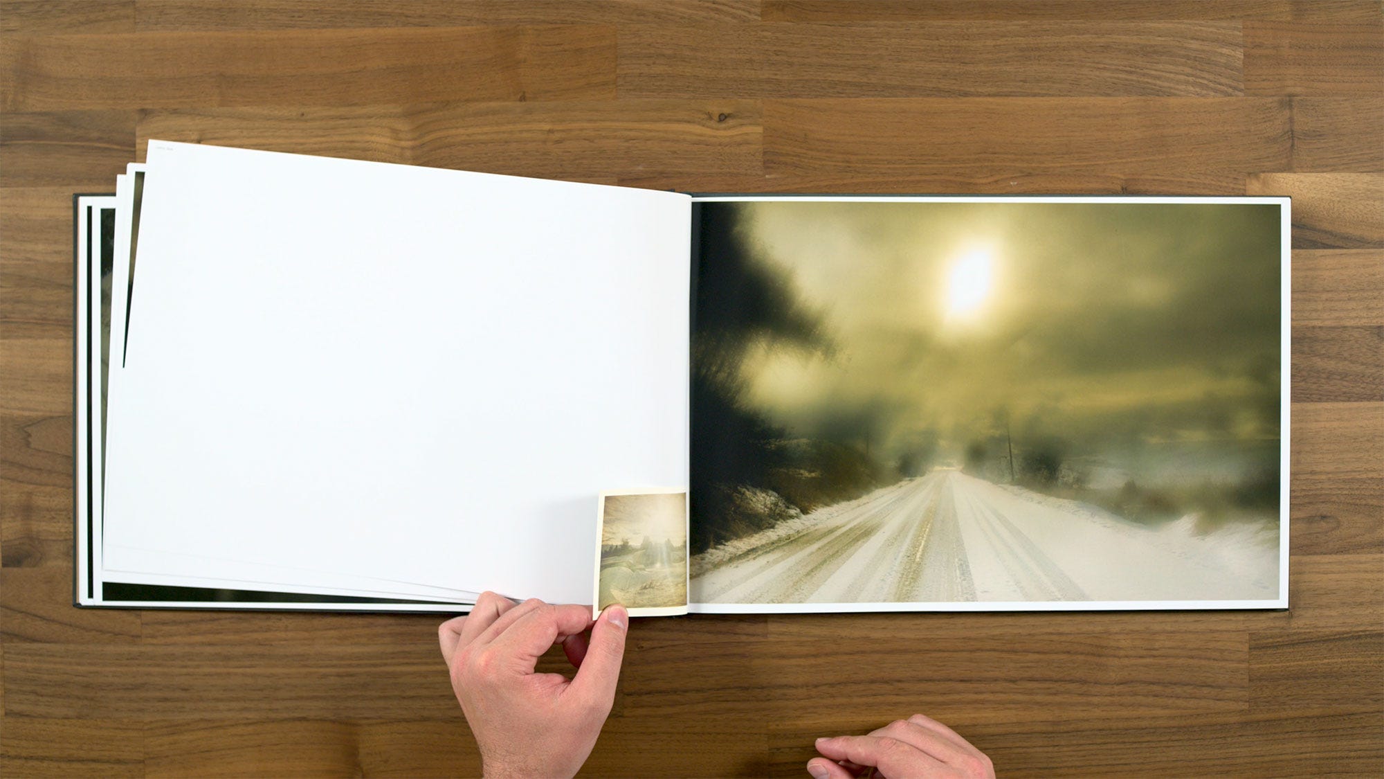
This spread has another little bound-in instamatic image, which kind of mirrors the sun and vanishing point road. Even if it’s fairly straightforward connection, it works by at least being visually interesting.
Similar palette on these two, but the differences in subject matter and scale make for a nice pair. This one on the left definitely feels like a very classic Hido image.
It's almost kind of a combination of the Roaming work where he's shooting through the car window, along with a moody house that’s a little reminiscent of House Hunting.
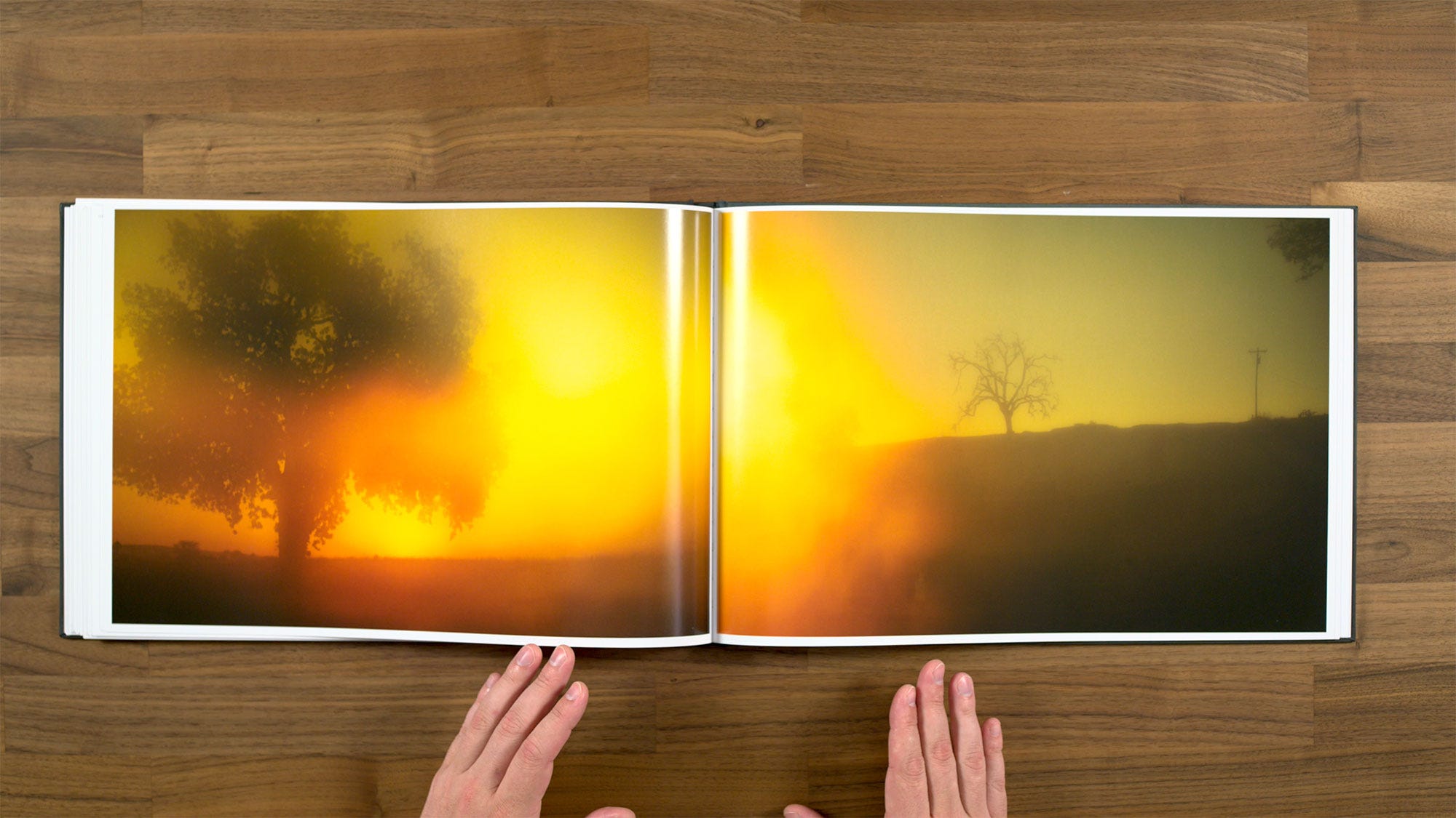
Here's the image from the cover. Notice how much more poppy it looks on paper vs. the soft look from the linen cover. I really like this one, I think it’s particularly strong, dynamic image. It definitely grabs your attention, you can see why it's one of the images that's been used to promote the book online.
Something kind of interesting happens here is when you flip over to the other side, you get a kind of a mirrored image looking the other way down the road. Sometimes I think something like this could end up being a little repetitive, boring, or expected.
However in this instance, I do actually quite like how it works. The physicality of turning the page almost feels like turning your body around 180 degrees and looking down the road the other way. So I think that's kind of a fun little detail.
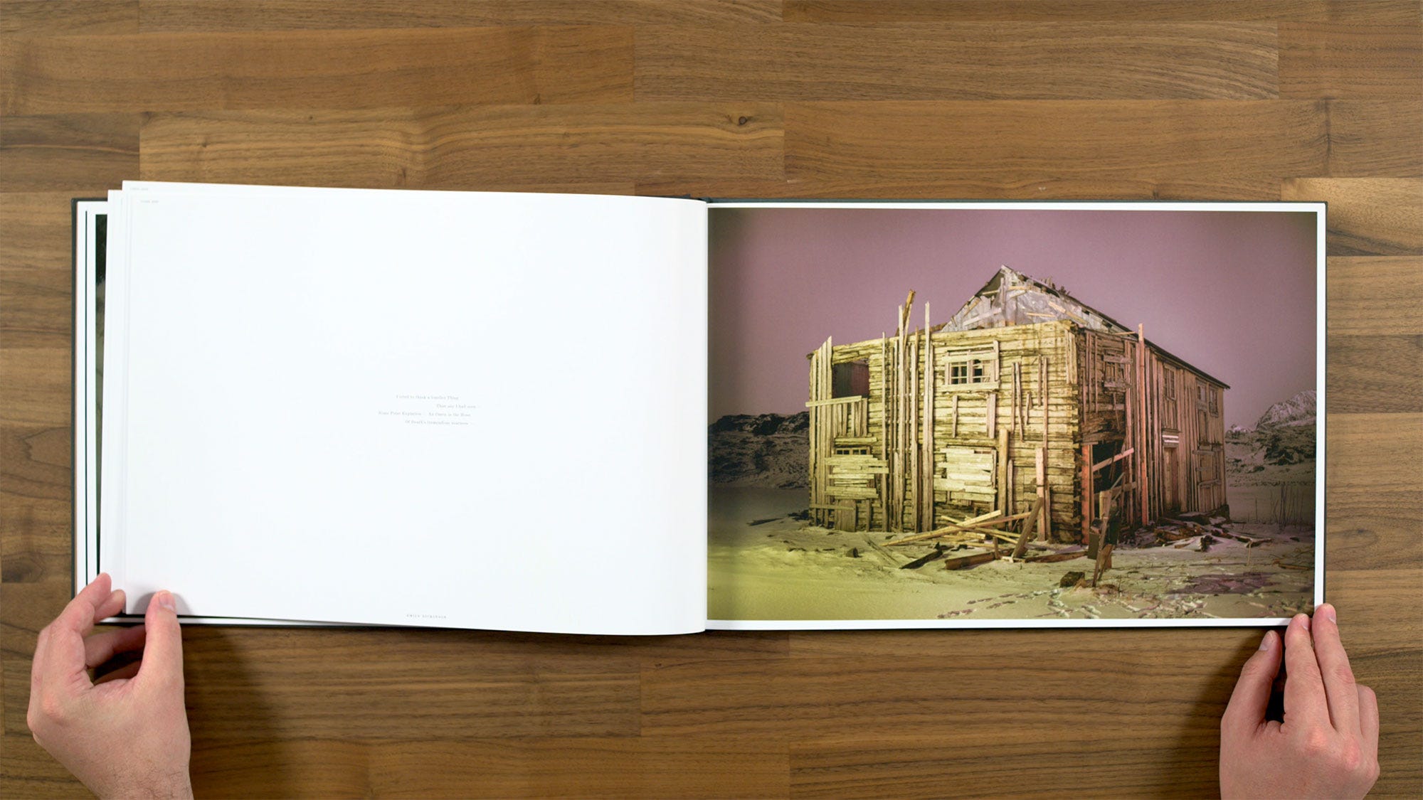
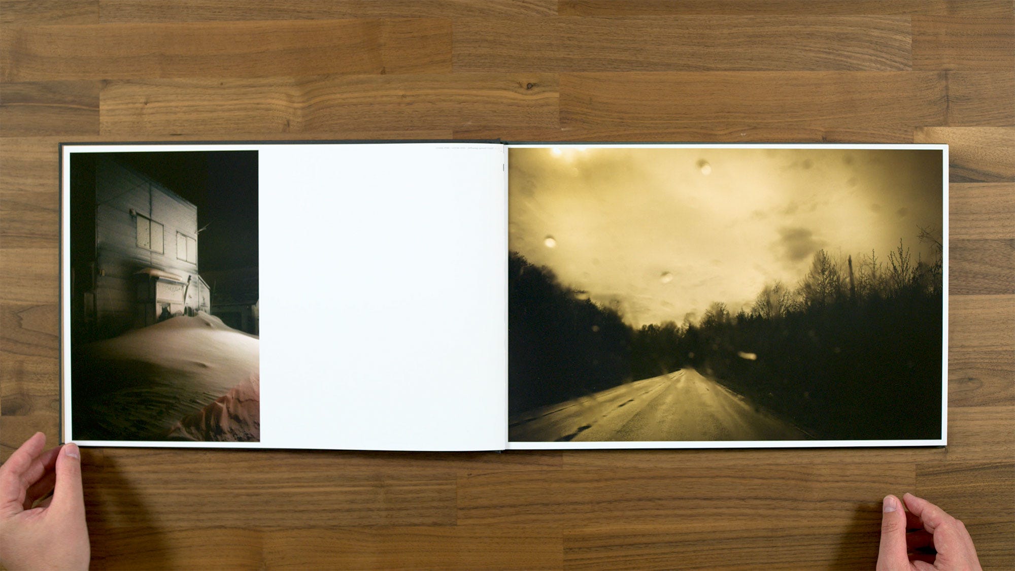
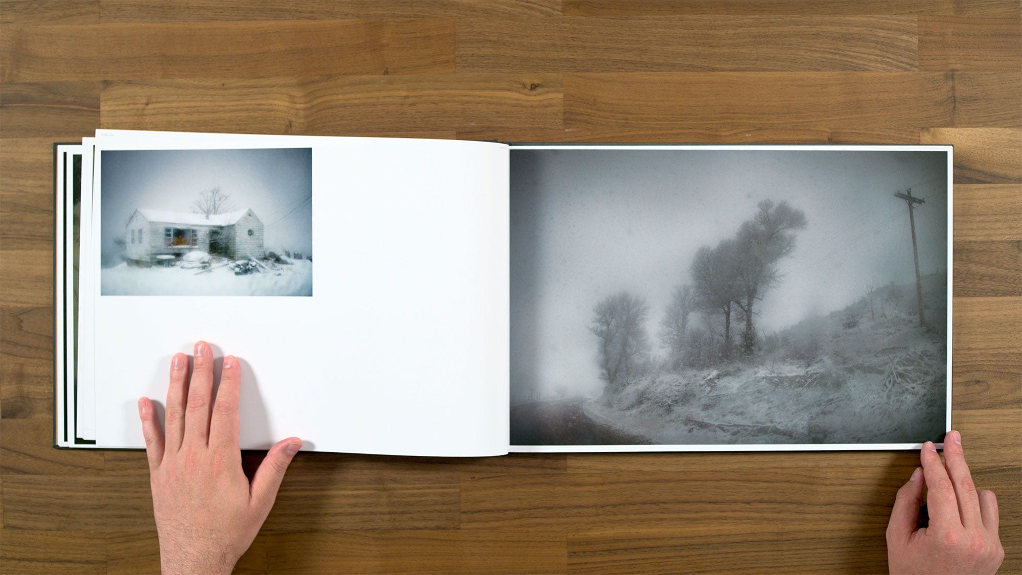
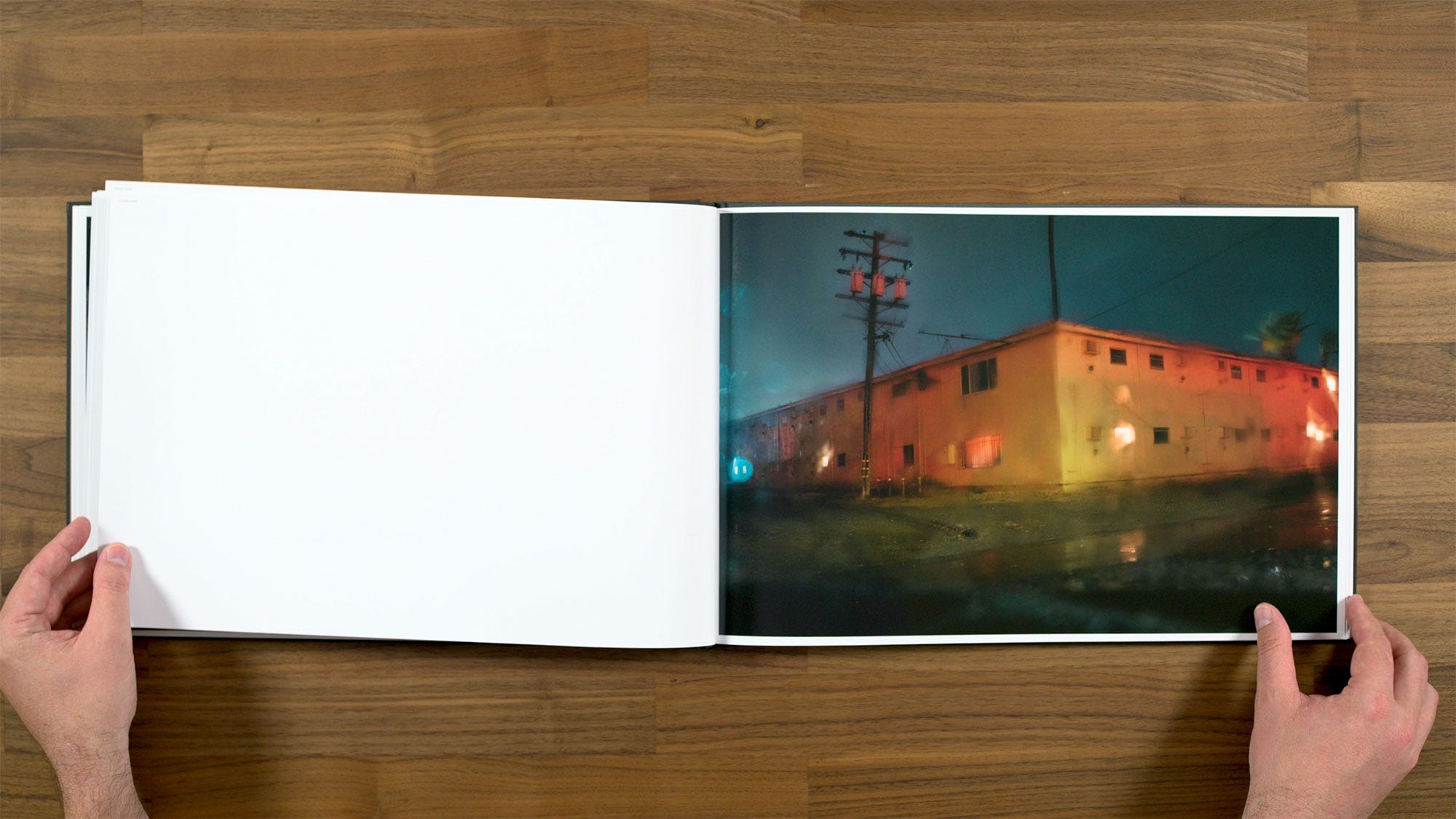
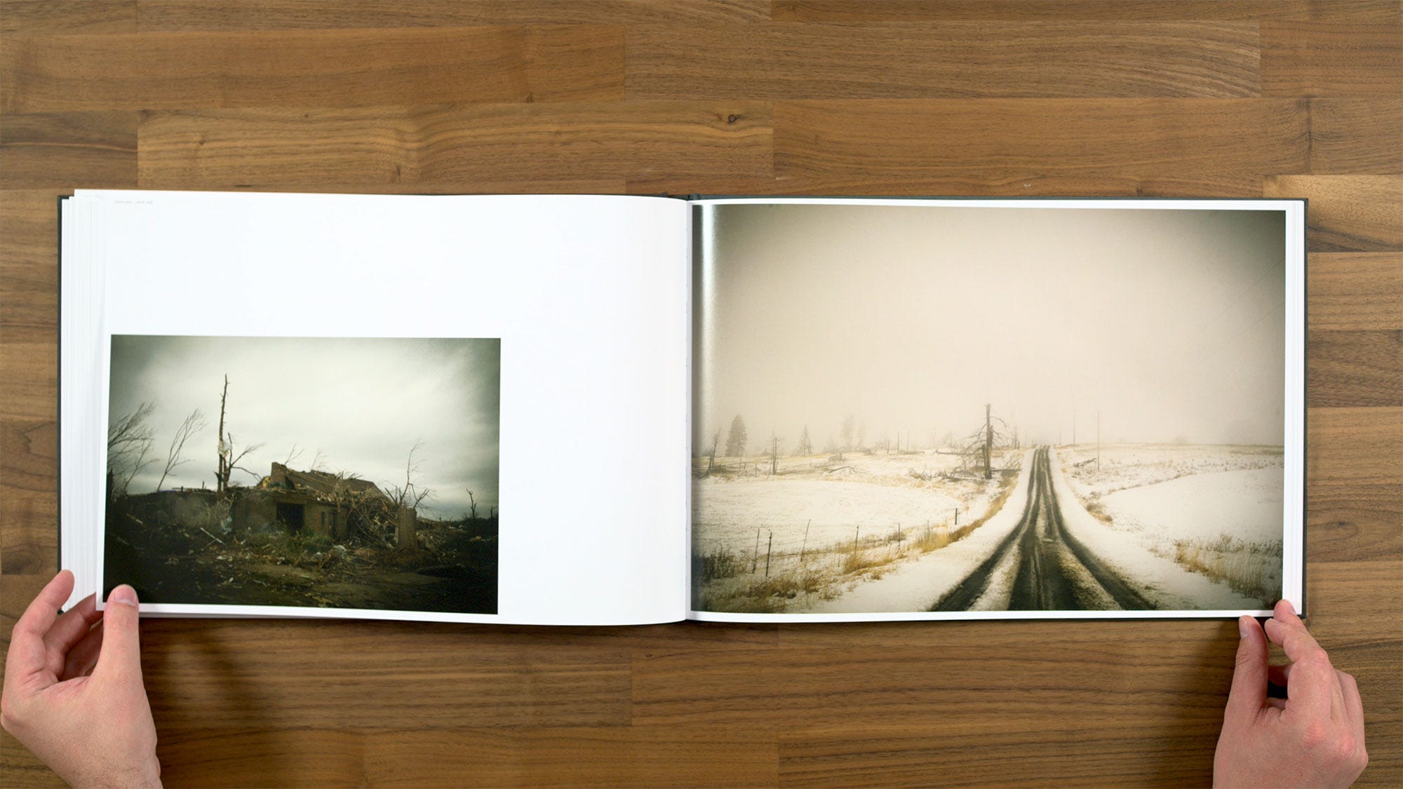
At this point in the book we get another image of a house. Obviously houses have been something that Todd Hido photographed pretty much continually throughout his career, beginning with the work that he really became known for, House Hunting.
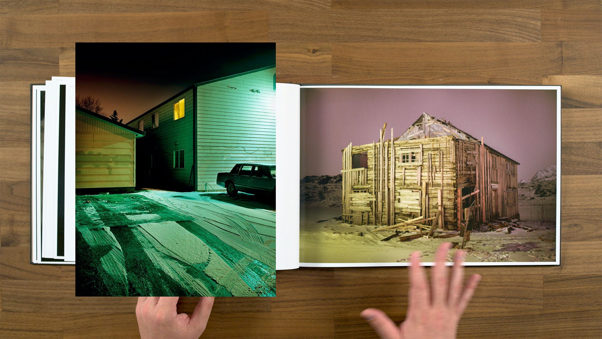
So here’s a photograph of a house at night, but it's a very different type of house than we've generally seen from him in the past. This one is very dilapidated, with wood literally falling off it, which is quite different from the suburban looking houses he’s typically gravitated towards. So a similar subject for Todd, but with a new approach to it.
We also get a rather dark poem from Emily Dickinson to go along with this image:
“I tried to think a lonelier thing, than any I had seen. Some polar expectation, an omen in the bone, of death's tremendous nearness."
Here we're getting another set of images with two different orientations paired with each other. There is obviously is a scale difference between them, but I think they're well paired. I feel like they have something to say to each other, which allows me as the viewer to draw some type of connection between them.
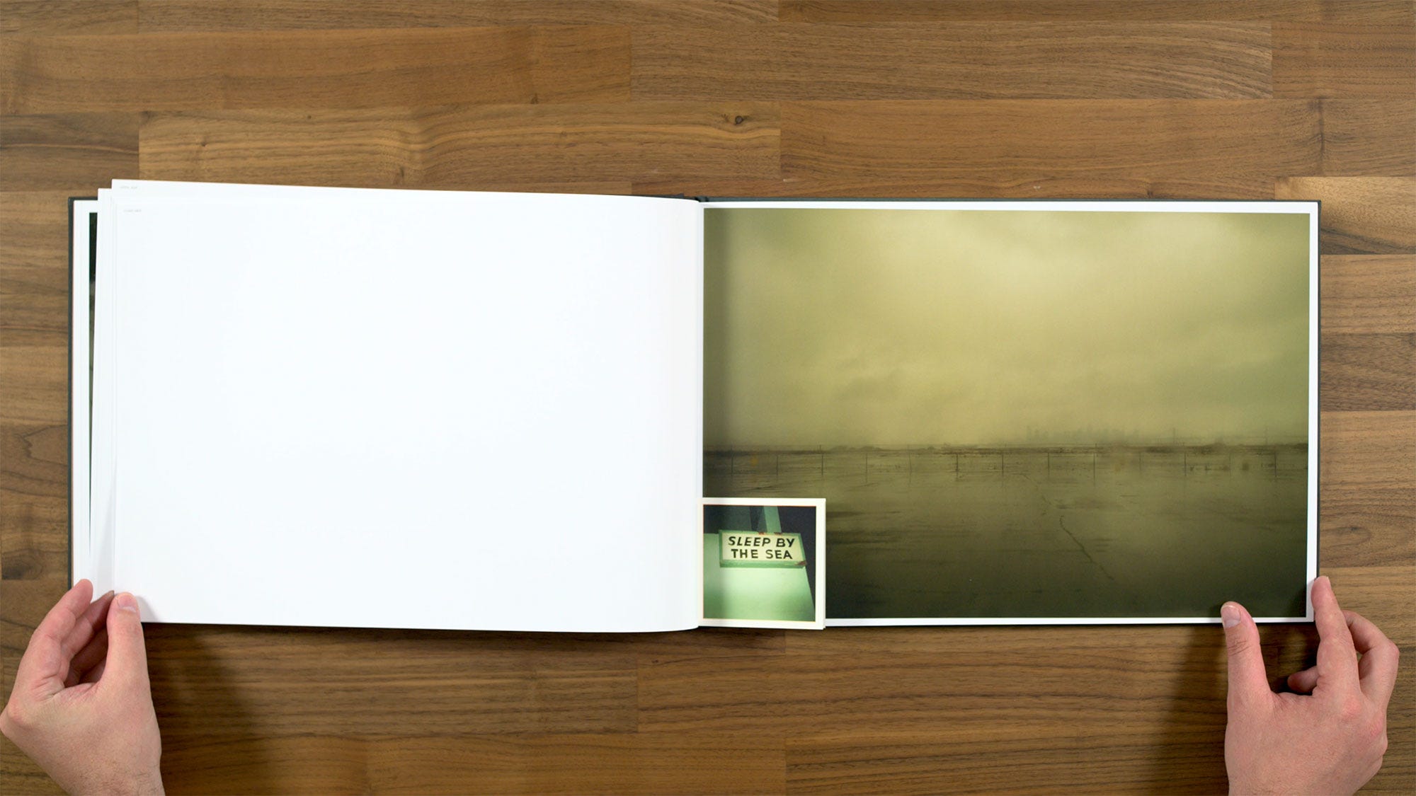
This spread has another sewn-in image, and this one is actually has multiple images. I really like this first little sleep by the sea image along with the larger photograph in the background. That is one of the more urban images in the book, you can actually see the city of San Francisco across the bay in the background behind this desolate parking lot if you look closely.
I also really like how it works with this little beach or seascape painting.
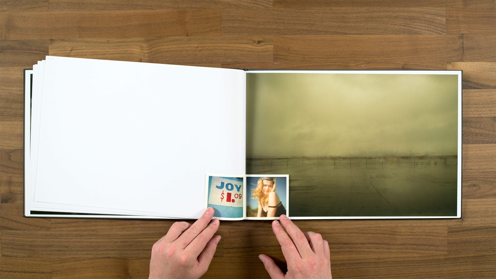
It’s these middle two images I feel less sure about. Particularly the figure on the right, which is the only figure we've seen in the book so far (outside the little vellum booklet that is). It does feel like it’s lacking context to appear at this point in the book, so it’s a rather out there pairing choice.
Although I will say, that these type of seemingly disconnected image combinations are something that Todd Hido has definitely explored to a much further degree in the past. Particularly in his book, Excerpts from a Silver Meadow, where he really went full out with juxtaposing any random type of image he wanted with each other. So what he’s doing here is pretty tame by comparison.
Here we get a really nice one that's a little bit more an industrialized version of the Roaming through the windshield type image.
In this part of the sequence, we’re getting some more of these Roaming type ones, but we’re also getting a little bit of the places at night motifs from House Hunting or Outskirts mixed in as well. Overall with this book you get the feeling that it’s kind of a compilation of the styles and subjects that Todd has photographed many times before. But maybe he's combining them in some slightly different ways than he's done in the past.
Here we have another set of multiple sewn-in images. Something about these two in the middle feel a little off with regard to how their palette interacts with the main image, but I definitely can see how they’re working conceptually.
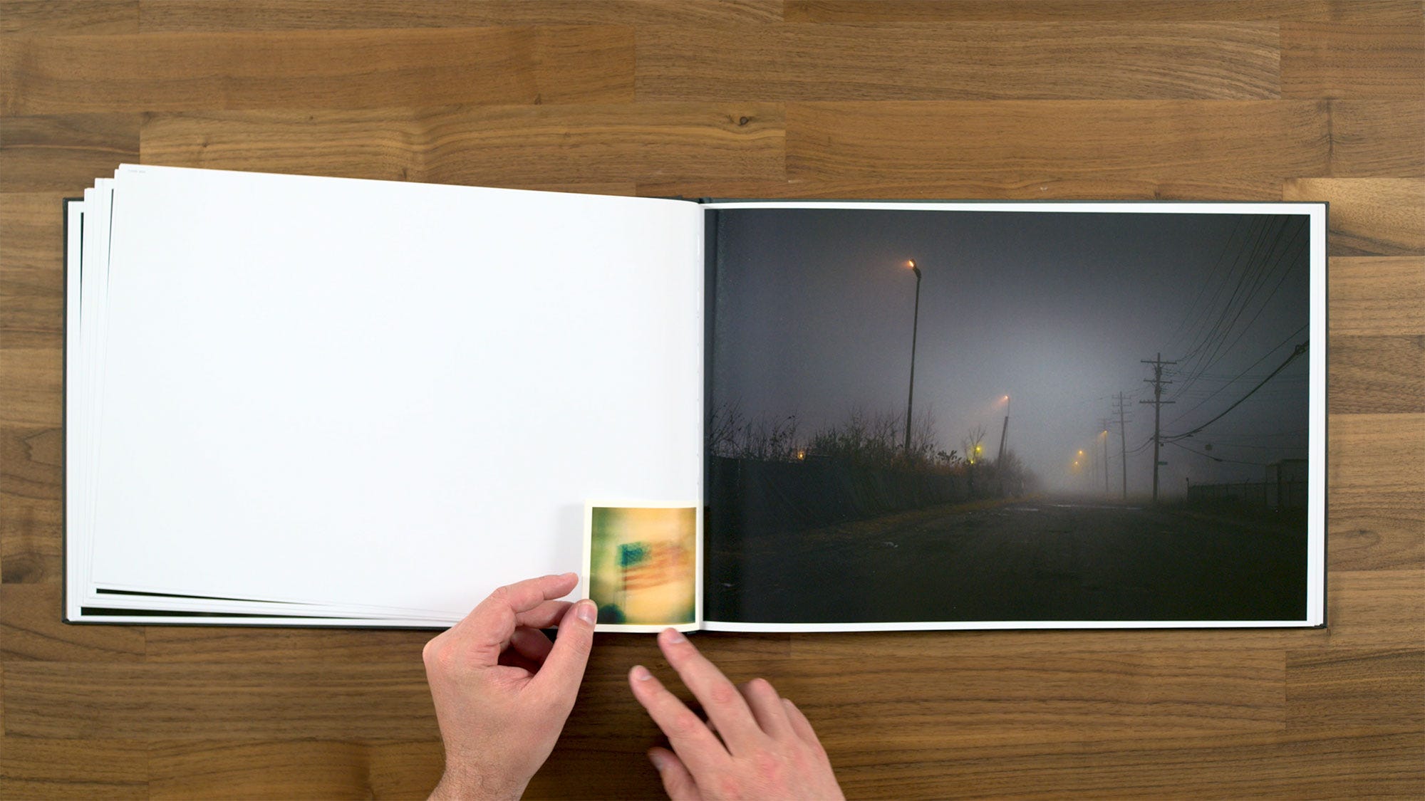
Personally I think that this one of the flag makes the nicest pair when it comes to being able to draw a connection between them.
I criticized an earlier set of images along similar lines to this one, but I think is a very good example of an image with a lot of black negative space. The negative space itself has interesting forms, with the power lines and poles set against the cloudy sky. The reflections in the water on the road, and the little glow from the street light really add something too. Also, the way the water on the windshield is interacting with the power lines gives a real mood to it, and the fact that it's so dark feels like it's intentionally part of that mood as well.
From a page design perspective, 4:3 aspect ratio images like this one give you have plenty of space between the image and the gutter.
However, with the 3:2 aspect ratio images, sometimes the gutter ends up being smaller than the rest of the margins due to the way the book is trimmed or bound.
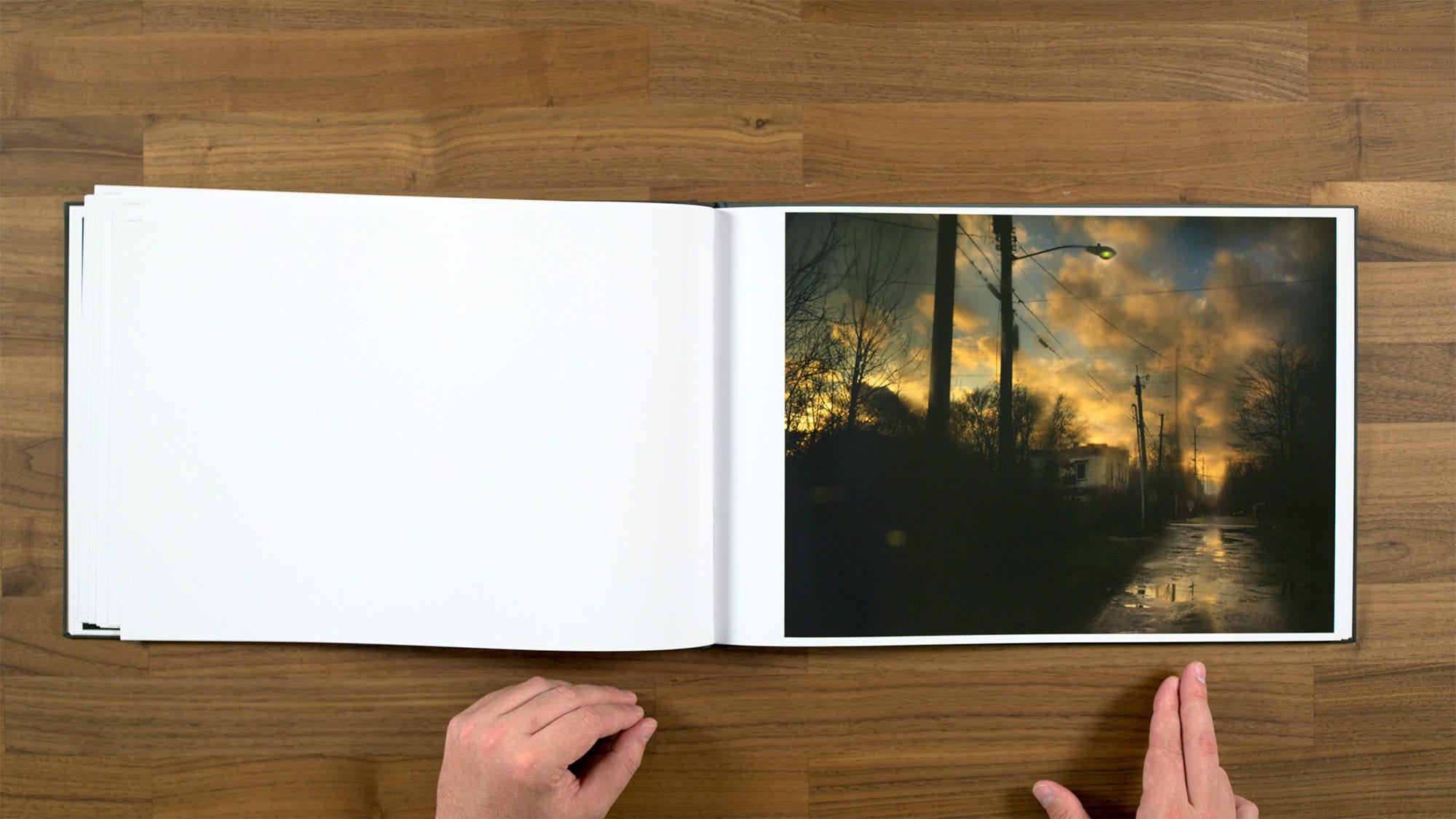
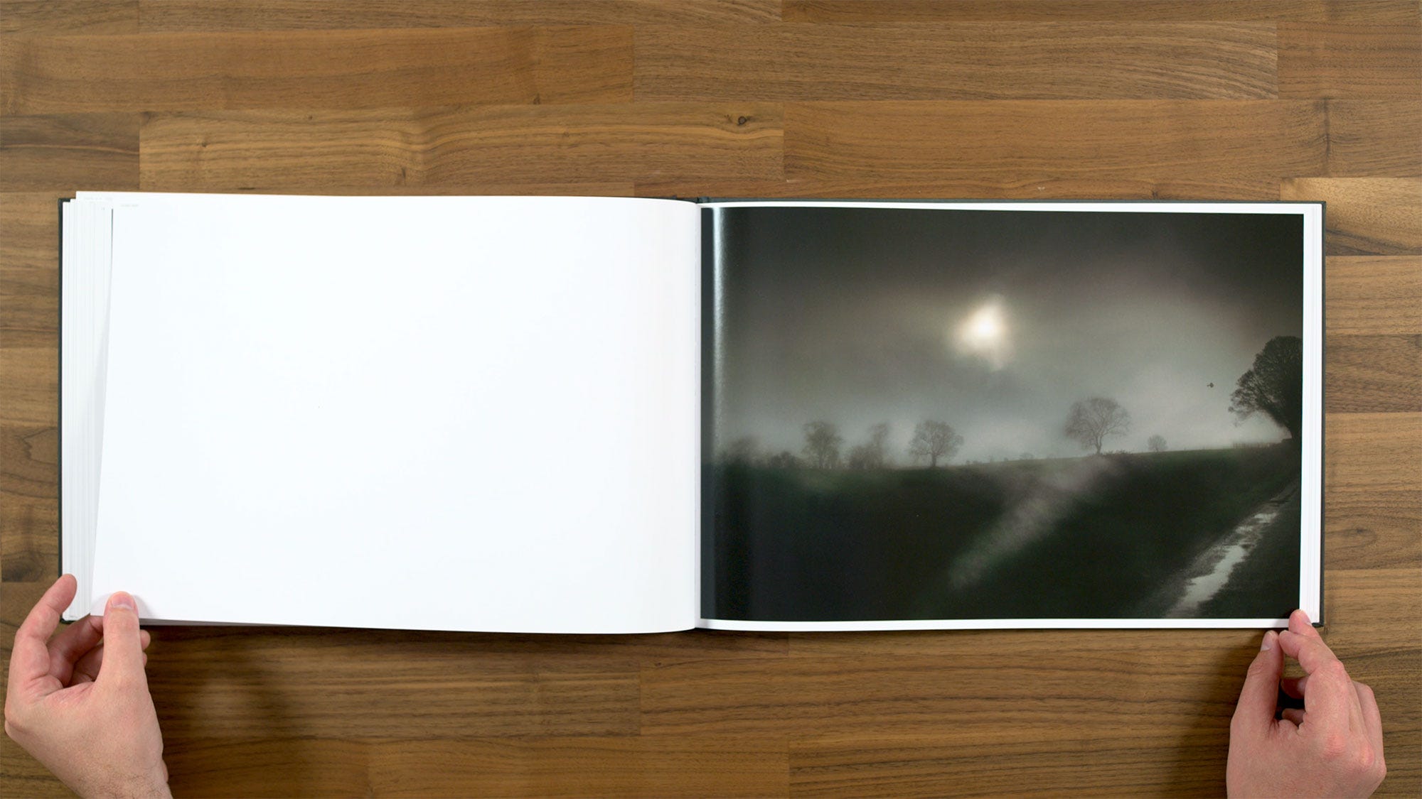
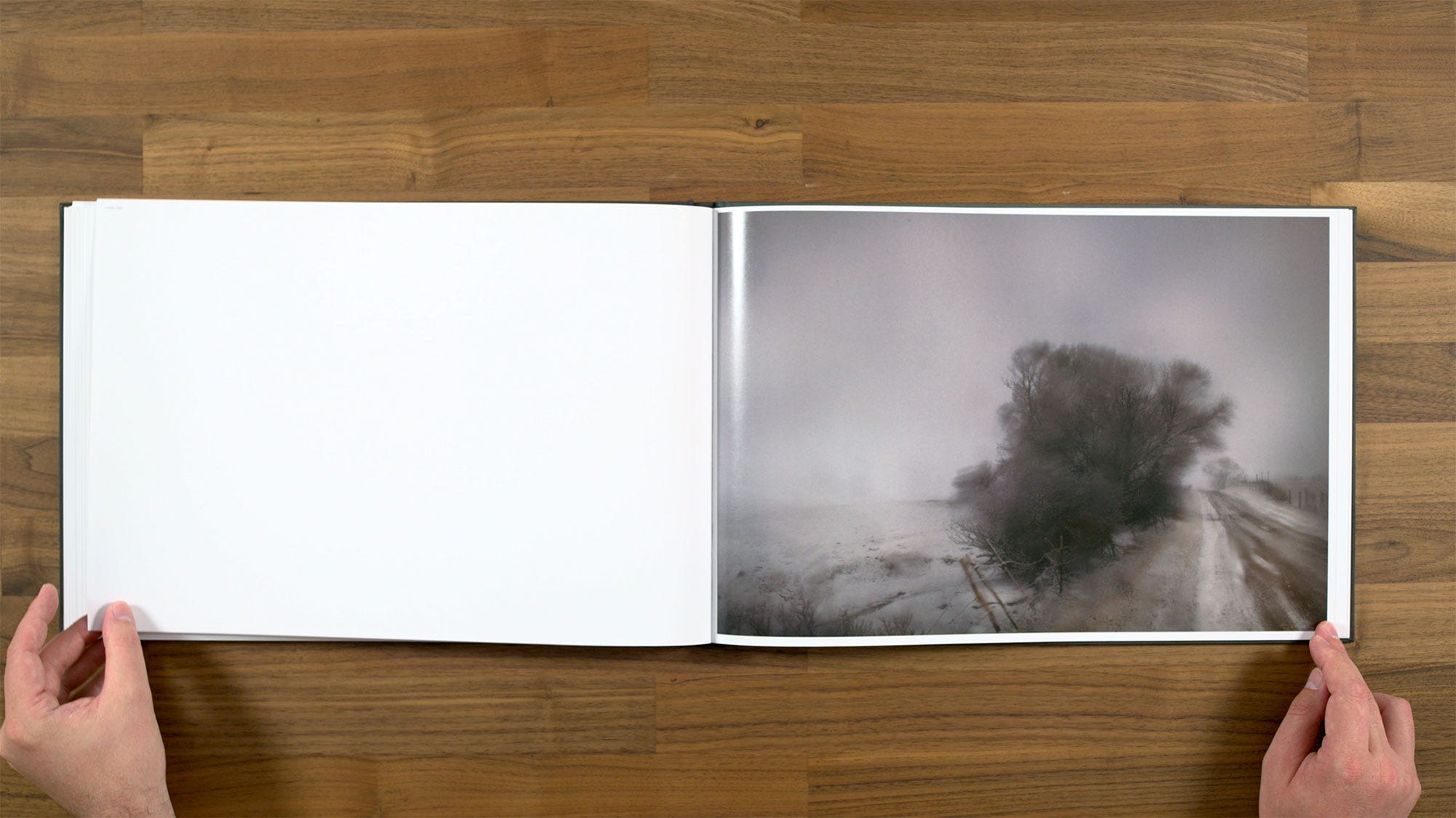
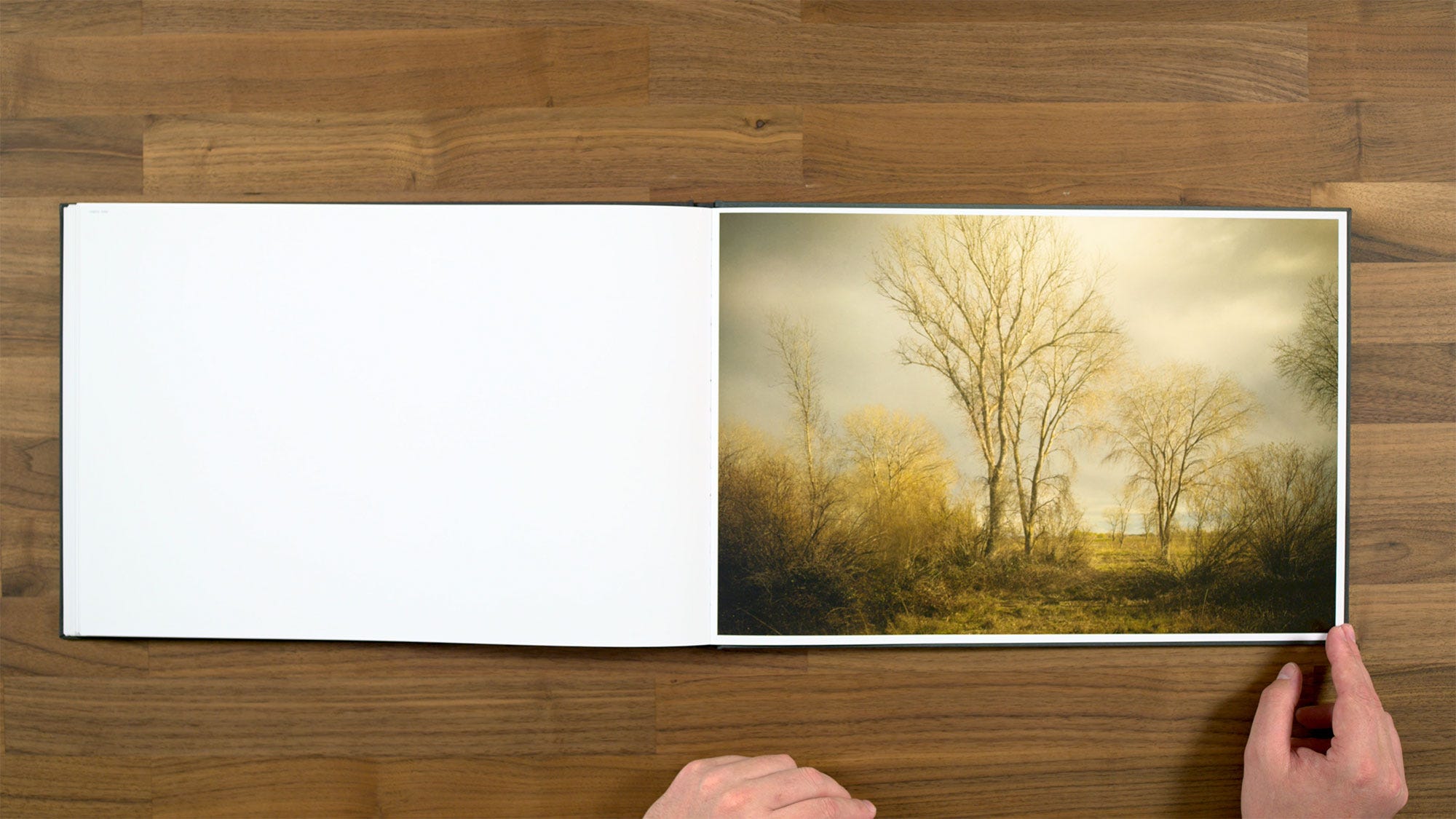
Some people might call an image like this subtle, but I also think you could make the argument that it’s just a straight up boring image. There’s really not a lot going on here other than the silhouetted trees. Compared to how strong some of the other images in the book are, this one feels like a pretty weak photograph. I think the book would have benefited from cutting this one, it just doesn’t add anything to the project as a whole.
Here you follow it up with one that's very bold minimalist kind of a image. The way the flash interacts with the falling snow is really quite striking. This is also the beginning of a nice run of a sequencing.
Next we move to a very House Hunting style image.
To kind of another House Hunting style image which makes a nice pair with a Roaming style one. It feels like these plenty of visual space between them, you’re not seeing different versions of the same things.
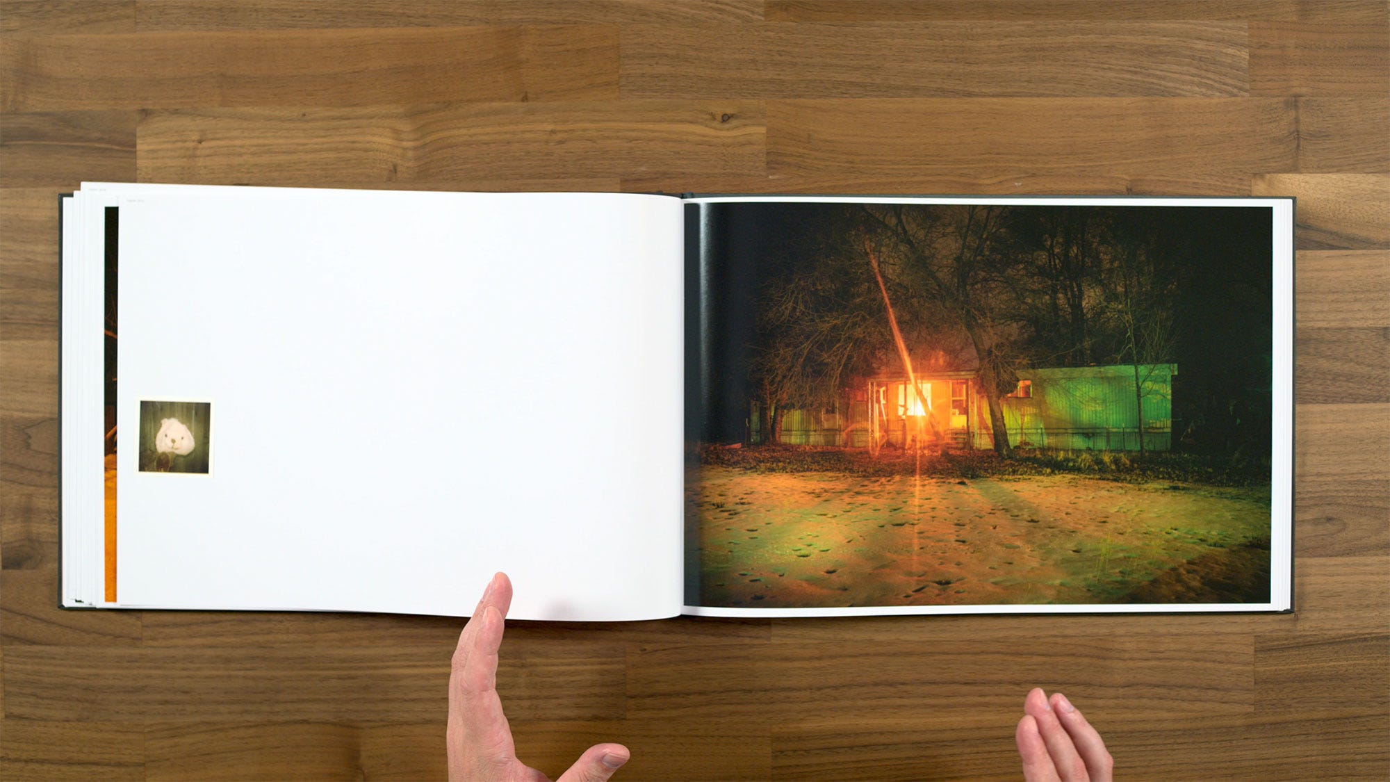
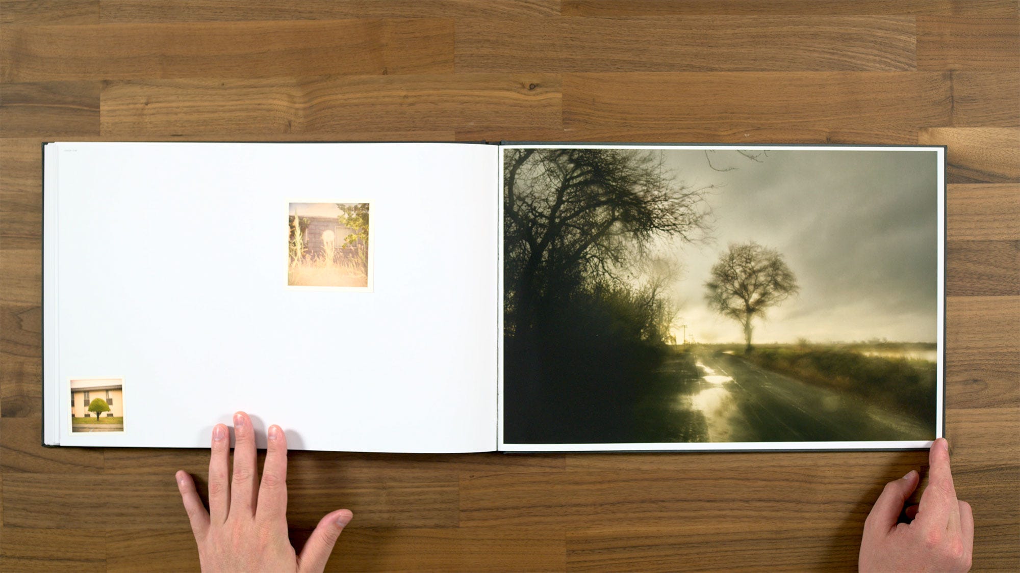
Here we have another tipped in image along with more of a classic House Hunting style one of a trailer. The little instamatic photo appears to be a stuffed bear or something. So it’s a little bit of a weird image combination, but I definitely feel like there's space for the viewer to draw a connection between these two things. It’s very free associative.
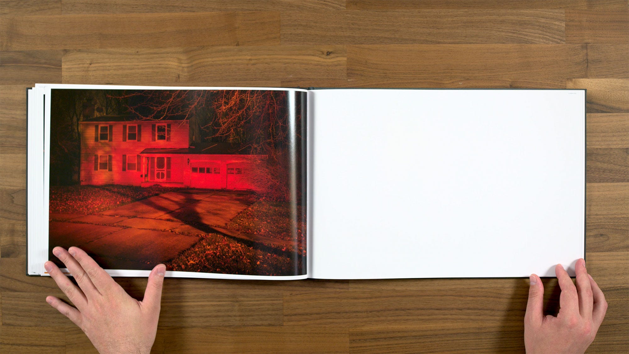
In this section, we’re in a little bit of a streak of photographs that are more house oriented than the majority of the book, which predominately focuses more empty landscapes. This one with that red light is a very classic Todd Hido house image.
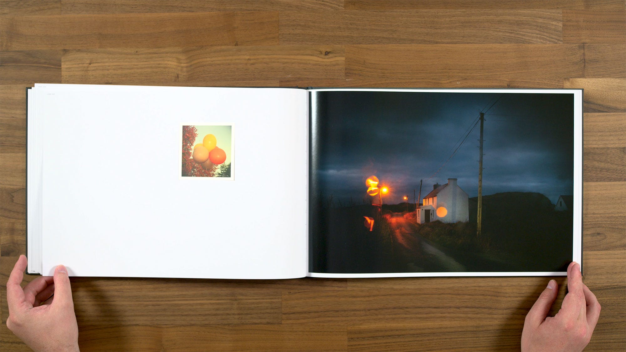
This is my very favorite pairing in the entire book. There’s a lot of conceptual contrast between the two, but there are also some little parts of tipped in image of the balloons that are mirrored the main image. The circular shapes of the balloons are repeated as little flares around the lights. There's a nice similar palette on both, but also a little bit a complimentary color contrast.
It's a little bit weird and out there, but in a very fun way, which I find kind of delightful. If all of the spreads with the little tipped-in or bound-in images were as good as this one, the book would be even stronger than it is right now.
As I previously mentioned, Todd photographed more outside of the continental United States for this project, in places including: Iceland, the North Sea of Japan, the Hawaiian Islands, the shores of the Bering Sea, and the Nordic fjords above the Arctic Circle.
We're getting to another stretch of empty landscapes and roads taken through the windshield.
I think this pair works okay. There's some visual similarities, but there's also enough contrast to give me some space as the viewer to think about the connections between them.
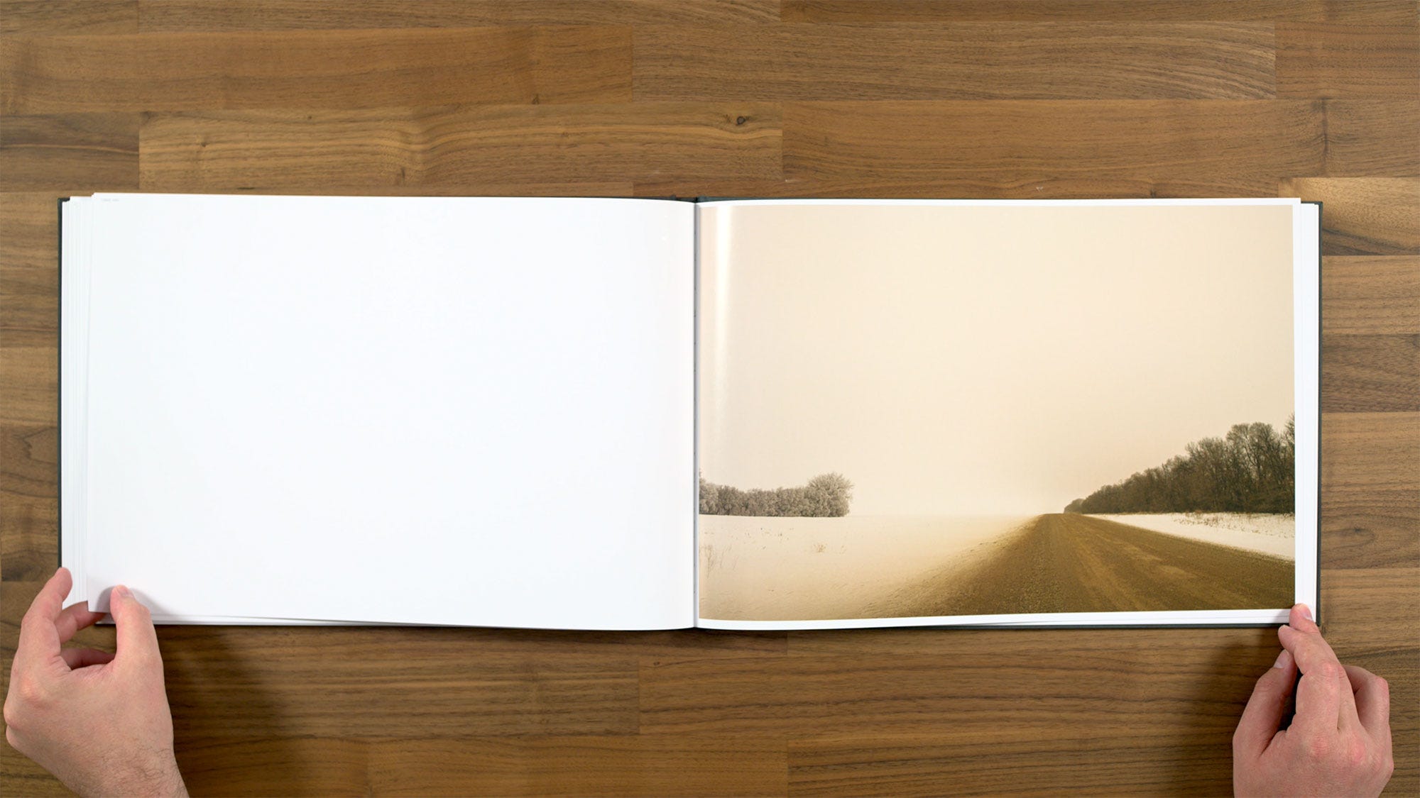
From a sequencing standpoint, we just came to a spot I personally feel don’t feel like works very well. There doesn’t seem to be enough visual contrast in the transition between this image and the previous one. Since they're both wintry landscapes with a really similar palette, I almost feel like I’m seeing more of the same thing.
In my own books, I’m always looking to create a sequence where the next page feels sufficiently different enough to be little bit unexpected or surprising (while also never being so different that it’s jarring). There are a lot of spots of the book with really nice dynamic transitions between spreads, but these two are so similar that it doesn’t feel surprising at all. I really like this one as an image in it’s own right though. The sequence going from here in the the next couple images work really well too.
I wasn’t expecting what was coming next, but I was really enjoying it. It's very dynamic. This is a really great photograph too.
Here we get to something which we haven't seen at all in the book previously. These aren't so much paired images, as they are two frames meant to be seen next to each other as a single image. So they really function more as a diptych. They’re visually striking and work nicely on their own merits.
The problem I have with them, is that we don't see anything else in the book like this at all. Nothing with this type of super glowy color palette, or any other diptychs. So it really does feel an outlier when we don't ever revisit anything in this same style or formatting again. That being said, I'm still okay with them being in here. I would have just liked it better if they had done something similar at some other point in the book, so it wasn't something we only see one time.
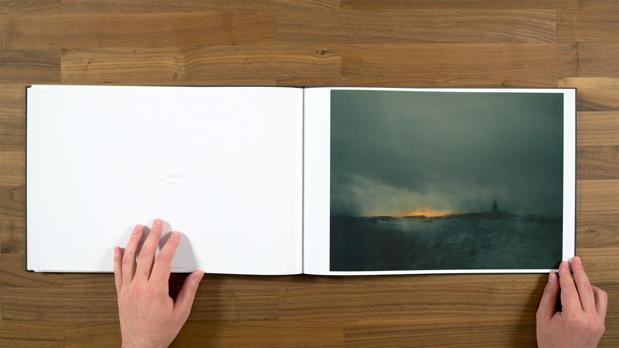
We have a Robert Creeley poem with this one:
“One day after another, perfect. They all fit.”
We also have a rare appearance of a figure, also not in the same way as the figure from instamatic image we saw earlier. Really more of a barely visible silhouetted figure in the distance in this case.
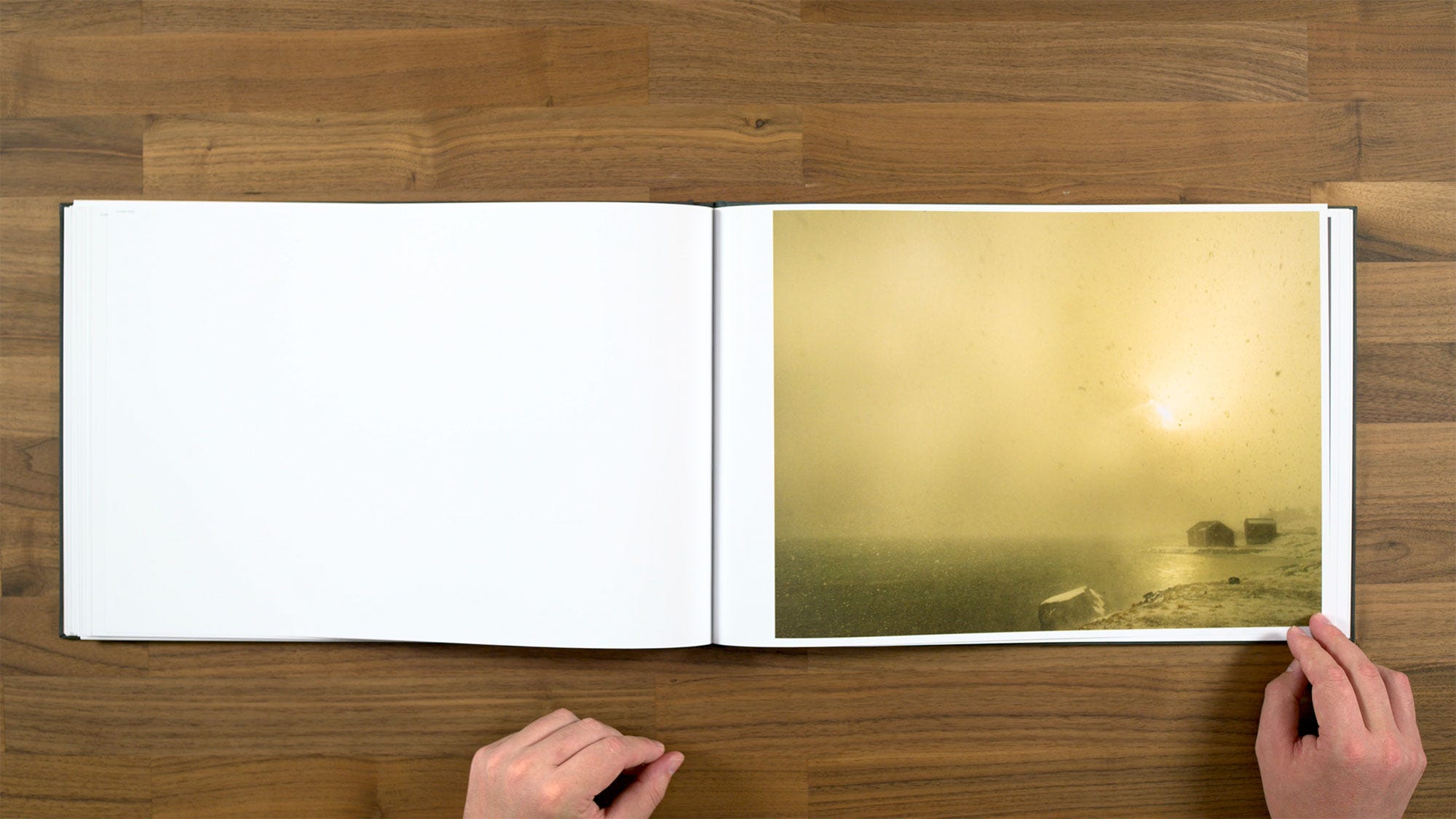
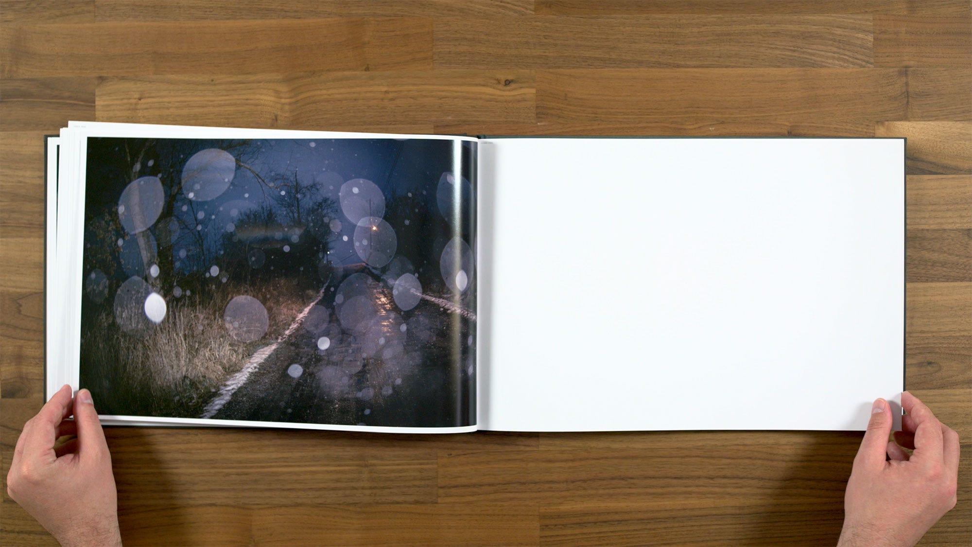
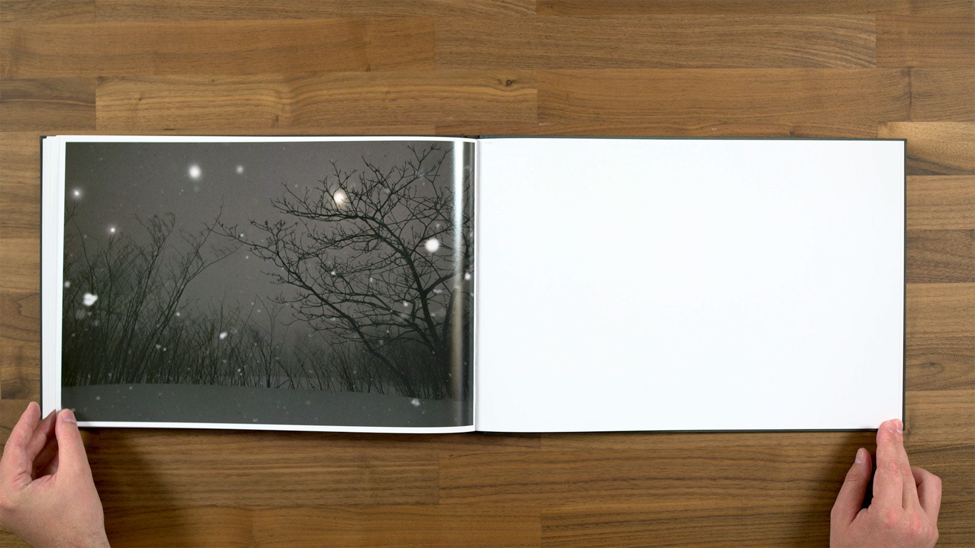
This image is quite striking with the way the snow is falling. It's quite bold on one side of the image, but also quite subtle on the other. I feel like it draws you in, but then lets you continue to move around. Definitely a nice, classic feeling Hido photograph.
This one has also a super classic Roaming through the windshield aesthetic.
These feel like a nice pair. I feel like there's enough visual and conceptual distance between them that you can really draw a connection as the viewer.
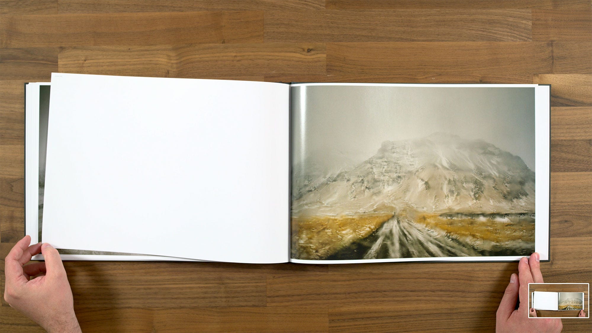
I do really like this image, but I’m not so sure about it’s placement from a sequencing standpoint. Last page we had a mountain with a similar color palette on the same side of the spread, and now it's like, okay, we've gotten closer to the mountains. I don't think that this has the dynamism that other parts of the sequence have had. It's not like we’re even going continue on with a new mountain sub-theme either, we’re about to move on to something else. So this is a little bit of a weak point for me.
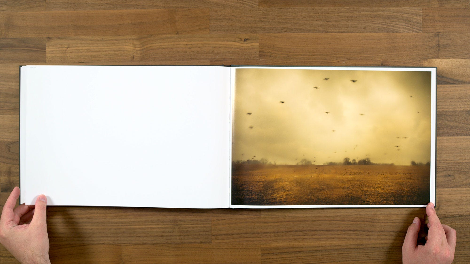
This is certainly a striking one, with the graphicness of these birds flying in the field combined with the softness shooting through the window.
Here's another pair that I think would have been stronger if it was paired differently. I do think they're both nice images in their own right, but they’re so similar feeling. I don't really think they’re telling a different enough story that you gain anything by seeing them together. Both of them would be fine on their own, or even paired with something else that was a little more dynamic. Right now they're definitely not the strongest possible pairing for either of these images though.
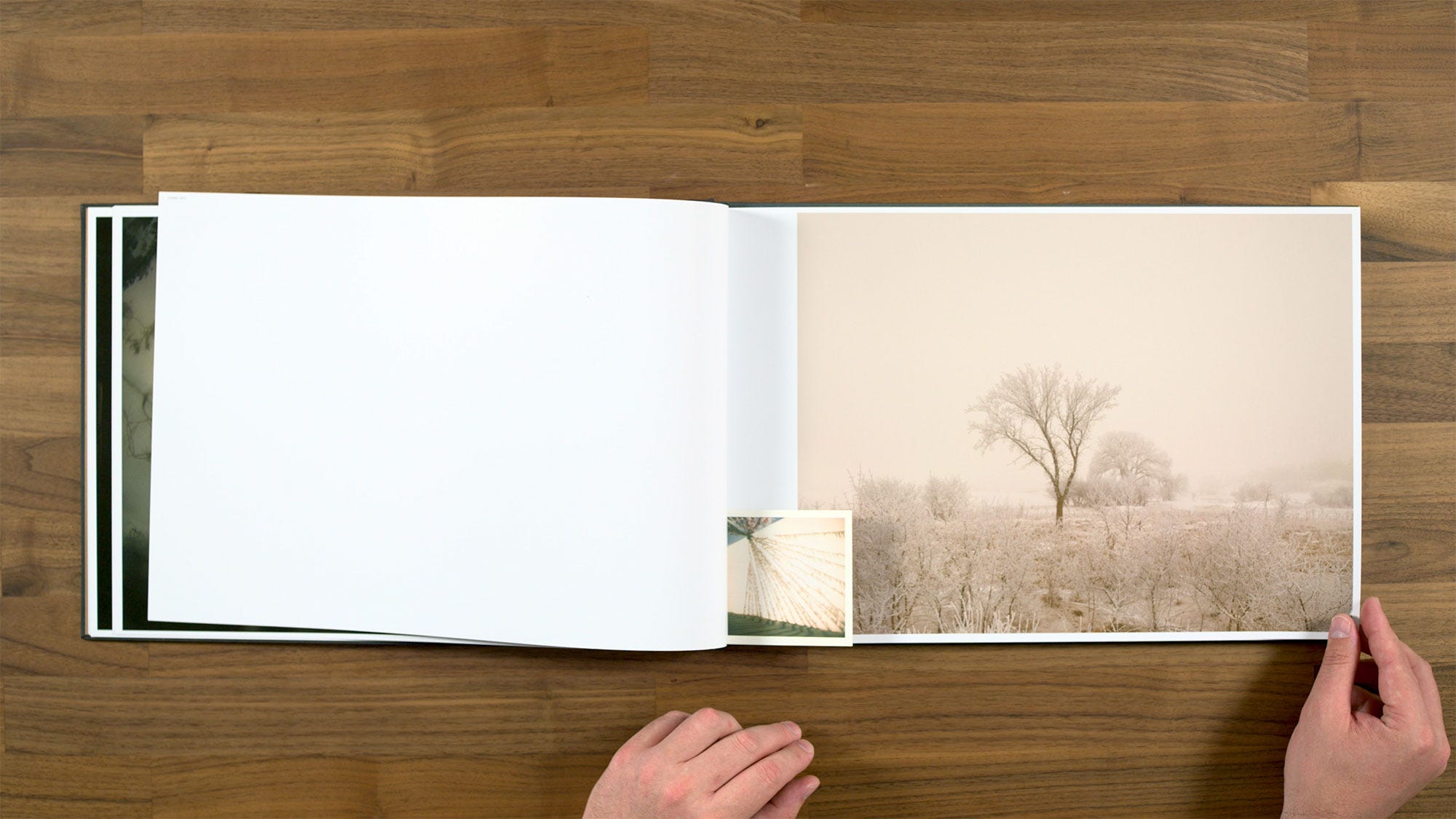
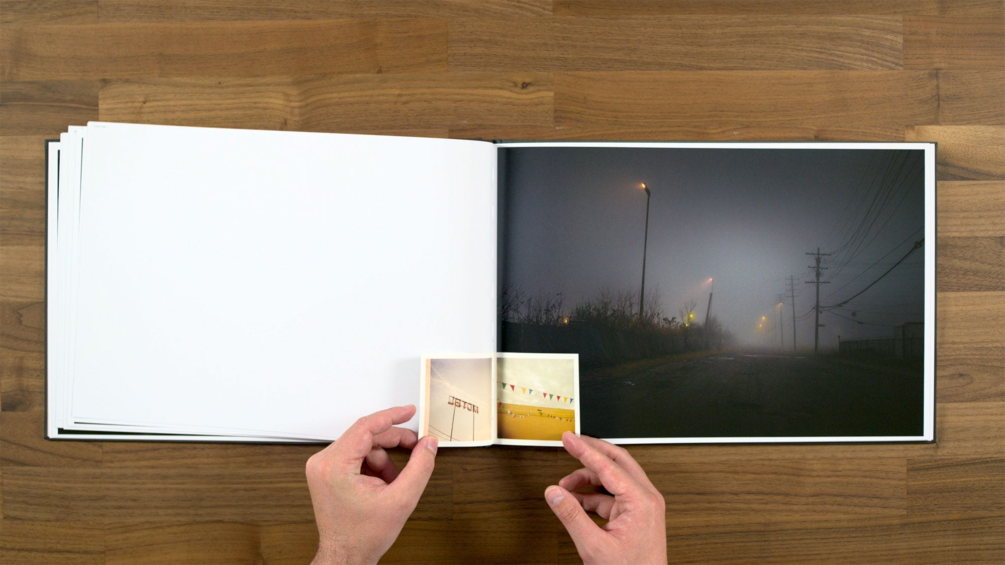
We have a couple of different tipped in images on this spread, in a little more of a salon style, which is something we haven’t seen up to this point.
Interesting little side note on this one. I published a photograph by Michael Martin of the same apartment building with that tree in front of it in Subjectively Objective’s 2019 survey book, Observations in the Ordinary.
Speaking about this project, Hido said:
“It's not my job to create meaning, but to charge the air so that meaning can occur.”
I feel like that's a pretty good summation of his work in general, and particularly the work in this project.
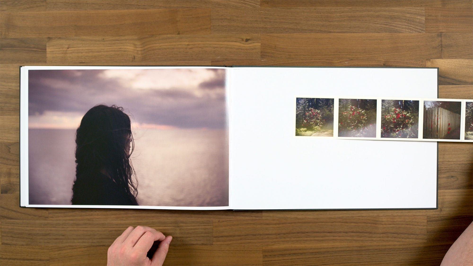
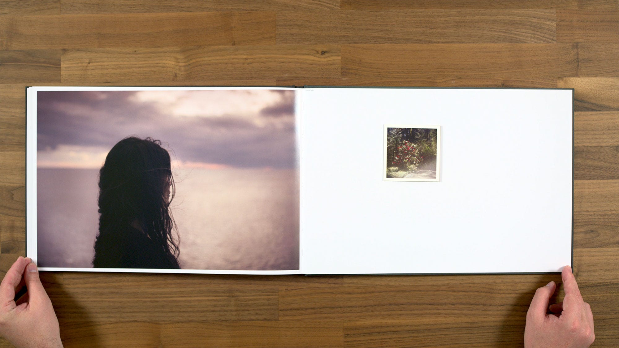
Here we get something which we've not seen at all before in the book. We have a full scale image of a figure, mostly from from behind (you might even consider this a portrait), along with tipped-in image that folds out with these sort of iterative images of a rose bush. I do particularly like one of the fence on the far right.
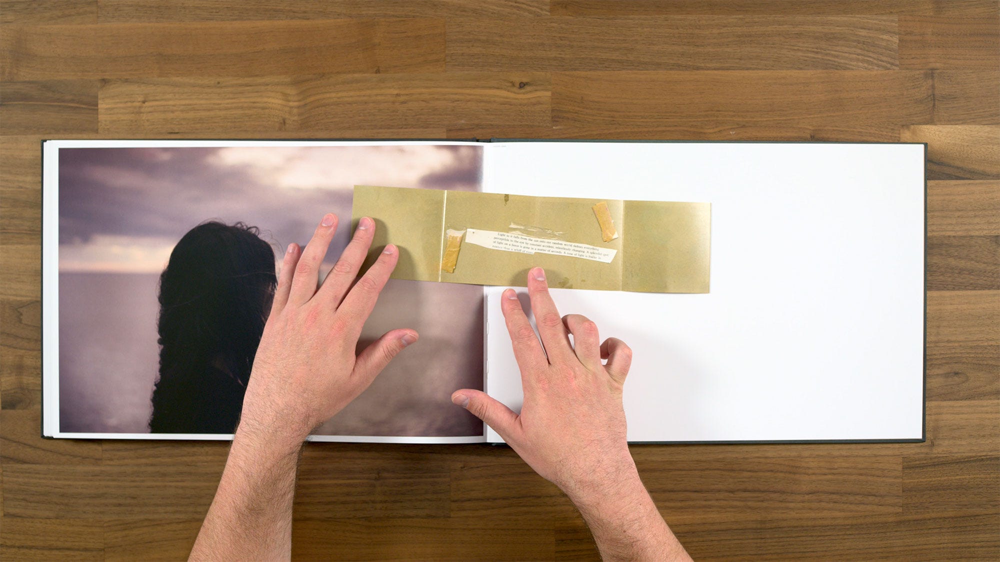
On the back of the fold-out, we have what like looks a folder with a poem taped onto it. It almost looks like a scan. I do like this tipped in piece, I think it's quite interesting. But I kind of wish we'd seen more of things like that in the book, because this is only time we’re ever going to see it.
I like the portrait too, although it does have a very different feeling than the rest of the book. In the past, Todd Hido has definitely mixed in portraiture along with his landscapes and night work. In this instance though, this is the only time that we're seeing a full scale portrait in the book, and we're not going to see another one, because this the penultimate spread in the book.
So although I like this spread in its own right, I don't really feel like it works in the context of the book. Maybe if he included more portraiture like he had in the past, it would feel like more of a reoccurring motif. But right now it just feels kind of out of left field. We get two different things we've never done before, and then the book is over. So I feel like the book would have probably been stronger and more cohesive without including this spread at all.
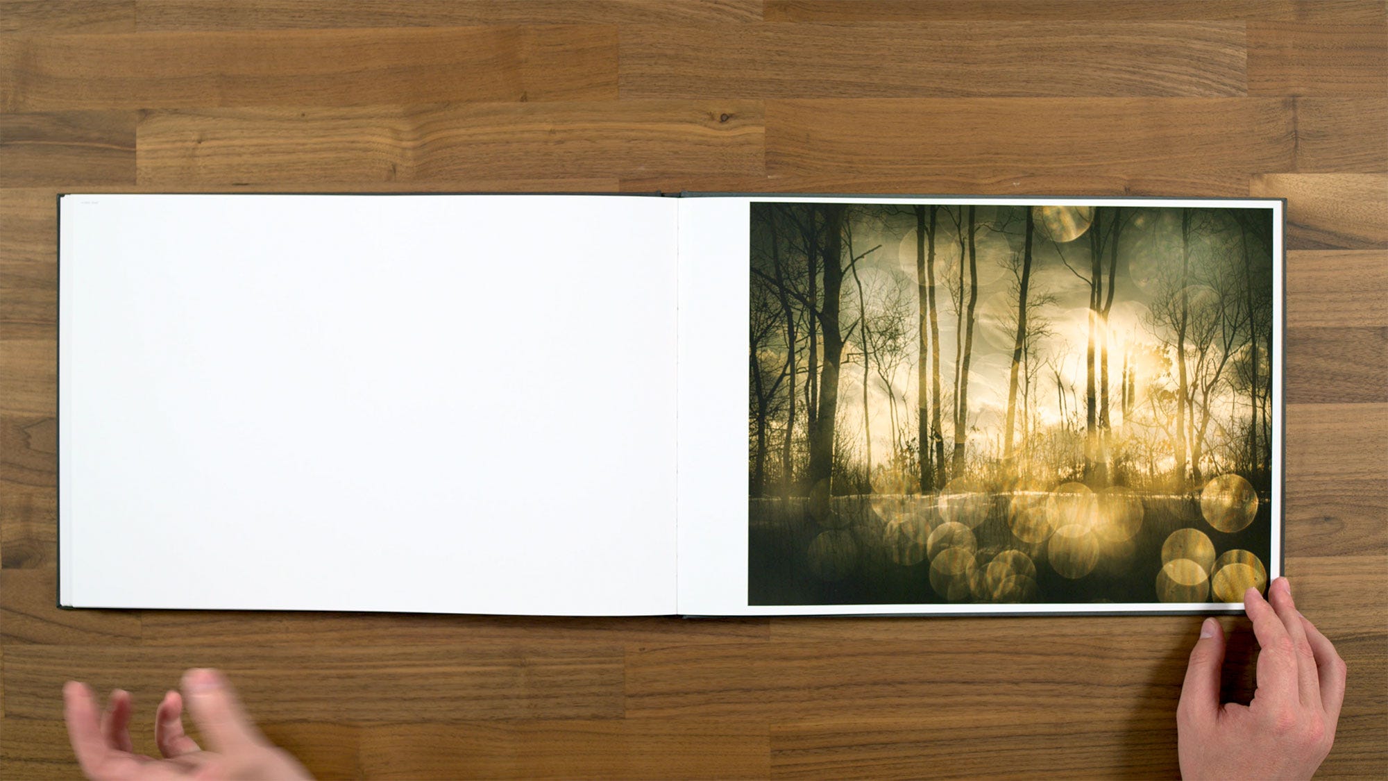
The last image feels like we’re going back to a very similar feeling to where we started. A perfectly pleasant, if somewhat subtle note to end the book one.
There is a pretty extensive credits page.
The back of the book includes a different image than the front cover. This was the image with with the very subtle figure off in the distance.
In Conclusion
The question is, should you buy this book? It's a fairly expensive at $85, however, it's also a very large book at 17x14”. So it's not necessarily a bad deal for the amount of book you're getting for the money. It's definitely not as tight and concise as Todd's earlier classics, like House Hunting or Roaming.
However, it is much more expansive when compared to those books (which only had about 35 images each). As we talked about before, it does have a little bit of weirdness to it, but it's not nearly as out there as some of his other books like Excerpts from a Silver Meadow. So if you're a fan of his earlier books, I'd say this is one you probably will enjoy. Something else to keep in mind is that Todd's books do have a tendency of selling out. So if you're interested in it, you might want to pick up a copy sooner rather than later.
If there are other books you'd be interested in seeing me review, let me know in the comments. If you’d like to support what I’m doing, buy a book, magazine, or print from Subjectively Objective. If you’d prefer to give ongoing support through Substack, you’ll receive coupons equal to your subscription value that can be used for anything in the Subjectively Objective shop.
I hope to see Hido’s work in person someday either in a gallery or book form. I’m big fan of his landscapes in particular.
Great review. You're quite honest about individual images and whether they work or not, which is great.
I also like the bits about book production, which you usually don't see in book reviews.
You definitely need some solid proofreading, however, of your writing. Seeing obvious writing errors is definitely a turn off when I'm reading professional work.
Thanks. Look forward to more.
Patrick